YOHOHO is turning 10: why we founded a creative studio unlike traditional agencies.
YOHOHO was founded to solve two problems: fragmented communication and agencies that had become too slow.
YOHOHO was founded to solve a problem. Or maybe two. The first one we ran into every day: the communications industry too often worked in silos. Branding went to a design studio, the advertising campaign to a creative agency, the website to a digital agency. Meanwhile, social media agencies kept multiplying. More contacts, more handoffs, more chances of misunderstanding each other.
The second problem was the quality of the work. At the agencies we came from, increasingly complex structures and processes often ended up wearing projects down instead of improving them. Between feedback rounds, revisions and realignments, ideas lost their strength, timelines stretched out and client relationships got complicated. In the end, frustration was one of the few things we all managed to share.
Why the traditional agency model no longer worked.
This is where YOHOHO comes in. We used to talk about it at Rock’n’Roll, a club in Milan where we met up after work. Electric guitars played on stage, kids moshed in front of it. We spent our nights imagining an agency with a punk soul, one that could move people, do it simply and with all the irreverence of being in your twenties.
We were convinced that branding, advertising, websites and social media content could be done in a more consistent and direct way. That an idea could make it all the way through without being taken apart piece by piece as it passed from one vendor to the next. And that it was worth building a studio to give it a try.
The idea of a more agile, direct and cross-disciplinary creative studio.
On those nights we started imagining a studio unlike the big agencies we knew. A place where a copywriter and art director team, a graphic designer, someone handling social media and ads, an account manager and a web developer could work together as a core team, bringing in the people best suited to each project. The team would be built around the work to be done.
Today this idea might seem almost ordinary. Flexible teams, remote collaboration, professionals brought in project by project: in the meantime, these options have become far more familiar. For us, back then, it meant challenging the agency model we had worked in. Understanding that talent doesn’t stop at your office door, and that quality grows when you can choose the people best suited to the job, even if they’re somewhere else and see things differently from you.
It also meant imagining a more direct relationship with clients: fewer filters, less dispersion, less distance between the people who conceive a project and the people who approve it. Trust had to start there.
Branding, advertising, social media and websites: the advantage of a single vision.
But the real turning point was something else. We wanted to keep everything together. We wanted naming, logo, brand identity, advertising campaign, website, social media content and ads to stop being separate pieces and go back to being what they should always be: consistent expressions of the same idea.
Because a brand doesn’t live in silos. It lives in the sum of all the places it shows up. In the continuity between what it promises, what it shows and the way it speaks to its audience. Without shared direction, that continuity gets lost. But when every choice follows the same creative direction, every channel strengthens the others. And strategy leaves the documents behind: it becomes something people recognize.
Why we called ourselves YOHOHO: the idea of creative pirates.
By founding our studio, we were also taking a stand. Faced with big advertising agencies, international networks and a growing number of specialized firms, we wanted to prove there was room for another path.
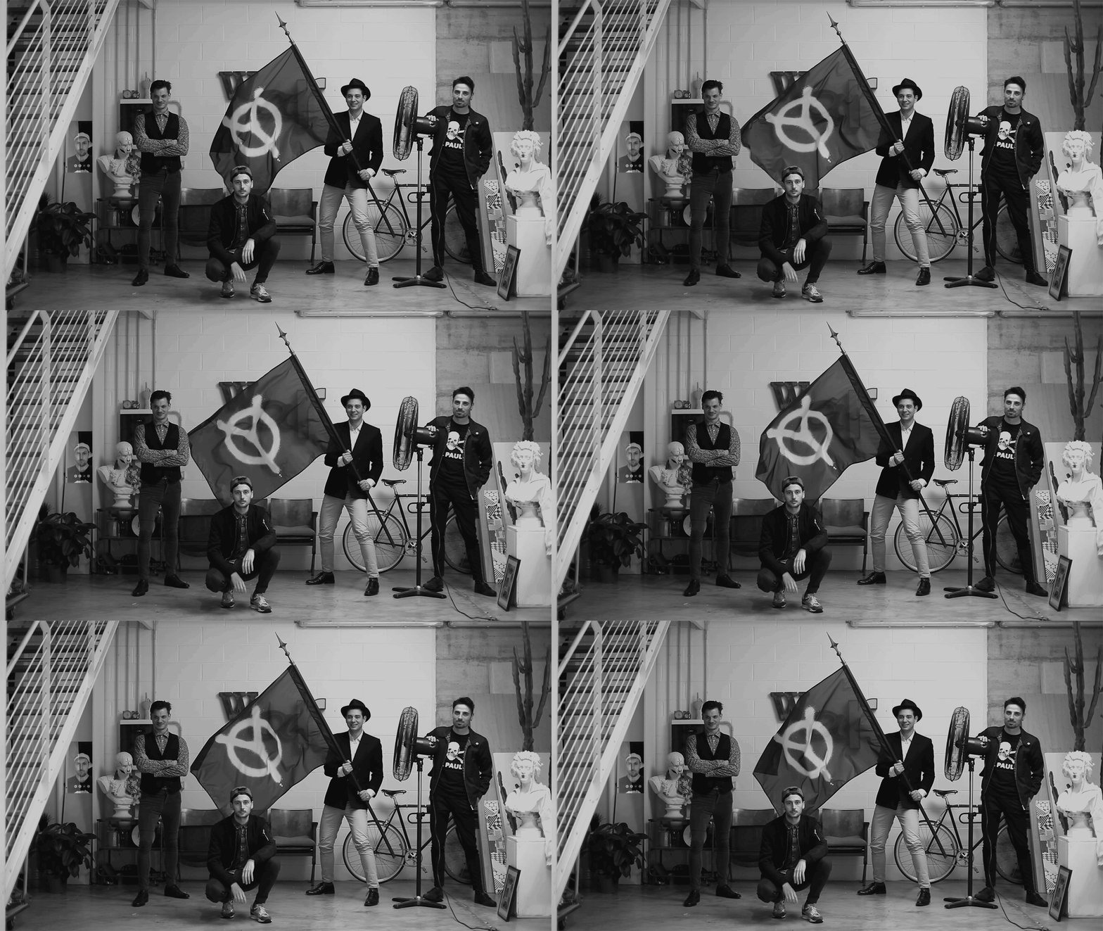
There was something irreverent, unconventional and combative about it. The image came on its own: we felt like pirates. Creative pirates. People who enter the industry without asking permission, convinced there’s still room for the raid, for risk, for another way of sailing.
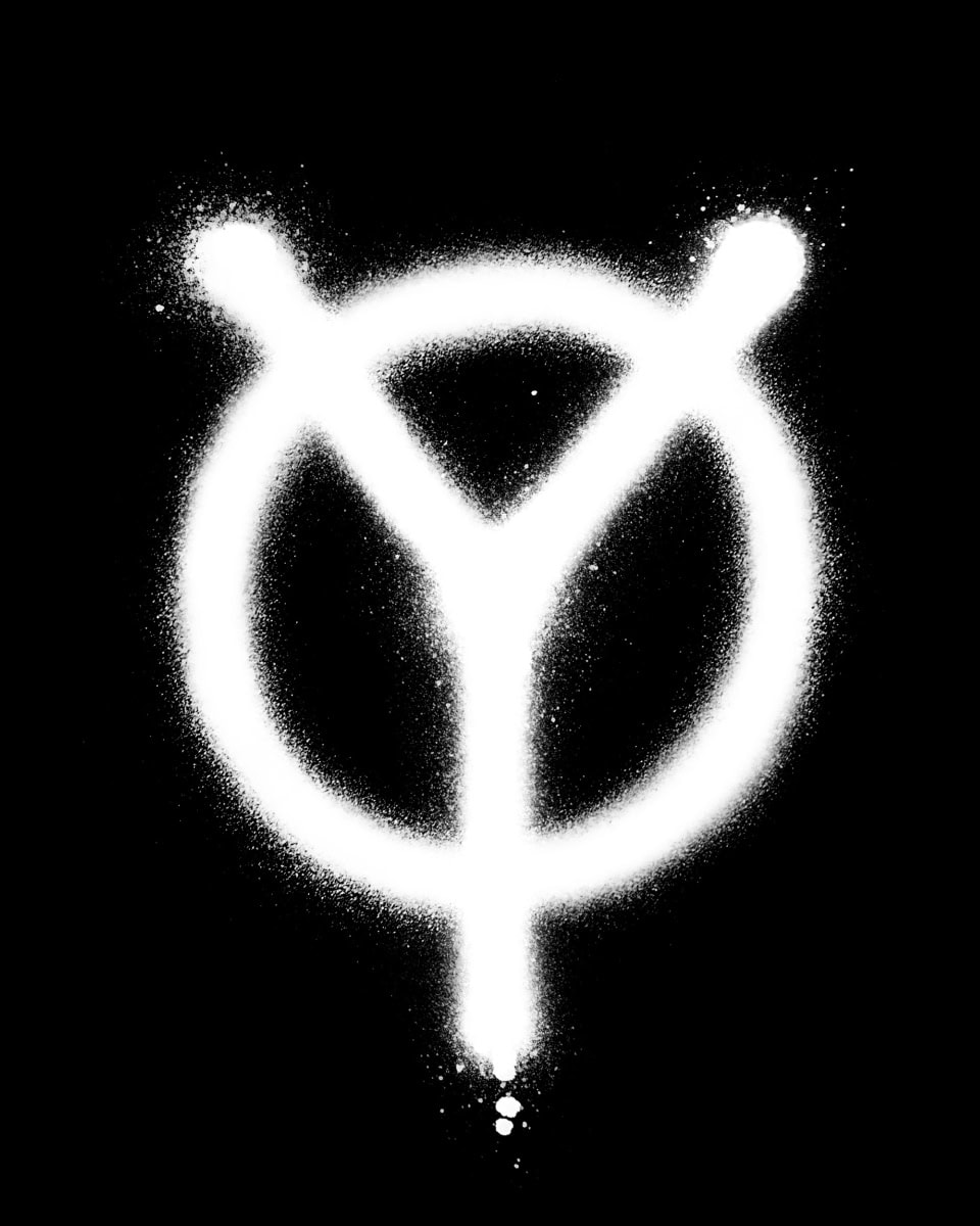
That’s where the name YOHOHO came from. A deliberately unusual name, and for that very reason one that sticks in your head. It comes from the famous pirate song in Stevenson’s Treasure Island: a cry that is at once a song, a challenge and a promise to storm aboard. It seemed perfect to us.
A pirate creative studio, though, needed someone willing to come aboard. We needed brave clients. Clients able to see the value of a different structure and trust a more direct, integrated process. That’s where our tagline comes from: Creatives for the brave. Because creativity always takes a certain amount of courage, on both sides.
From branding to advertising: the studio’s first major projects.
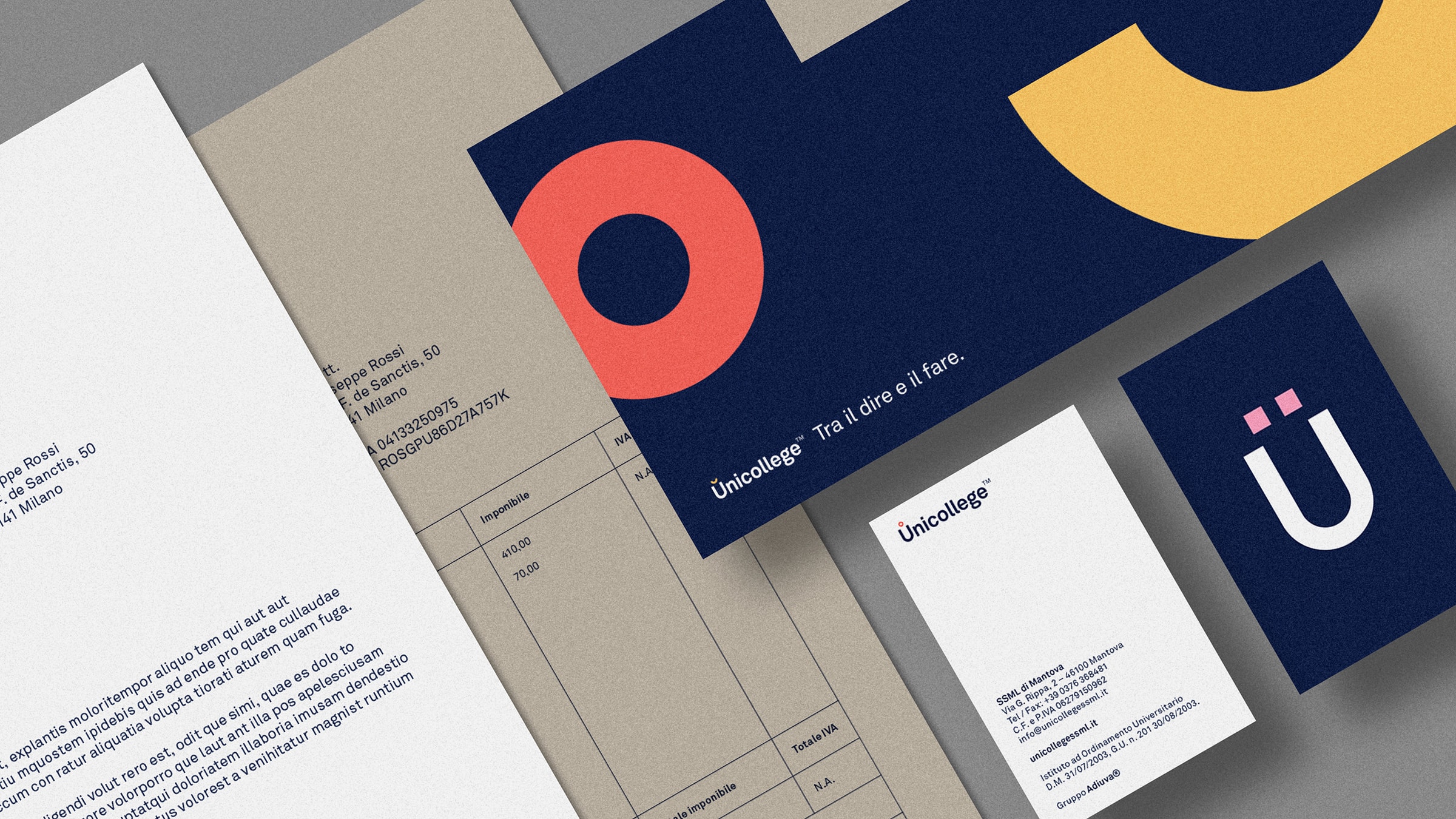
Adiuva: the first integrated project, from branding to websites.
The first major client to believe in this possibility was Adiuva. It meant a lot to us: it gave us three years of work to put our model to the test, with everything a long-term project involves.
Adiuva is a holding company made up of several education and training businesses, each with its own identity, goals and audience. Our job was to build the group’s branding and, at the same time, give each individual company a recognizable character, its own tone of voice and a consistent visual direction. Family branding, in the fullest sense of the term. Each business had to work on its own and be recognized as part of the same family.
From this strategy came the websites, the social media content plans and the ad campaigns. Branding, web and communication took shape from the same choices, which had to work both for the group and for each company.
It was the first truly YOHOHO project. The method was starting to show: in the relationships between the different brands, in their languages, in the continuity of their communication.

Lamborghini Urus: when we realized we could compete with the big agencies.
Then came Lamborghini. With the Urus project, we realized our way of working could hold up even at the highest level. The context was complex, expectations were sky-high and there were many elements of communication to bring together.
What interested us most was the chance to work on an idea that went beyond a single commercial. A campaign that would show Lamborghini in a new light: an iconic high-performance brand, able to make possible what once seemed impossible.
Since We Made It Possible, the tagline that drove the project, ended up printed on the façade of the Industry 4.0 plant in Sant’Agata Bolognese. The Urus launch event was also attended by the President of Italy, Sergio Mattarella.
For us, it was an important confirmation. An agile structure, with the right skills and direction, could stand up to the work of the big international agencies. After Urus, we could say so with a project to back it up.
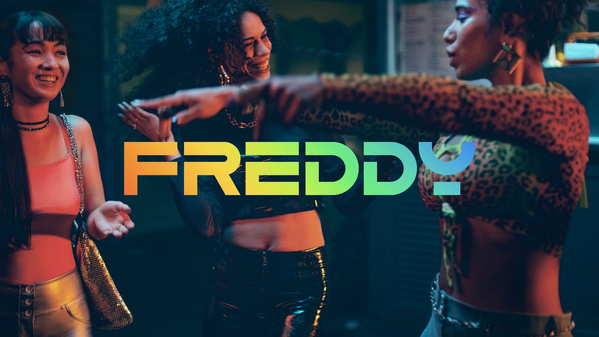
Freddy: proving that creativity can support a brand over time.
If Lamborghini was a show of strength, Freddy was one of the deepest and most formative relationships in our history. We shared more than five years of work, spanning repositioning, relaunch and rebranding. When Freddy decided to go back to basics, we were at the brand’s side: the goal was to find a contemporary vision without betraying its nature.
The heart of the project was clear from the start: establishing Freddy’s positioning as a brand that sees sport as the art of movement. The body as a means of expression. The athlete as an artist. A different perspective in an industry dominated by records, wins, goals and competition.
This led to manifesto films, editorial content, interviews, social media, events, special websites and, finally, the rebranding. The Artists of Movement involved along the way included Jury Chechi, Alessia Maurelli and Nicoletta Manni: very different figures, each able to embody the same idea.
Freddy taught us how much work it takes to stay consistent over time. A vision has to be able to generate new campaigns, move across different languages and keep pace with the brand’s evolution. This is also how creativity can give a brand back its relevance, desirability and emotional power.
Startups, branding and market launches: the boldest side of YOHOHO.
Over the years we’ve also worked with companies like Ferrovie dello Stato (Italian State Railways), Vibram, Luxottica, Netflix and Ducati. But there’s one particular satisfaction that has stayed with us: launching startups.
Maybe because that’s where our model finds its purest form. When a brand doesn’t exist yet, its perception has to be built from scratch. Every choice matters. Every word, every mark, every page of the website helps say who you are for the very first time. It’s a delicate position, and that’s exactly what makes it exciting.
Take Lunar, a project that remains emblematic for us. A technical, innovative B2B brand that chose a path far from the predictable language of its industry. We built a strong, almost sci-fi world, trying to balance creativity and clarity. We’ve never understood why a brand should give up its personality as soon as it starts talking to businesses. Even a technical product can inspire a surprising story, if you find the right angle.
Or Crash Baggage, where we worked on a strategy that turned a product feature into an attitude. The dents in the suitcases became the starting point for a philosophy: letting the unexpected leave its mark, making it a distinctive trait, embracing accidents as part of the journey. It’s a shift we find fascinating: when a product detail suggests an entire way of seeing things.
The same goes for Pulled Porn, a project where naming and identity were already a statement in themselves. Sometimes creativity has to stake out its territory. Provocation, though, needs consistency: name, tone of voice, visual identity, copywriting and experience all have to speak the same language. Otherwise it runs out of steam after the first punchline.
ROT allowed us to build a whole universe. In fashion, a cultural vision and an aesthetic have to be recognizable behind the products. We developed the branding, website and social media content plan as parts of the same system, so that universe would be recognizable in every encounter with the brand.
Finally, Ritocchini represents another central aspect of our work: the power of language. In certain industries, many services are described with the same formulas. Aesthetic medicine and cosmetic surgery, for example, often rely on cold words and standardized tones.
With Ritocchini we set out to break that pattern, building a launch project from naming to logo, from website to social media, all the way to ad management. We were looking for a more vivid, more contemporary language, able to bring people closer without trivializing a sensitive subject. This, too, says a lot about who we are: we care about finding words that shift meaning, not just words that fill space.
What we’ve learned from 10 years of branding, communication and digital projects.
Looking back at our work, we realize that even across worlds far apart from each other, we kept following the same idea. Start from the creative strategy. Find the core of the project. Understand which perception needs to be built, changed or relaunched. Then make sure everything works in the same direction.
We care about creativity that organizes, guides, clarifies and differentiates. The kind that makes a brand clearer, more desirable, more precise. That finds the right form for each client, without forcing on them a style that looks like everyone else’s.
Why we’re launching this blog now.
This logbook is here to tell the story of the projects that shaped us, the insights that guided us and the methods we’ve refined. To go inside the work starting from the original question: what was the problem? What needed solving? Why did we choose that particular path?
We’ll talk about how to build consistent branding, how a website can become a strategic tool, and what makes a campaign capable of changing how a brand is perceived. And about what happens when branding, advertising, social media and web are conceived together.
As YOHOHO approaches its tenth anniversary, the way of working we once imagined seems less unusual. Flexible structures and collaboration across different skill sets have become more familiar. We’re proud of the path we chose. But it would be a mistake to grow so attached to the formula that we stop questioning it.
The challenge is still to bring together strategic vision, creative quality, speed and trust. To understand what still works and what needs to change. That goes for our clients’ projects, and it goes for us.
That’s also why we’re launching this blog. The anniversary gives us the chance to share what we’ve learned and open a new chapter. It’s been almost ten years since those nights at Rock’n’Roll. We’ve come a long way since then, but we’re still creative pirates looking for brave challenges.
Expect the unexpected.
Dare to challenge us?
Tell us about your brand project:
bebrave@yohoho.studio