Freddy: how to renew a heritage logo without betraying it.
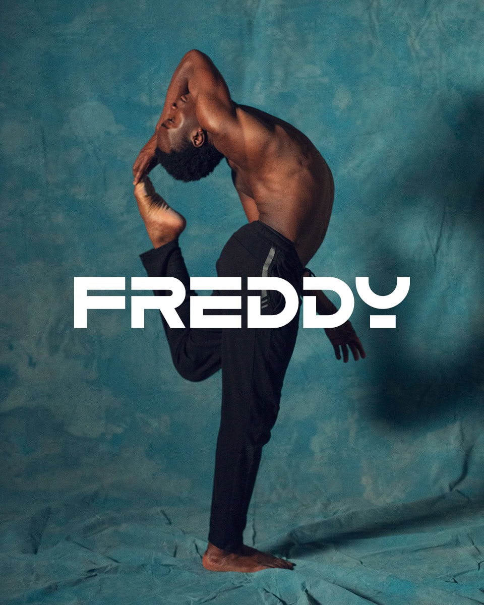
The rebranding of the Freddy logo shows that a heritage brand isn’t updated by replacing it with something new, but by freeing it from everything that keeps it from being alive in the present.
Some logos can be changed without too much trauma. And then there are those that, as soon as you touch them, seem to immediately hold you accountable for what you’re doing. Freddy’s clearly belonged to the second category.
We’re talking about a historic brand from Chiavari, Italy, tied for decades to the world of sport and to a very precise world of its own, condensed in a definition we’ve always found beautiful: the Art of Movement. Its logo was recognizable, certainly. But it was also one of those marks that, as time goes by, become more complex to deal with precisely because they’ve sunk deep into the memory of those who look at them. The pictogram of the athlete inscribed in the square, the famous “little man”, was a true icon for the audience and for the company itself. The FREDDY logotype, with its very particular design, was unquestionably recognizable. And then there was everything that always comes with cases like this: the perfectly understandable fear of changing something the public has known for over thirty years.
Carlo Freddi, the founder, was rightly very reluctant to touch the logo. And he had excellent reasons to be. When a mark has accompanied a brand for so long, it’s never just a graphic element. It’s part of the company’s identity, of its world, even of its emotional history. That’s why, in projects like this, the difficulty isn’t so much understanding whether to change, but how to do it without breaking that bond. The reasoning behind every branding project applies: before stepping in, you have to understand what’s worth preserving.
Freddy
Logo, Visual Identity, Design Assets, Art Direction
The problems of a historic company logo: recognizability and rigidity.
The point, though, is that the Freddy logo also had many problems. And they were real problems, not theoretical ones.
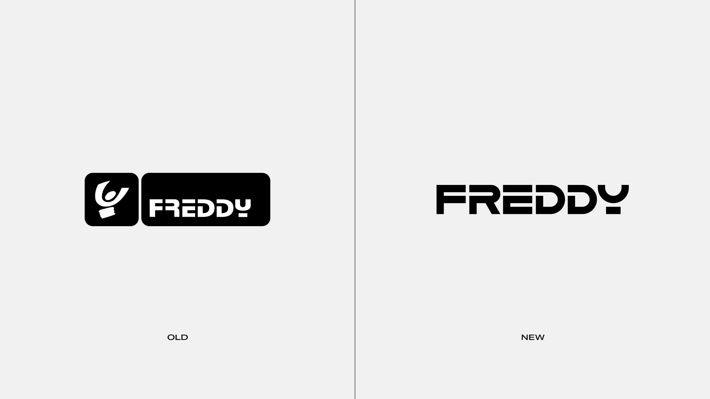
Its structure was too rigid and worked poorly in digital applications. The logotype came from a very distinctive design, but one built with a technique that wasn’t entirely adequate: the proportions were uneven, the spacing lacked harmony, and the letters, taken one by one, had personality, but as a whole the result looked a bit clumsy. As for the pictogram, it remained hugely important on an emotional level, but visually it was starting to carry a weight of years that you could feel in full.
On top of that, both the little man and the logotype were locked inside two black cages, a square and a rectangle, which in applications almost always turned into a blot. It happened on labels, on signs, on garments, on promotional materials. Rather than freeing the brand, that system stiffened it.
In short, there was a lot to do. And inside Freddy everyone knew it. It just had to be done the right way.
The paradoxical mission of a restyling: changing without anyone noticing too much.
The mission, after all, was as clear as it was paradoxical: creating a new visual identity without anyone noticing too much.
It’s a request we like a lot, because it tells an important truth about rebranding. The best projects, especially when they involve heritage brands, aren’t the ones that shout change, but the ones that make it feel natural, almost inevitable: as if that logo was always meant to be this way.
This, in our view, is what sets a well-made restyling apart: it doesn’t impose novelty, it doesn’t look for surprise, it gives the brand back the chance to look right again.
Finding the mark within the mark.
In Freddy’s case, that was the whole key. There was no need for upheaval. The mark within the mark had to be found again.
We started by freeing it from its cages. The black square of the pictogram and the black rectangle of the logotype conditioned its visual behavior too much and severely limited its potential. Removing those fences wasn’t just an act of formal cleanup, but the way to give the brand back breathing room and mobility, and the ability to sit better in space, especially in digital environments and in all those applications where a logo has to live with flexibility.
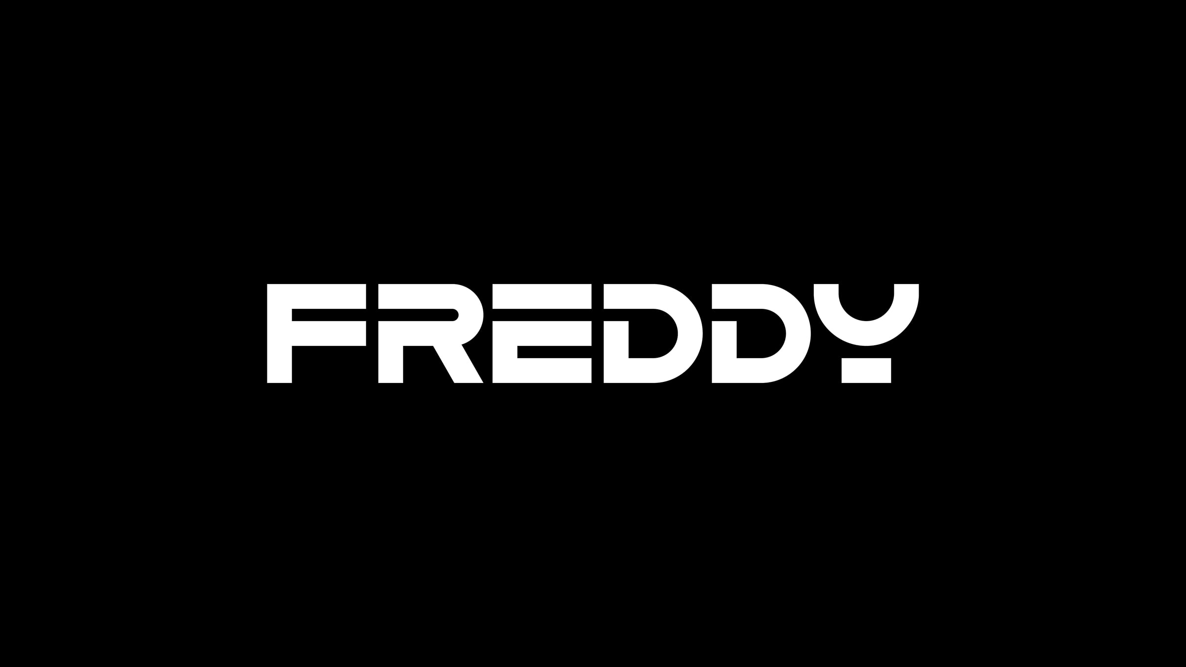
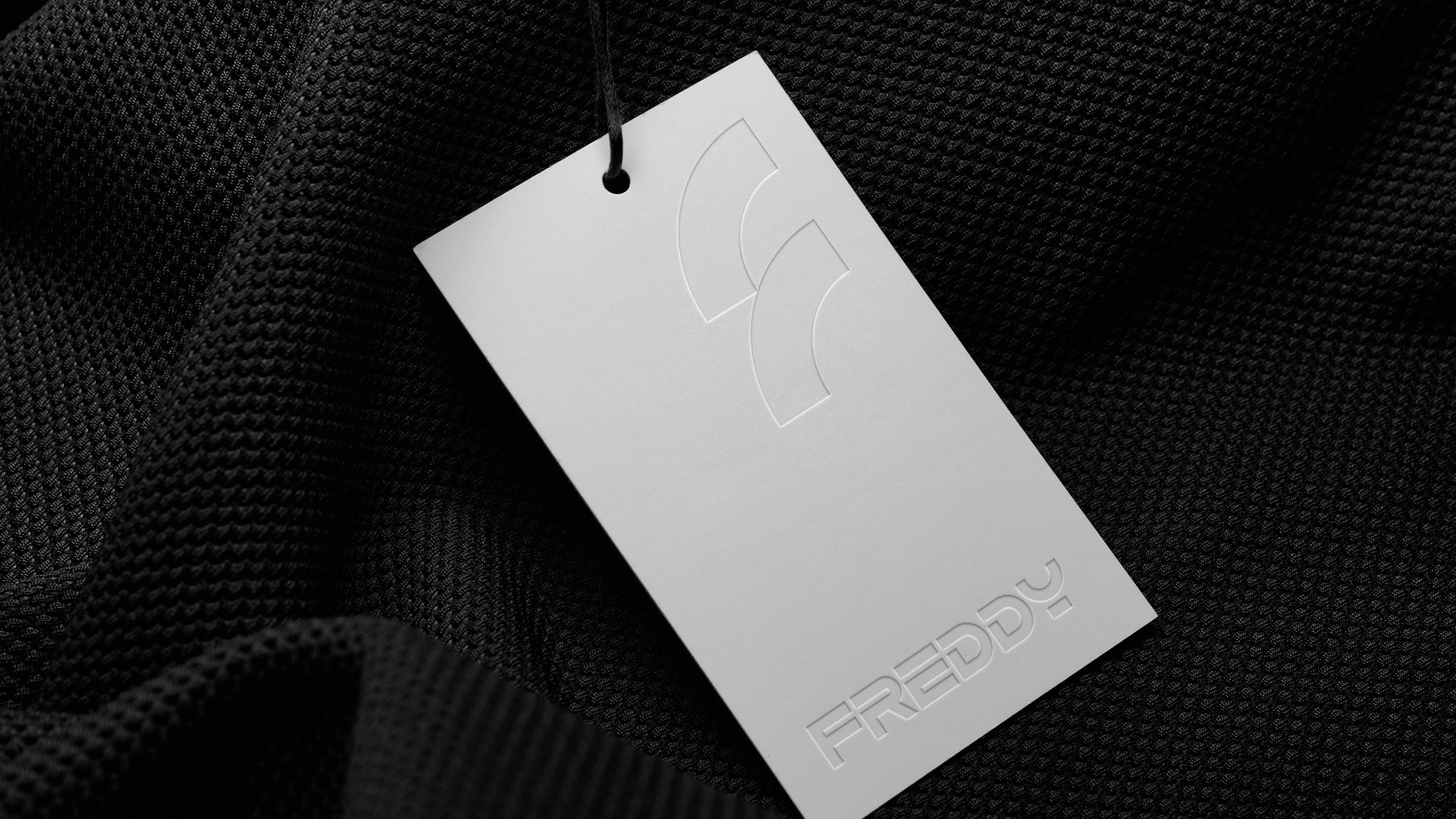
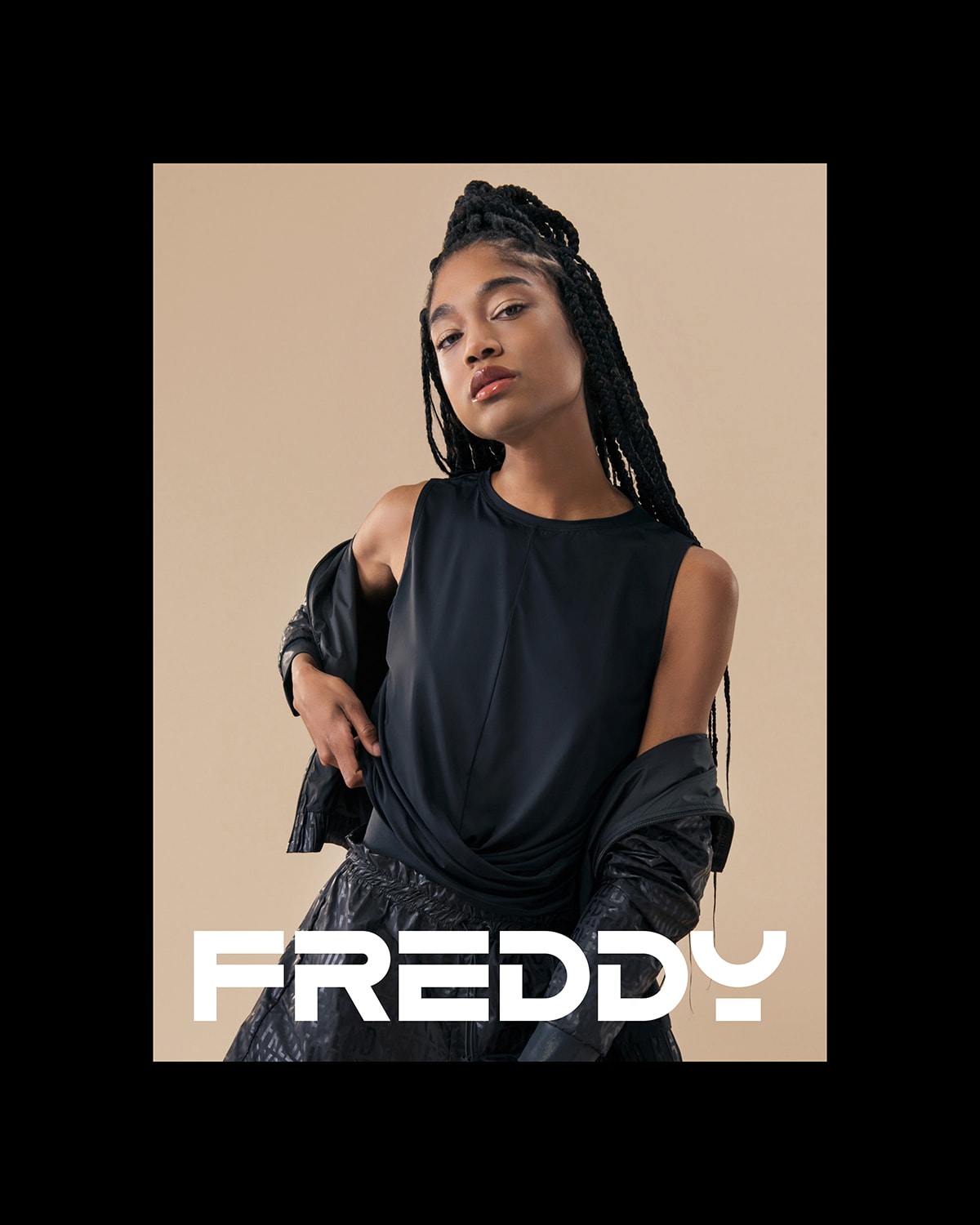
Then we redrew the logotype. Not to change its character, but to let it fully express what it had always promised. We kept the peculiarities that made it recognizable, but corrected its proportions, rebalanced its weights and harmonized its spacing. It’s the kind of work that, seen from the outside, can seem almost invisible. But when it’s done well it has a very strong effect. The company logo still looks like Freddy, only it suddenly appears sharper and more contemporary.
It’s still the same logo, but it finally works well.
Sometimes true rebranding doesn’t consist in inventing a new mark, but in removing from the historic mark everything that was holding it in the past.
When a brand comes back to life.
That’s how it went with Freddy. With a few seemingly small adjustments, the mark began to release a communicative potential that had been compressed before. While keeping all its historic DNA, it suddenly became modern and light. Not in the sense of trendy, but in the harder one: it came back to life.
This is the point we care about. A historic logo isn’t renewed to make it newer in the abstract. It’s renewed to let it live in the present without carrying a visual fatigue the brand can no longer afford. It’s renewed to give it back energy and effectiveness. And when the work is done well, the past isn’t erased, but put back into circulation.
The rebranding becomes part of the story of a brand that’s changing.
There’s another decisive aspect that makes the project even more interesting. Freddy’s rebranding didn’t live on its own. It had to be in tune with a broader transformation, which the brand had already been telling for some time through the TAOM, The Art Of Movement campaigns. There Freddy had already started shifting its narrative center of gravity: no longer sport as an obsession with performance and results, but as the art of the body in motion. The athlete not as a machine, but as an interpreter. And along with this, new values: inclusivity, passion, body positivity, a broader and more contemporary relationship with the idea of sport.
That’s also why the rebranding couldn’t stop at fixing a logo. It had to resonate with a story that was already evolving. It had to make people feel that Freddy was entering a new millennium without disowning its past. This, in our view, is the most successful part of the project: the fact that the historic mark, once rethought, was able to better support the brand’s new values and new energy.
When design becomes a concrete lever of value again.
And this wasn’t an abstract feeling. It showed immediately in the applications. Freddy merchandising, meaning all those products where the real sales driver is the very strength of the logo, started performing much better. Belt bags, backpacks, gadgets, objects where the mark doesn’t simply accompany the product but defines it, recorded a dramatic increase in sales.
It’s one of those cases where design stops being perceived as an aesthetic matter and goes back to being what it is: a concrete lever of value.
This step is very important, because it proves something that’s often forgotten when talking about rebranding. A well-redesigned mark doesn’t only change perception, but also the way the brand behaves in its real applications. It improves presence on products, legibility, desirability, and the ability to sit in materials and in space in a stronger, more natural way.
The best line we could have hoped for.
The greatest satisfaction, though, came at a very precise moment. When Carlo Freddi saw the proposal, his reaction was: “That’s the Freddy logo.”
It’s a beautiful line, because it contains exactly everything a project like this should achieve. It doesn’t say: “I like your version.” It doesn’t say: “It’s a nice restyling.” It says something much more important: it recognizes that mark as authentic. In fact, in a way, even more authentic than the original. As if the logo had finally reached the form it was always meant to have.
For us this is the highest point a rebranding can reach: not imposing novelty or surprising at all costs, but giving a brand back the chance to feel inevitable again.
Updating a heritage brand doesn’t mean erasing it.
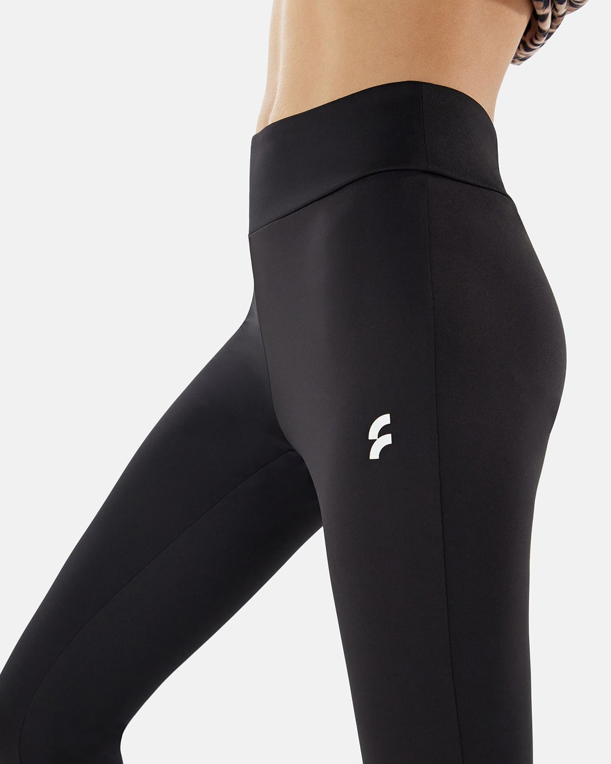
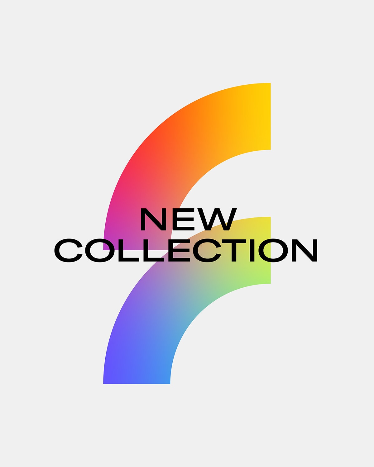
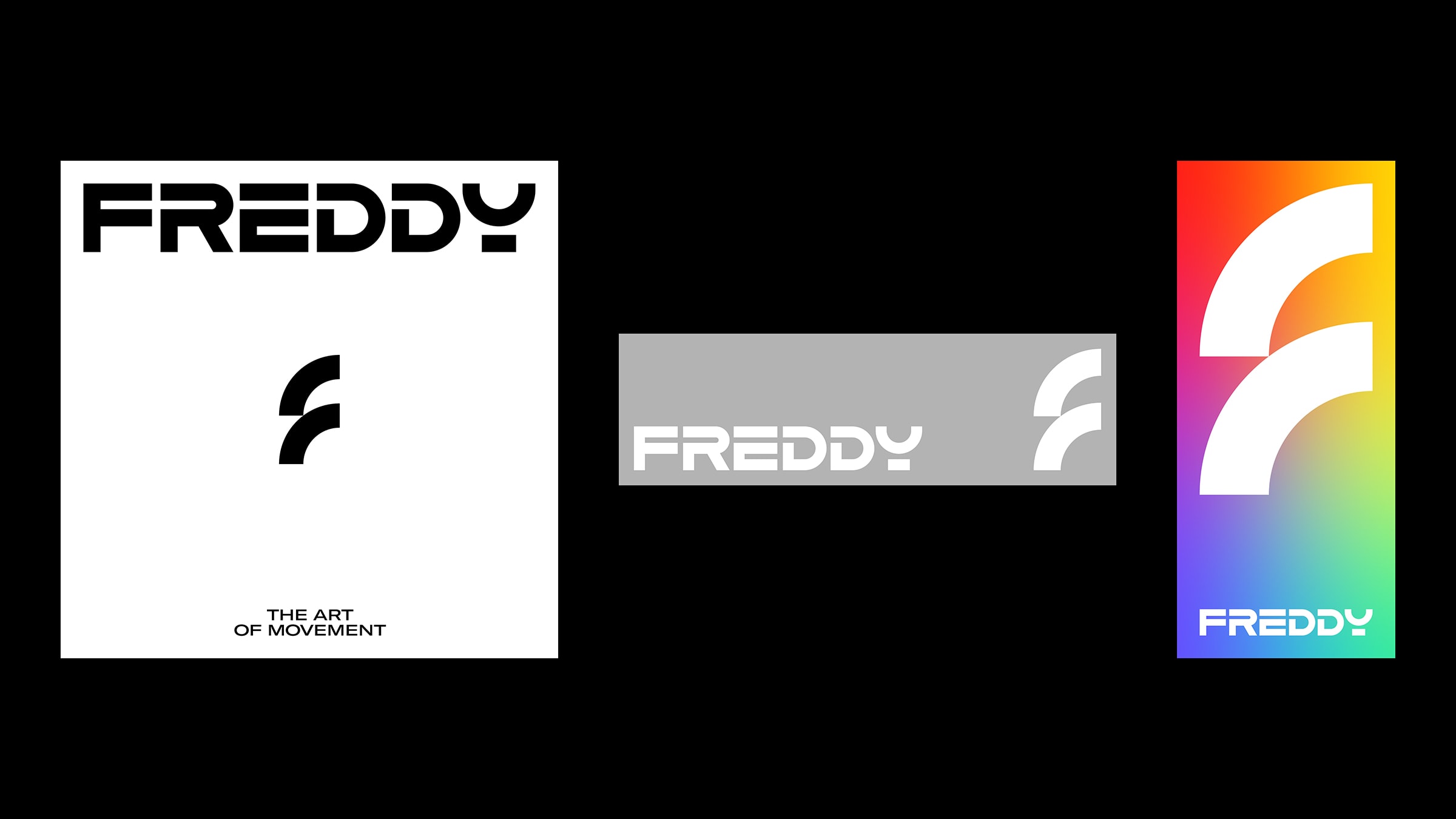
Beyond this, we also worked on a new pictogram, the F, designed for a young, inclusive line of Freddy clothing. In that case the work was different and freer: the dynamic mark recalls two artist’s brushstrokes and becomes the symbol of a new energy, closer to the new generations. But this step, too, fits perfectly into the same story. On one side the intelligent recovery of a historic icon. On the other the opening toward new audiences and new sensibilities.
Here it becomes clear what updating a historic sportswear brand means: not wiping the slate clean, not using the past as a museum, but turning it into material that is still alive and can move in the present. It’s the same principle that guides every growth path for brands and small businesses that want to stay contemporary without losing their history.
In this sense, Freddy is a case we love: a historic logo is renewed without betraying it when you don’t try to replace it, but to free it from everything that keeps it from still being alive.
In short, this is how we worked on the Freddy logo rebranding.
Freddy is a historic Italian sportswear brand founded in Chiavari. At YOHOHO we handled the rebranding of the company logo by removing the black cages that stiffened the system, correcting the proportions and spacing of the logotype and adding the new F pictogram for the young line.
This branding project is part of the broader narrative path of the TAOM, The Art Of Movement campaigns. Merchandising recorded a significant increase in sales. The reaction of founder Carlo Freddi, “That’s the Freddy logo”, confirms the success of the work: a historic logo is renewed by freeing it, not by replacing it.
Dare to challenge us?
Tell us about your rebranding idea:
bebrave@yohoho.studio