Pulled Porn: how to create a truly food porn brand, provocative and ironic.

With Pulled Porn we turned a Milan fast food dedicated to pulled pork into a brand impossible to ignore: a case of naming and brand identity where everything (manifesto, visual identity, retail, art direction) amplifies the same promise of pleasure.
Something curious often happens in food: the product has character, the brand much less. Kitchens are full of technique, taste, ingredients, rituals. But then comes the moment to give shape to the venue, the language, the identity, and everything flattens out. The result is reassuring, predictable brands, almost always built the same way. They work, sure, but they rarely stick in your head.
When a client asked us to launch a fast food dedicated to pulled meat in Milan, the request was very different from usual. They didn’t want a correct or polite brand. They wanted something radical and provocative that would get noticed. And the project, by the way, didn’t exist yet: there was no identity to fix or venue to renovate. Everything had to be invented from scratch. A challenge we know well in branding: when you start from scratch, the creative strategy comes before everything else.
The first question, then, wasn’t what logo to make. The real question was: what kind of experience are we telling?
Pulled meat isn’t just a sandwich. It’s an almost carnal experience.
In the case of a well-made pulled sandwich, the answer was almost obvious. Pulled meat is one of those foods you don’t just eat: you crave it. Meat slow-cooked for hours, juicy, shredded, full of flavor, soft bread, crunchy toppings, dripping sauces. It’s an intense, almost carnal experience.
And yet almost all the brands working around this product present it in a neutral, almost technical language. We asked ourselves why. If the experience is so intense, why should the communication be shy?
The whole project comes from this question. We didn’t want to build a brand that simply explained the product. We wanted to build a brand that amplified what that product already made people feel.
Here provocation stops being a superficial gesture and becomes a positioning choice.
Pulled Porn
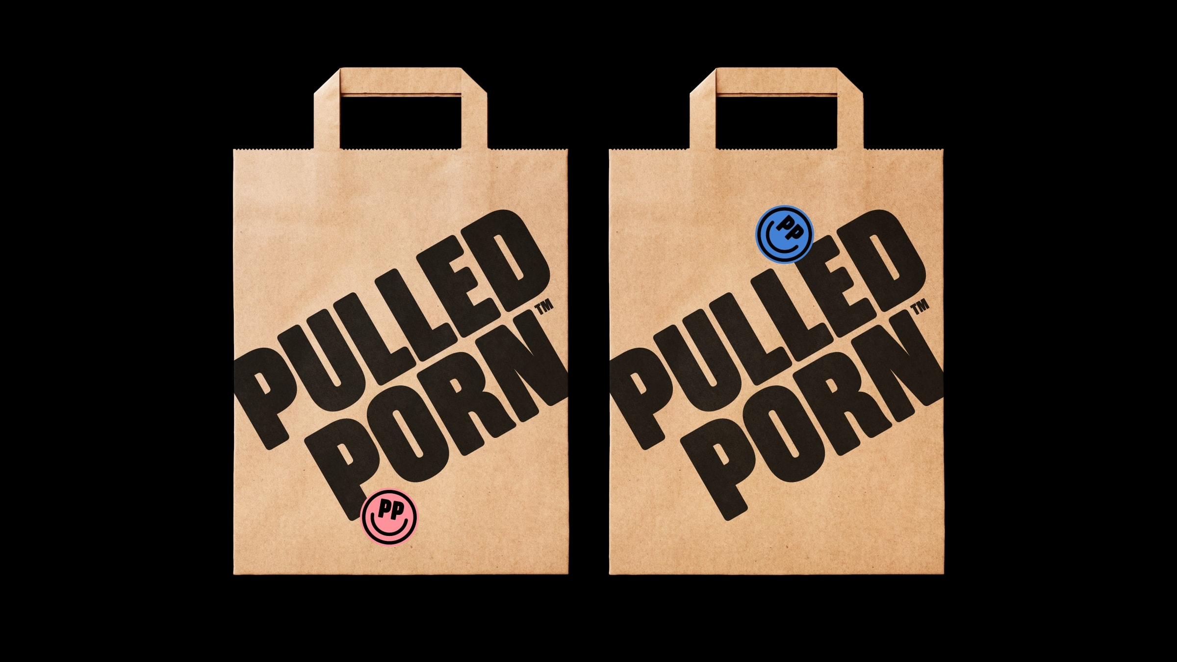
Naming, Logo, Visual Identity, Design Assets
Provocation isn’t there to shock. It’s there to be consistent.
This is the decisive point. Our goal wasn’t to shock, but to live up to the intensity of the experience.
That’s why Pulled Porn doesn’t have values in the traditional sense of the word. It has vices. The first is gluttony: the brand loves food above all else and considers eating a lot, well and in good company a form of happiness. The second is lust: Pulled Porn talks about the pleasure of taste using the vocabulary of eroticism, with winks, double meanings and metaphors. The third is self-irony: it doesn’t want to shock the audience, but to become the accomplice of those who love life’s pleasures without too much guilt.
This is where the project takes shape. Provocation isn’t decoration, but a positioning strategy. It helps the brand stand out in a saturated market, but above all it finds the right language for a taste experience that’s already exaggerated and memorable in itself.
A name that turns the product into a world.
The name comes from the same logic: Pulled Porn. It’s a name that doesn’t simply describe the product, but immediately turns it into a world of its own. In one second the pulled sandwich stops being just a sandwich and becomes something else: a guilty pleasure, a sensory experience, something to talk about with irony and desire.
This, in our view, is a very important step. Because a provocative name works only when it doesn’t feel gratuitous. And here it doesn’t. It comes from a very simple truth: eating a well-made pulled sandwich really can feel like an exaggerated, abundant experience, almost indecent in its intensity. The name doesn’t invent this feeling. It gives it a vocabulary. It holds for every good company name: the name must already contain a position, not just a sound.
And that’s why it sticks.
When naming, tagline and menu speak the same language.
Of course we didn’t stop at the naming. A name like this works only if the whole brand moves in the same direction.
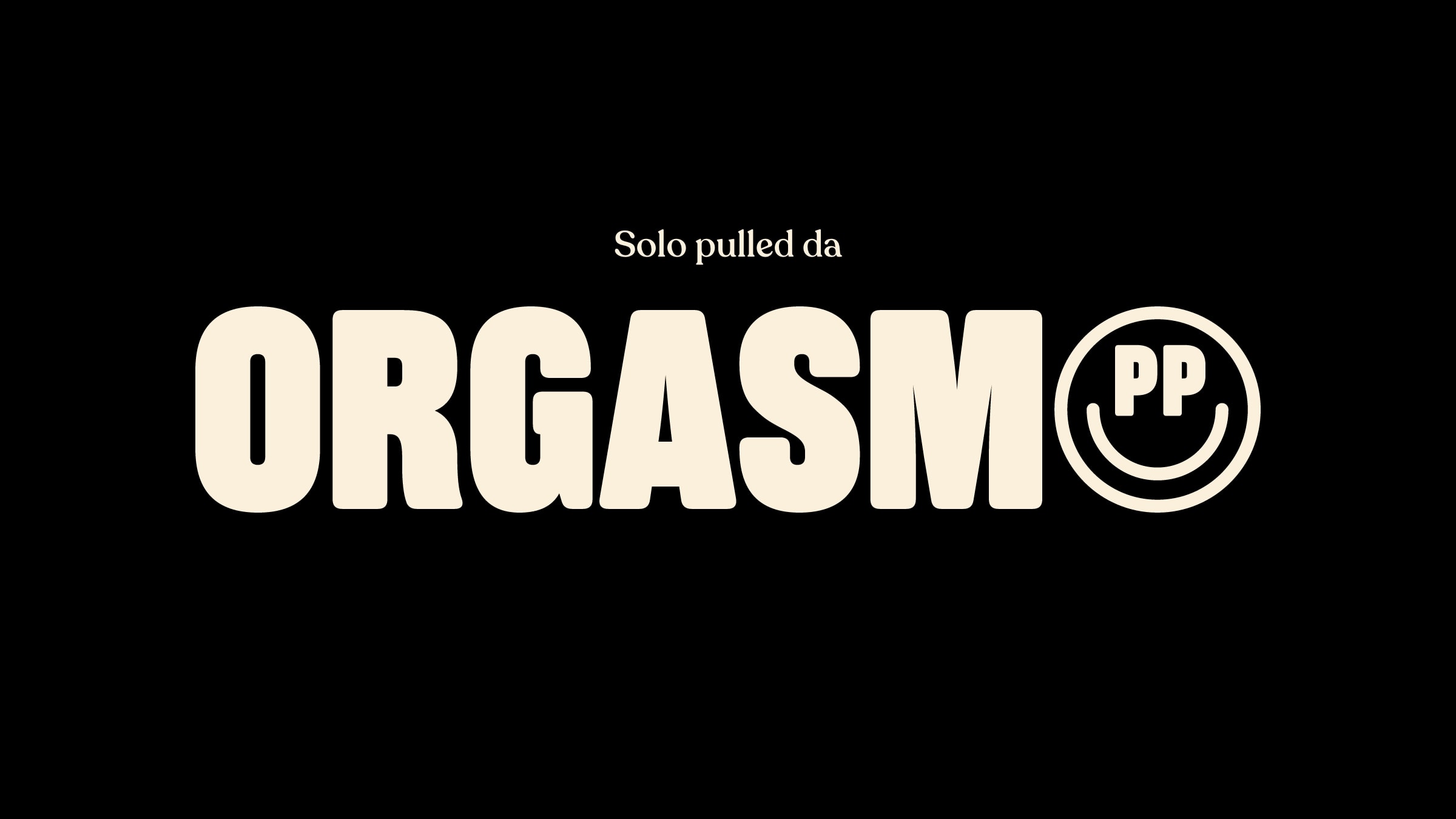
At that point the communication started to build itself almost on its own. The statement says it all in one sentence: “The fast food where every pulled is an orgasmic experience.” The tagline is even more direct: “Orgasmic pulled only.” The menu presents the sandwiches as actual Pornstars, while the copy describes the preparation in the same allusive language: foreplay lasts 48 hours, because the meat is slow-cooked sous vide at 72 degrees Celsius. The sizes are L, XL, XXL.
Here the details matter enormously. The sandwiches aren’t generically called “pulled pork” or “veggie sandwich”. They’re called PORCO, MANZO, POLLASTR* and PATATA: Italian names that play on double meanings around pork, beef, chicken and potato. Just reading these names you understand that the brand doesn’t simply lay a tone over things: it gets inside the product, renames it, turns it into a character.
Everything thus helps build a consistent narrative system, where the pleasure of taste is told in the vocabulary of desire. This is where you see the difference between a provocative gimmick and a real positioning: in the first case you have a strong name and everything else goes back to normal. In the second, every element keeps delivering on the same promise.
From concept to store: when the visual identity pushes everything in the same direction.
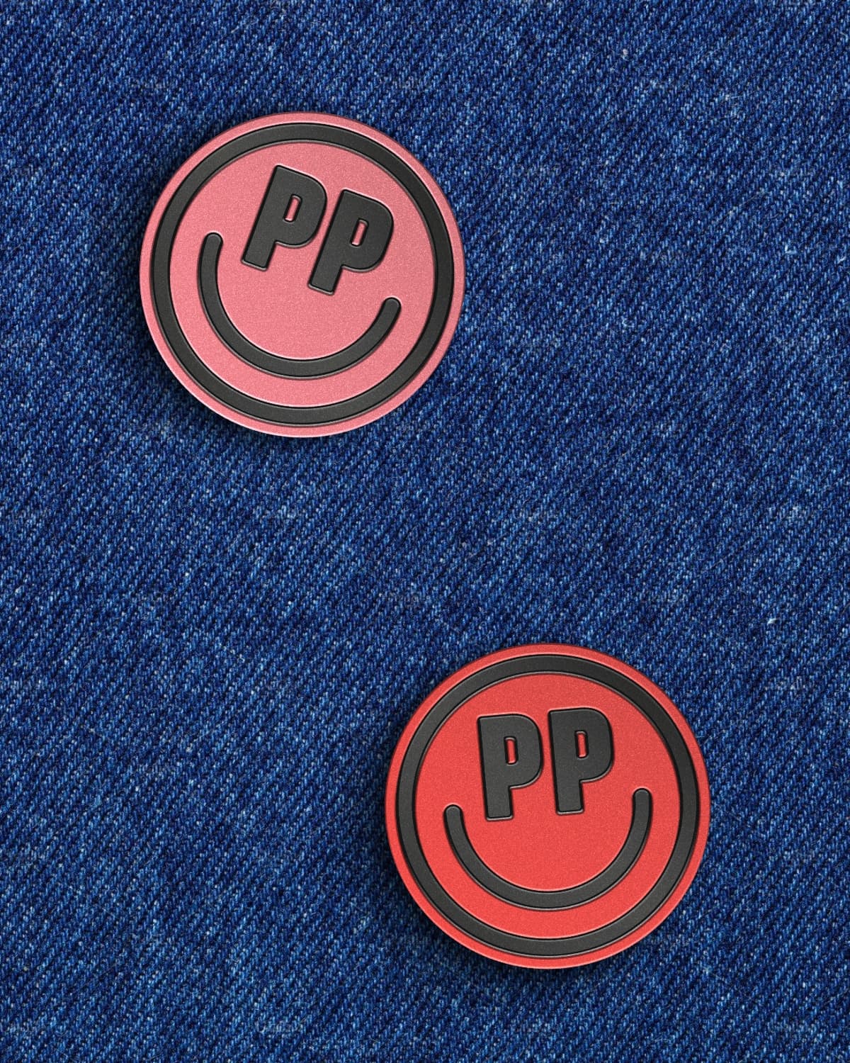
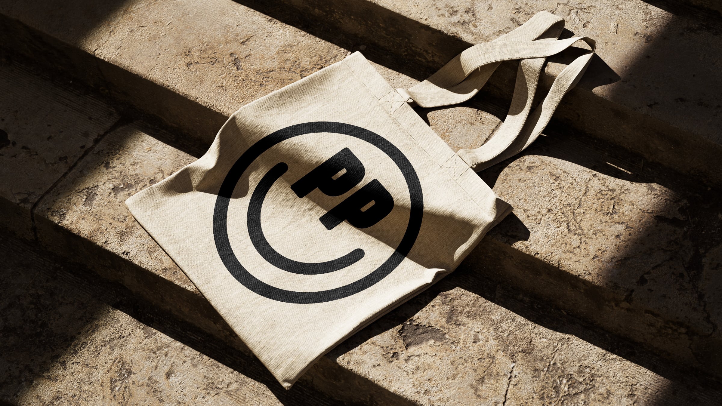
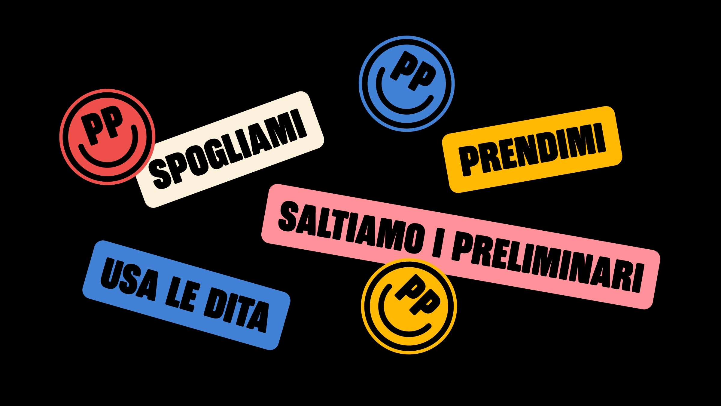
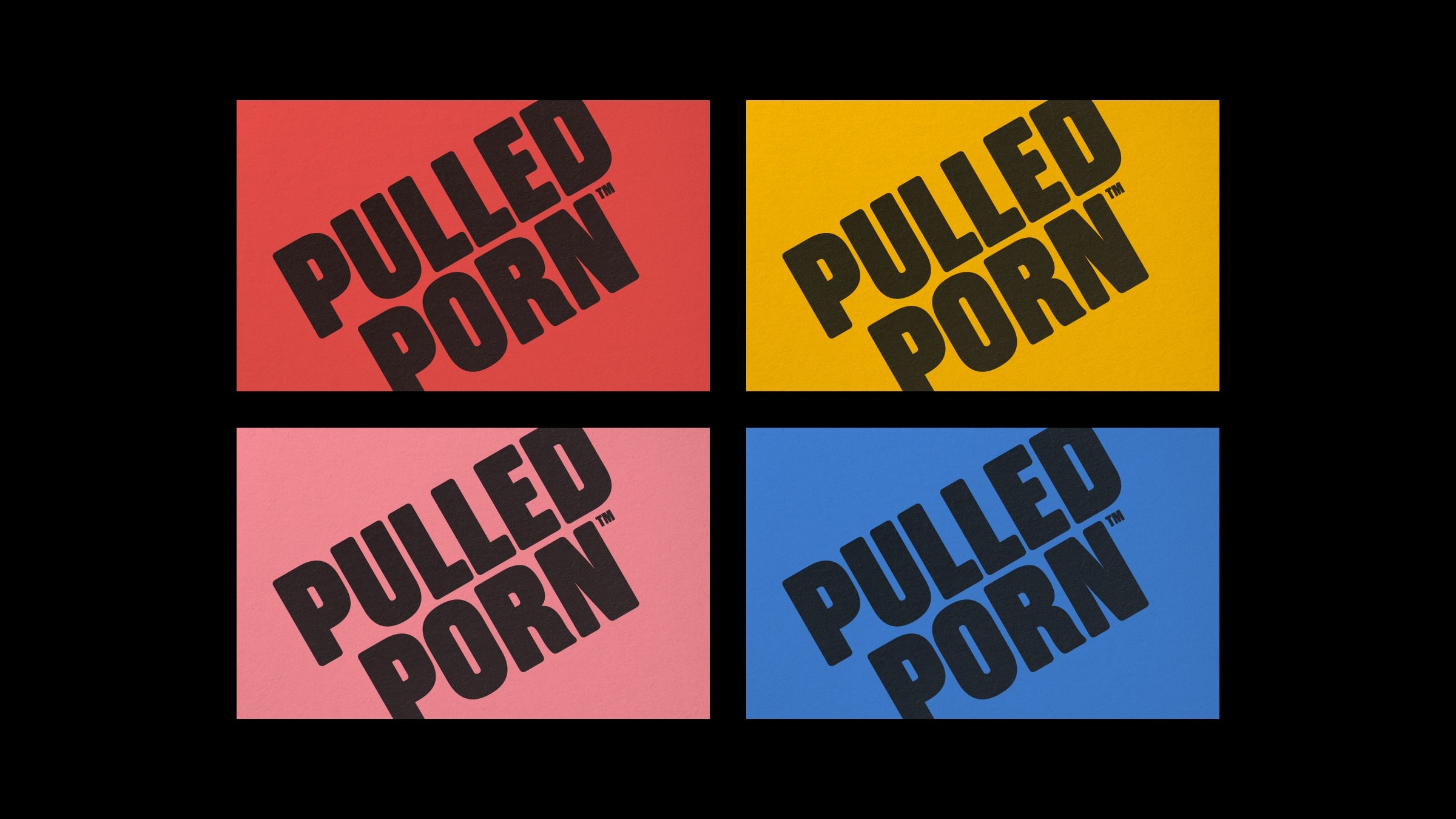
The visual identity became bold and ultra-pop, built around iconic pictograms and ironic stickers. It’s a choice we like a lot, because it moves the brand away both from overly clean food design and from the all-too-obvious “provocation-themed” venue. The result is more contemporary and more immediate.
The store was conceived as an informal space, with minimal shelves and stools, checkered tiles and LEDs on the counter, where all the attention is reserved for the brand’s true protagonists: the sandwiches. Here too the consistency is very strong. The space doesn’t try to steal the scene from the food. It builds the right tone around it.
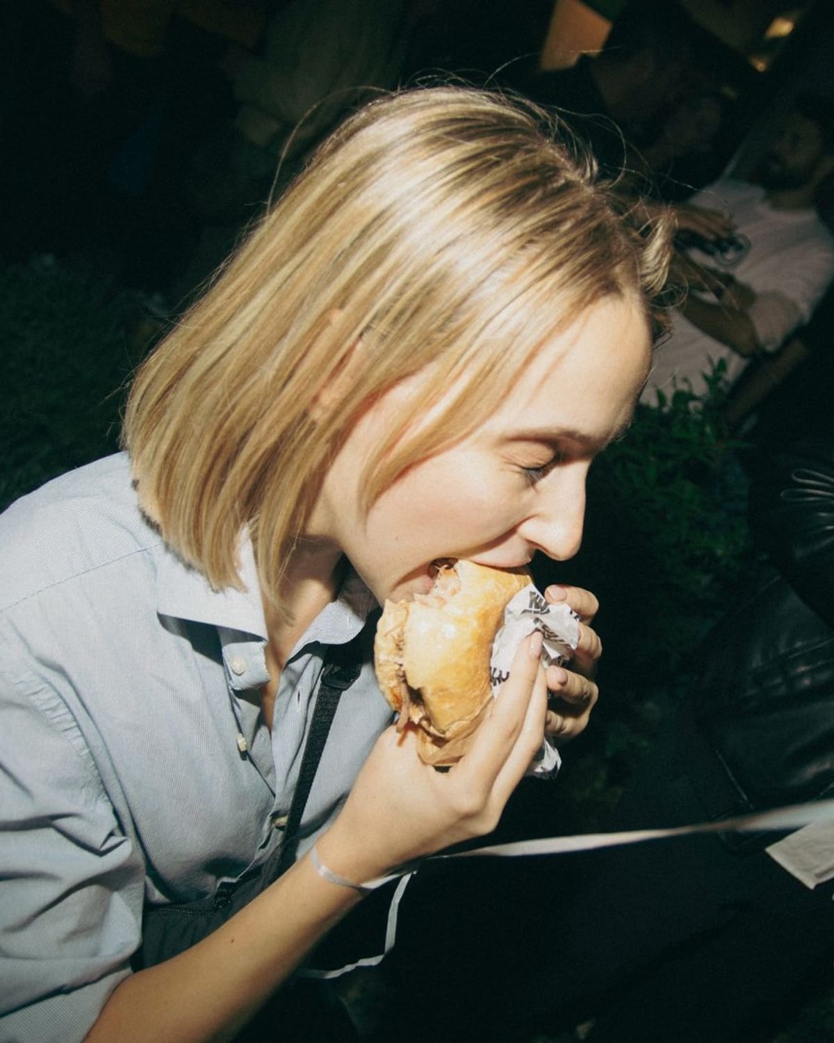
The same goes for the art direction. The photographs enhance the textures of the ingredients with directional lighting, the close-ups show the filling in macro shots, the videos make the sandwiches rotate like small objects of desire or let the sauces drip in a loop. Everything is designed to make one very simple thing happen: make you hungry. But not a generic hunger: a precise hunger, almost ridiculous in its intensity.
A provocative brand works only if its provocation is calibrated.
This is exactly why Pulled Porn works. It isn’t a gratuitous provocation, but a calibrated one.
This, in our view, is the most interesting point of the project. Because you can go very far with a creative idea that uses pornographic language, desire, double meanings and allusions. But for this exaggeration to work it has to be governed: it needs measure, it has to know when to push and when to smile, and stay tempered by irony.
And that’s exactly what happens here. Pulled Porn is never obscene. It doesn’t want to make anyone uncomfortable or exclude anyone: it wants to create complicity. To make you smile while it makes you hungry. To make you feel that the brand is saying out loud something that you, in front of a well-made pulled sandwich, are already thinking in silence.
It’s this mix that makes it effective: provocation + self-irony + real appetite. Take away the provocation, and the brand loses its bite. Take away the irony, and it risks becoming heavy. Take away the consistency with the product, and only noise is left. But when these three elements hold together, the language becomes empathetic.
Pulled Porn tells a truly orgasmic experience.
The heart of the project is here. Pulled Porn doesn’t use sex as a shortcut to attract attention. It uses the language of desire to make visible something the product already made people feel. In every integrated communication project, strategy, naming, visual identity and communication have to work as a single system.
This is what makes it convincing. The brand isn’t just recognizable. It opens up a world. It lets you understand right away what atmosphere you’re stepping into. It gives you the feeling that everything, from the name to the venue, from the colors to the words, down to the way the sauce drips in a video, couldn’t have been built any other way.
And this is what good positioning does: it doesn’t invent a fake experience, it makes a real one clear and memorable.
In short, this is how we worked on Pulled Porn.
Pulled Porn is a Milan fast food dedicated to the pulled sandwich, for which we at YOHOHO handled the entire brand identity project: provocative naming, manifesto, tagline, menu naming (Pornstars, PORCO, MANZO, POLLASTR*, PATATA), bold, pop visual identity, retail design, photo and video art direction. The positioning is founded on three vices: gluttony, lust and self-irony.
This case shows how a calibrated provocation can become a powerful lever of differentiation in a saturated market, turning a food product into a narrative universe impossible to forget.
Dare to challenge us?
Tell us about your food project:
bebrave@yohoho.studio