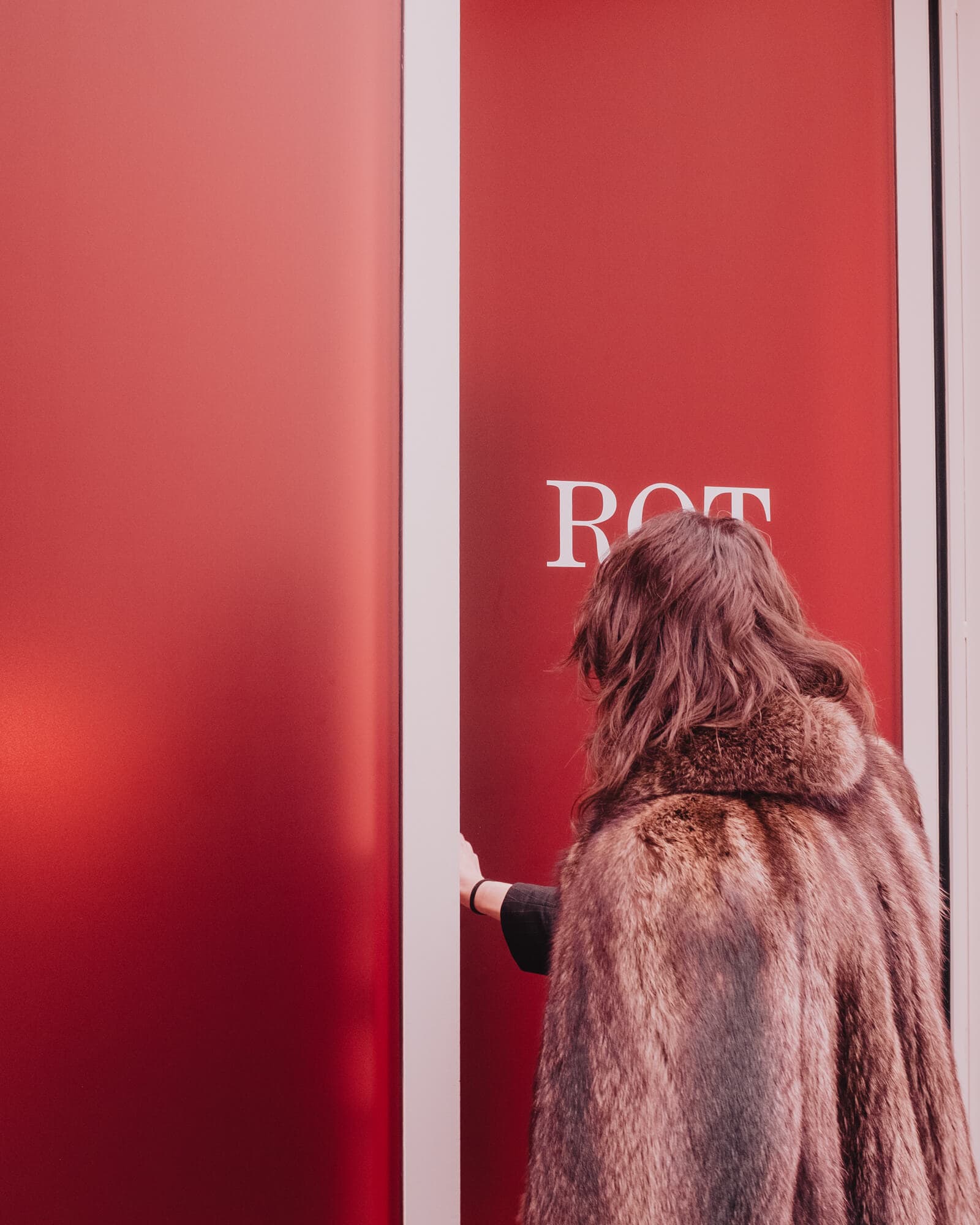
ROT: why in fashion a brand isn’t enough, you need a universe.
With ROT we built the brand identity of a new fashion brand: not just an identity, but a system of images, definitions, tensions and rules that turns a luxury knitwear label into a recognizable world.
New brands are constantly being born in the fashion world. Some have good products. Some have beautiful campaigns. Very few manage to build something rarer: a universe.
Fashion is probably the most competitive market there is. Every season new designers emerge, every week new capsule collections appear, every day Instagram and TikTok produce an endless stream of images, looks and collaborations. In a context like this a nice logo or a nice campaign isn’t enough. To stand out you need something harder to build: a world of your own.
When the visionary creators of ROT, a new name in Made in Italy luxury, asked us to create a brand identity, a website and a launch campaign as radical and chic as the garments they designed, this was exactly the challenge. ROT didn’t want to be simply a new luxury knitwear brand. It wanted to become a world. That’s why the work didn’t start from the logo or the collection, but from building a narrative structure. In every branding project that’s the first step: understanding which universe you want to build, before designing it.
ROT doesn’t have values: it has three threads of communication.
This, in our view, is one of the most interesting aspects of the project. ROT isn’t born around a set of values in the traditional sense. Its identity comes instead from the interweaving of three creative threads: the elegance of paradox, radical provocation and metamorphosis.
The first, the elegance of paradox, comes from the idea that the most interesting elegance is never linear. ROT is cashmere and lycra. Discipline and freedom. Form and dissolution. Opposites don’t exclude each other: they attract.
The second is radical provocation. Not as a scandalous gesture for its own sake, but as a language. ROT uses provocation to express the complexity of its world, staging bodies, desire, sexual tension and fragility with an aesthetic that constantly swings between sacred and profane.
The third thread is metamorphosis. ROT is a brand that refuses a final definition. It’s a constant becoming, without end and without ends. There’s no single, stable identifying content, because ROT can communicate this, its opposite and everything else.
It’s this structure that makes the brand so free and at the same time so recognizable: it doesn’t fix a rigid world, it defines the way to generate one.
ROT
Branding, Art Direction, Website, Social Content
When art direction doesn’t show the garments, but stages luxury.
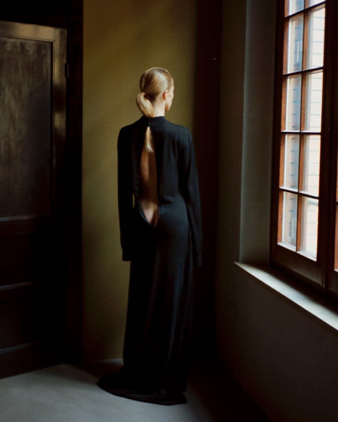
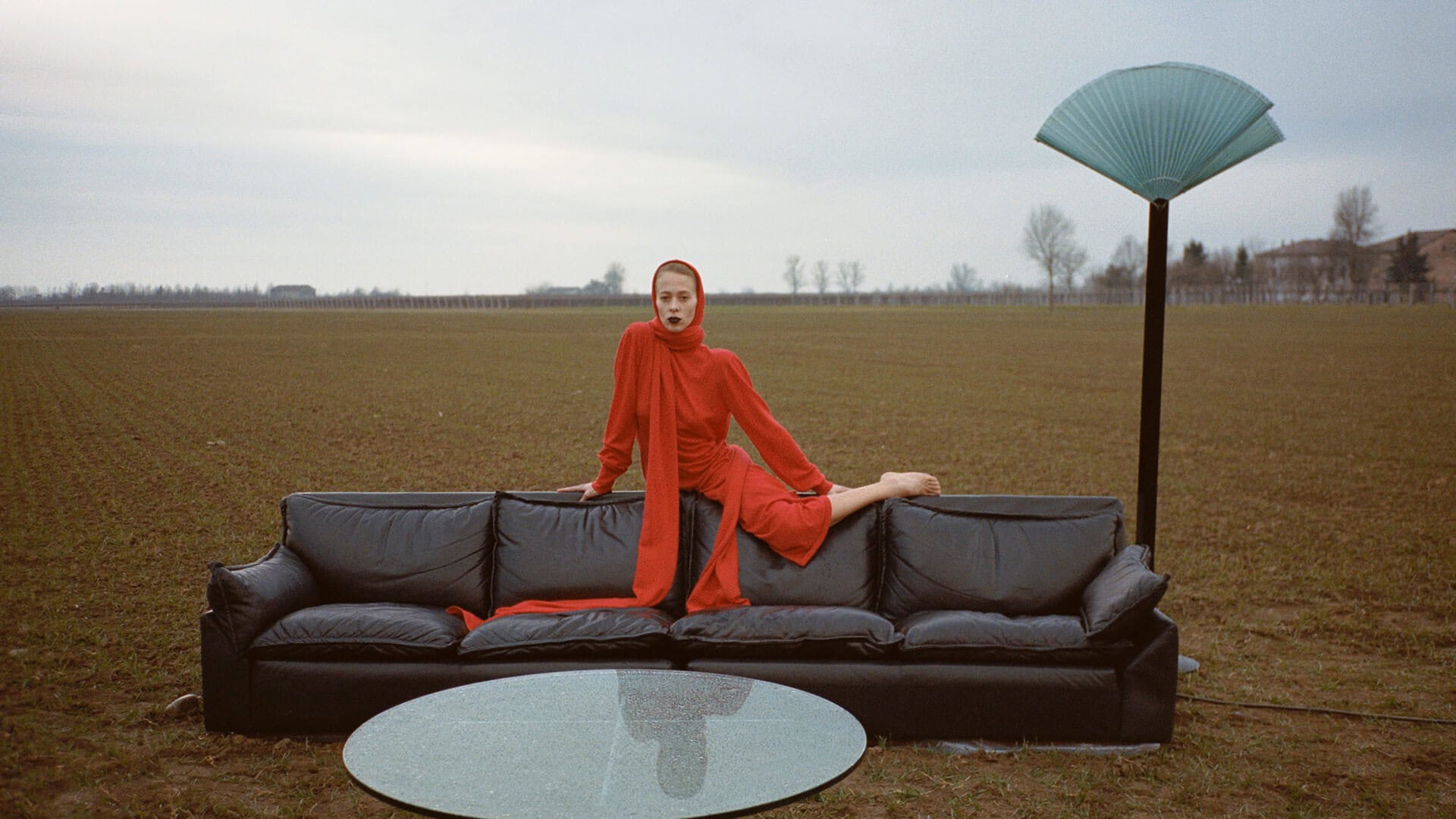
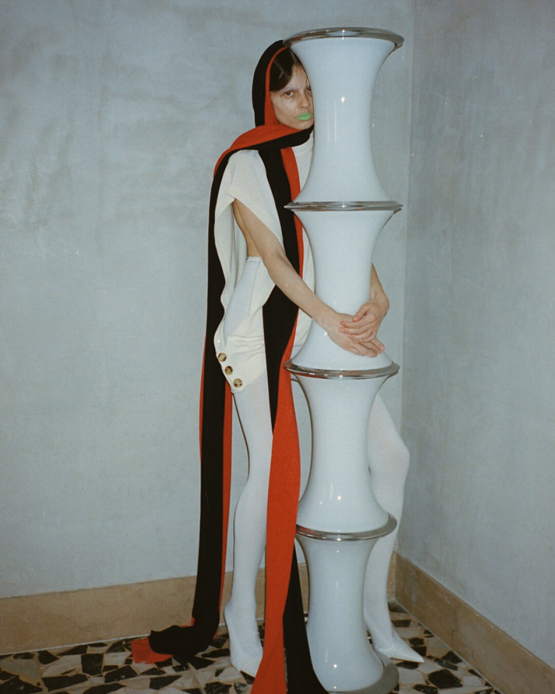
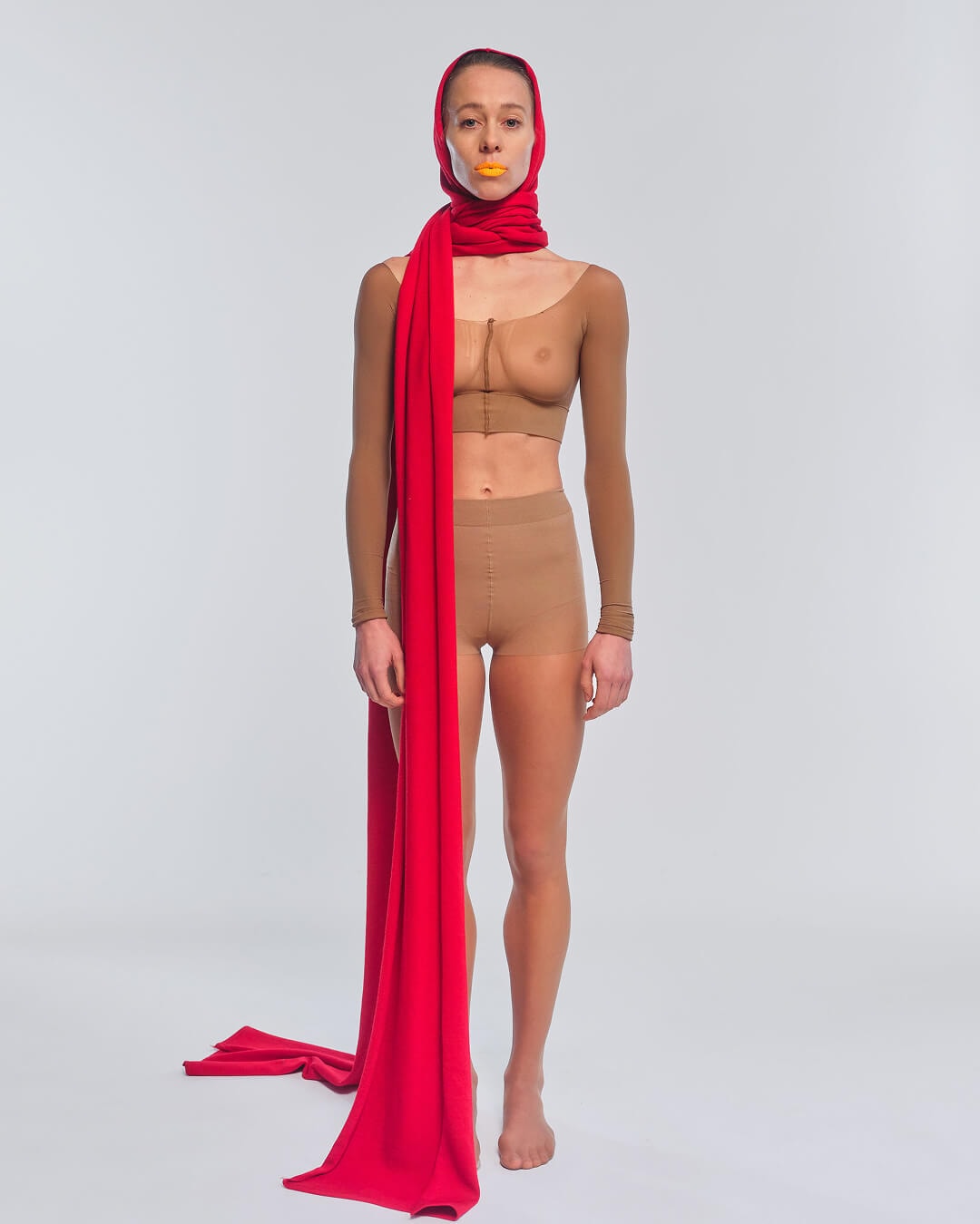
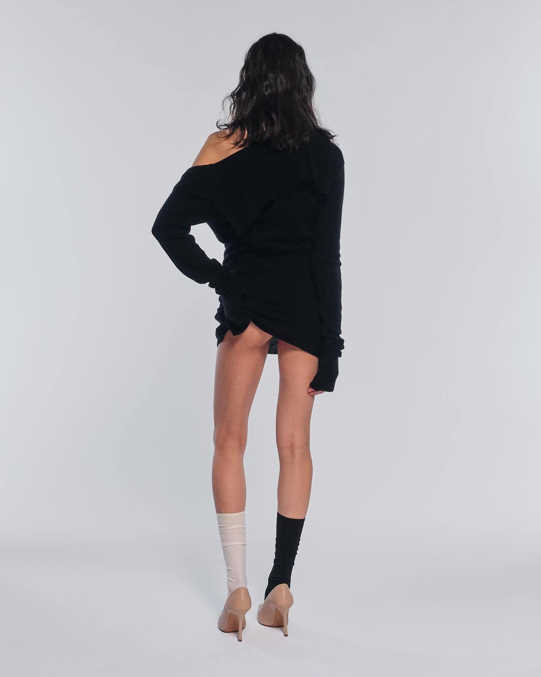
The same principle is reflected in the art direction, one of the main tools through which ROT’s universe takes visual form. In a brand built on such sharp conceptual tensions, photography couldn’t just document the garments. It had to become the place where those tensions take on a body.
The photographic treatment works on a very precise dialectic. On one side there’s an almost sculptural construction of the body: static poses, clean framing, essential backdrops, directional light that sculpts both the material of the garment and that of the body. But within this apparent composure a fracture keeps opening. The images introduce elements that disturb the perfection of the scene: sudden nudity, sexual gestures, gazes that break the frontality of the pose, bodies poised between dressing and undressing.
Photography, then, doesn’t accompany the product: it exposes it within a tension. Every image seems on the verge of transforming, and that’s where the work succeeds. Because the three threads we used to build the brand’s narrative find a concrete, visual, immediately recognizable translation.
A brand with infinite definitions.
From this same logic comes one of the most radical elements of the project: ROT doesn’t have a tagline. It has a dynamic system of definitions instead.
On the website, ROT is presented through a long series of statements that keep multiplying. Some are almost programmatic, like “ROT is cashmere and lycra” or “ROT follows some rules, and breaks those too”. Others are more visionary, like “ROT is ripping a cashmere dress apart while dancing to techno”. Instead of reducing the brand to a formula, this mechanism turns it into a linguistic organism in continuous metamorphosis.
It’s a more sophisticated choice than it seems. A traditional tagline closes meaning; ROT’s definitions keep it open. They don’t explain the brand once and for all, they make it proliferate. The reader doesn’t get a reassuring summary: they enter an atmosphere.
And this is what allows ROT to become a universe, and not just a well-built identity.
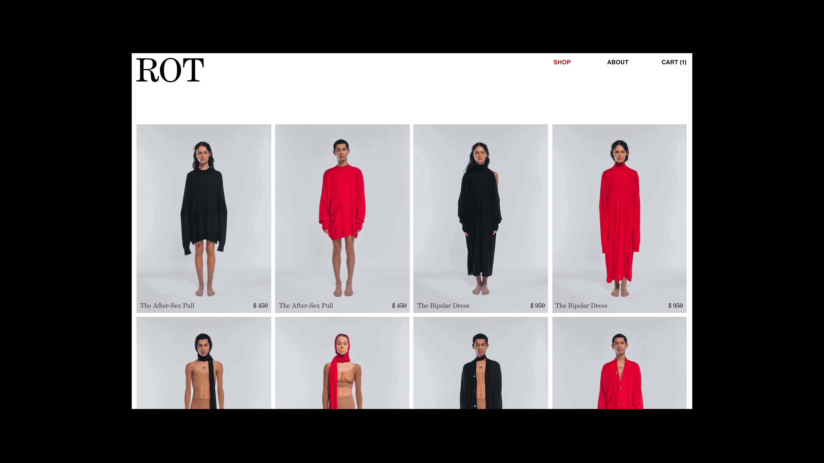
A fashion website that doesn’t look like an e-commerce.
The same principle guides the website too, which wasn’t designed as a showcase but as an experience. What we say about website design applies here as well: a website doesn’t just translate the brand, it pushes it further.
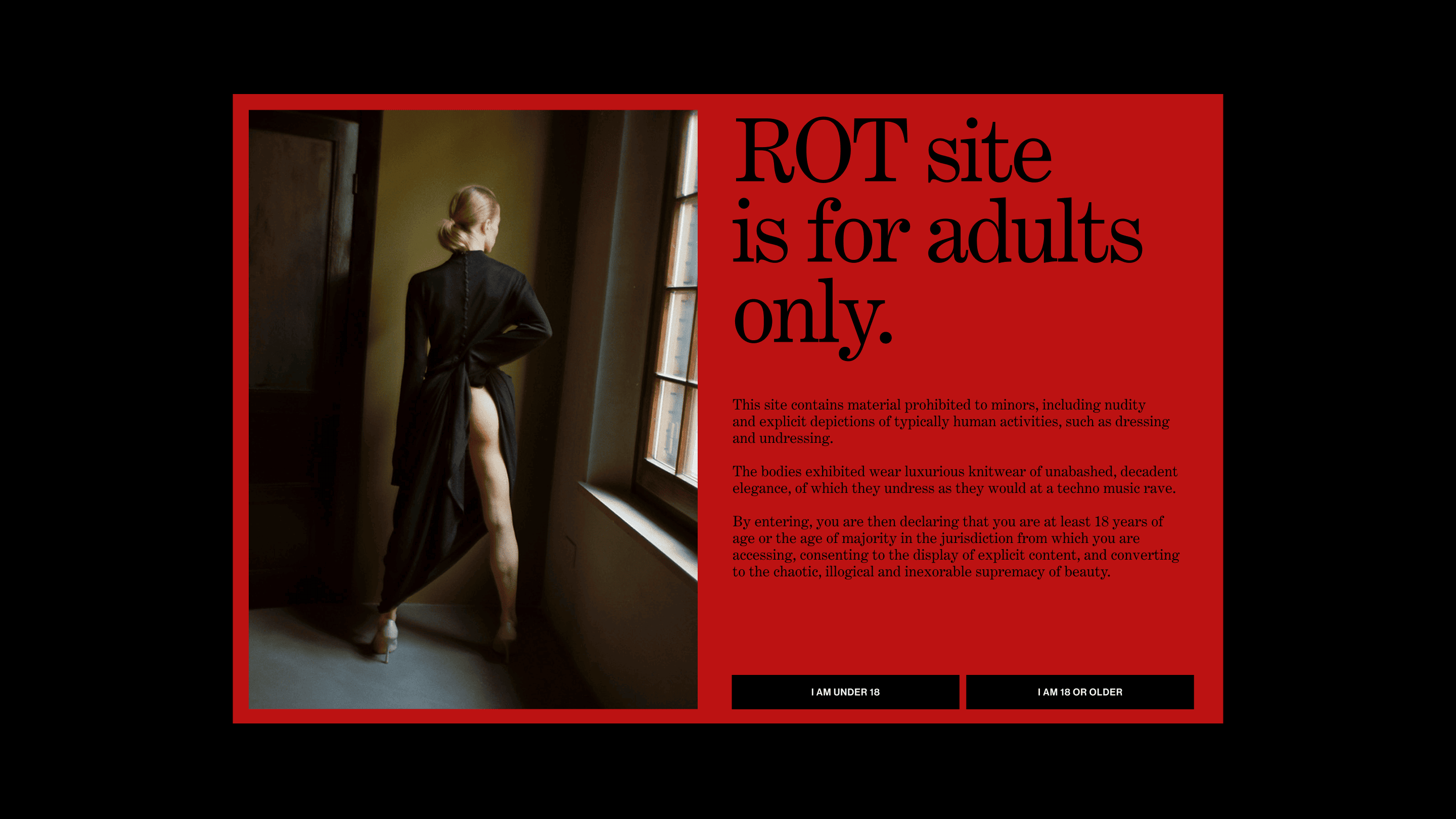
Entry is preceded by a disclaimer that immediately declares the nature of the game: “ROT is a site for adults.” The copy ironically borrows the language of age-restricted websites, talking about nudity, about bodies dressing and undressing, about daring, decadent elegance, until it arrives at a perfect formula: the chaotic, illogical and inexorable supremacy of beauty.
The most successful idea, though, is the large red fields that at first look like simple graphic blocks and instead work as real veils. Until the user accepts the disclaimer, some of the more explicit images stay covered. When they truly enter the site, those blocks stop being mere composition and become part of the story: they hide, hint, delay the view, turn censorship into an aesthetic gesture.
The overall design of the website follows the same logic. It’s minimal and theatrical at the same time. White, black and red build an almost museum-like space, but within this order more sensual, more unstable cracks keep opening.
This is where the real work of design translation shows. We didn’t just make a beautiful website. We built an environment where ROT’s universe could behave like a universe.
When language and visual identity truly meet the product.
One last aspect we want to stress concerns the relationship between the brand’s language and the garments. Because in ROT this relationship is never decorative. The cashmere is soft, precise, of the highest quality. The lycra really does introduce a tension into the garment, an elasticity that makes the fabric move differently. The sweaters and cardigans have real construction, with details you’d discover only by looking at the garments up close.
This is the point: ROT’s narrative universe doesn’t float above the garments, it comes from them. And it’s this correspondence between world and product that makes the brand credible. Not a fascinating story built on top of an ordinary reality, but a story that reality already contained.
The ROT project then had a natural continuation in ROT Week, where the same universe was physically staged during Milan Fashion Week. An exemplary case of how an integrated creative strategy can extend brand identity from the screen to physical space.
In short, this is how we built ROT’s branding.
ROT is a Made in Italy luxury knitwear brand. At YOHOHO we handled the entire brand identity project: a narrative structure founded on three creative threads (the elegance of paradox, radical provocation, metamorphosis), a dynamic system of definitions in place of a traditional tagline, photographic art direction, and a website with an adults-only disclaimer and red blocks working as interactive veils.
This case shows how to launch a fashion brand identity that doesn’t confine a brand, but builds a recognizable narrative universe that stands on its own. The activities for ROT Week are an example.
Dare to challenge us?
Tell us about your fashion brand:
bebrave@yohoho.studio