How our New York branding agency works and why every brand needs its own identity.
YOHOHO is a branding studio in New York and Milan that creates naming, visual identity, rebranding and tone of voice, always starting from the creative strategy, not from the logo. Here’s how we build, together with our clients, identities that truly stand out.
There are moments when a company realizes that the problem isn’t just how it presents itself, but how it’s perceived. It happens to a startup about to enter the market that realizes that, without a strong identity, it risks looking like one among many. It happens to a small business with an important history, when it senses that its brand is no longer in line with the real quality of what it does. It happens to a B2B company with a serious, competent offer that keeps speaking the same language as all its competitors. And it also happens to those launching a new project who have to decide where to start: from the name, the logo, the website, the communication?
Our answer, in all these cases, is always the same: you start from brand strategy. Because branding isn’t an exercise in style, nor a sum of well-made graphic elements. It’s the way a brand becomes readable and desirable, takes a position in the market and starts saying clearly who it is.
That’s why we’re not interested in building branding that’s beautiful in the abstract. We’re interested in building branding that’s right. Identities that make a brand stand out in a precise and memorable way. And doing it together with the client, not over their head.
Branding starts with a working day spent together, not with the logo.
When a client comes to us asking for branding, they’re often really asking for something deeper. Sometimes they’re telling us the brand doesn’t stand out. Sometimes that it can’t communicate its value well. Sometimes that the company has changed, but its image hasn’t. And sometimes that the project is new and needs to be born with a clear direction.
That’s why our work never starts directly from the drawing board. Nor from designing the company logo as the first act. It starts from a strategic workshop built together with the client: an intense day, side by side, where we put everything on the table. The business, the market, the competitors, the services, the products, the strengths, the weaknesses, the risks, the opportunities. We want to understand not only how the brand looks today, but what it needs to become. What perception it needs to create. What space it needs to occupy in people’s minds.
That’s the moment branding begins. When we set the goals together and find the point of difference from which everything else can grow: name, logo, tagline, visual identity, tone of voice, website, content. Without this step, branding risks becoming a shell. With it, it becomes a direction.
A brand identity works when every element confirms the same idea.
Once the direction is found, the work consists in turning it into a consistent brand identity system. This is where branding stops being theory and takes concrete shape: signs, words, images and choices that all have to work in the same direction.
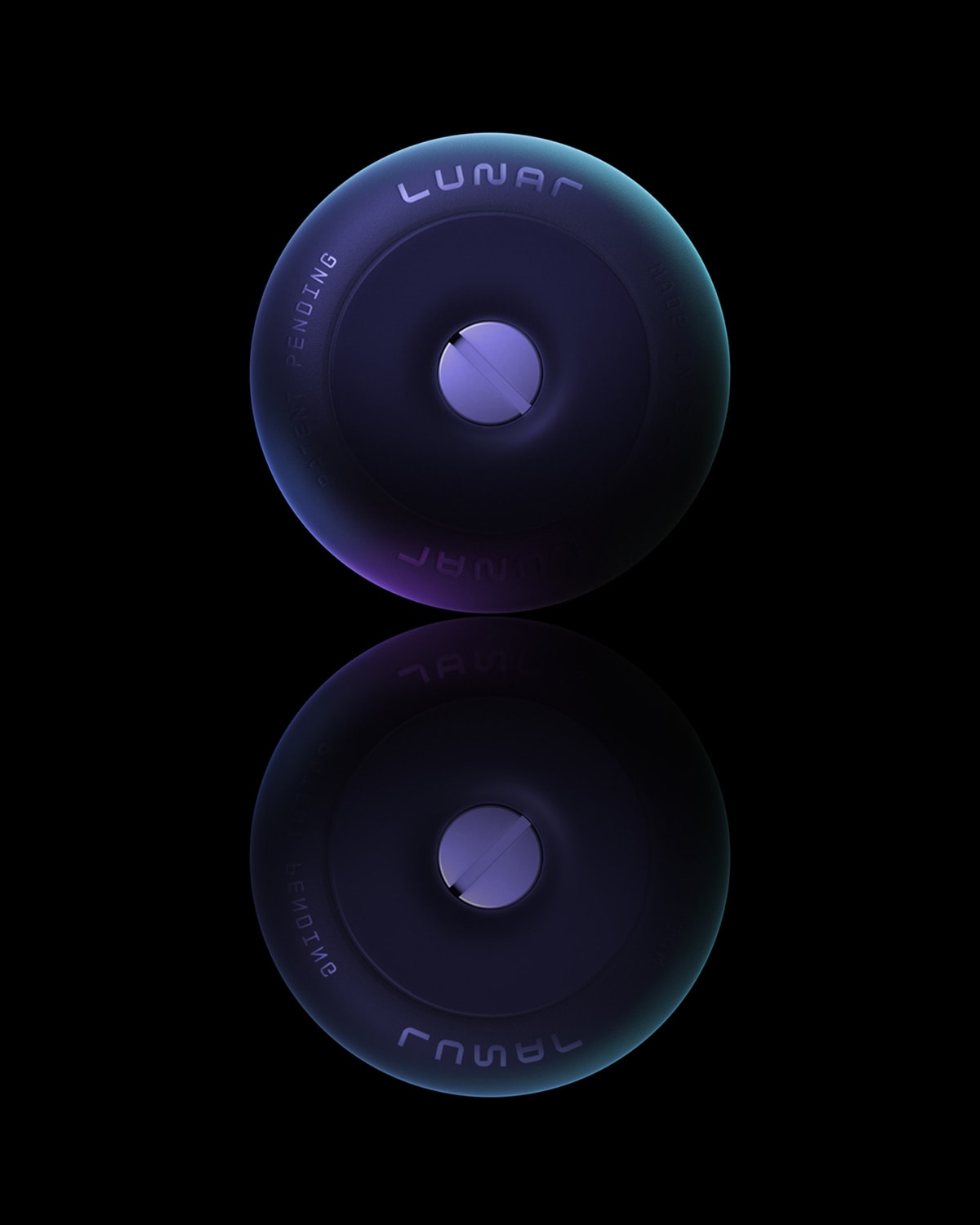
This is where a project like Lunar shows our approach well. In that case everything contributed to building a consistent and very powerful story: the name had a sci-fi flavor and immediately opened up a whole world; the logo subtly but clearly echoed NASA and the language of space missions; the tagline, “The quietest wheel in the universe”, introduced a solemn tone only to sabotage it right away with a carefully measured dose of self-irony; the visual identity looked as if it had been borrowed from an authoritative scientific journal; the art direction built a credible and surprising sci-fi universe; the copywriting told the story of the patent in a constant balance between the promise of an almost “Apple-style” innovation and its most radical parody.
This, for us, is branding. Not a list of well-designed pieces, but a compact system where every detail confirms the rest. When it works, the brand stops looking like a sum of elements and becomes a precise world, hard to forget.
Even in B2B, branding can have imagination.
One of the most common mistakes is thinking that branding is mainly for lifestyle, fashion, food or consumer brands. As if in more technical, industrial or B2B industries it were enough to look serious. In reality that’s exactly where branding can make a huge difference. Because in many professional markets the problem isn’t a lack of quality, but an excess of uniformity: everyone presents themselves the same way, everyone uses the same words, everyone ends up looking interchangeable.
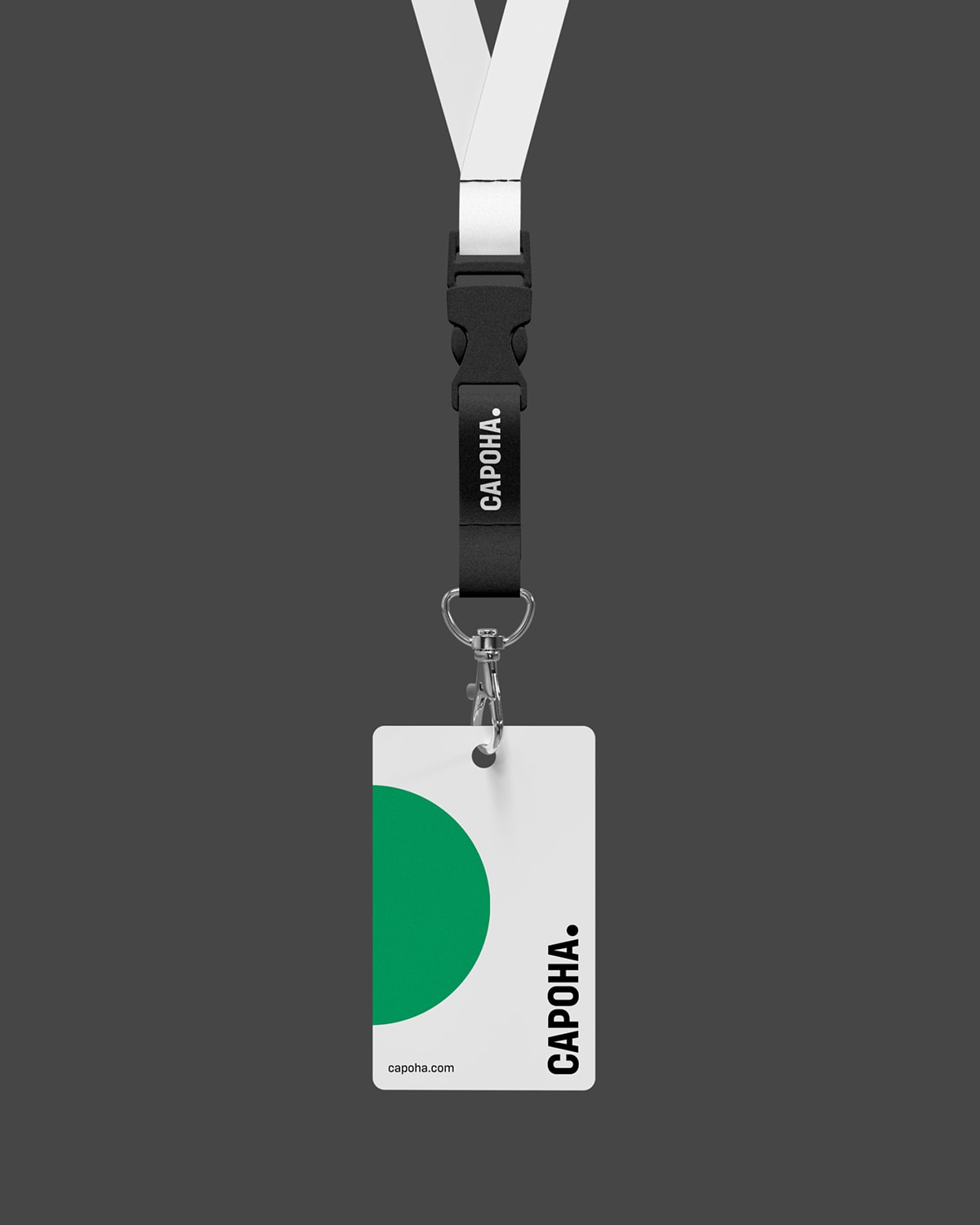
That’s why we care so much about working on B2B brands too: to find a territory that truly belongs to them. Lunar is a very clear example, but it’s not the only one. With Capoha too the work started from a simple observation: in the world of engineering consultancy, company names and languages tend to resemble each other to the point of almost cancelling each other out. So the branding had to break the automatic pattern, create a difference, make people feel that this brand had a stance of its own.
For us the point isn’t to make a company more original in a decorative sense. It’s to make sure it doesn’t look like yet another copy of a code we’ve seen before. Because in B2B, too, branding is there to make the company stand out, not to package it.
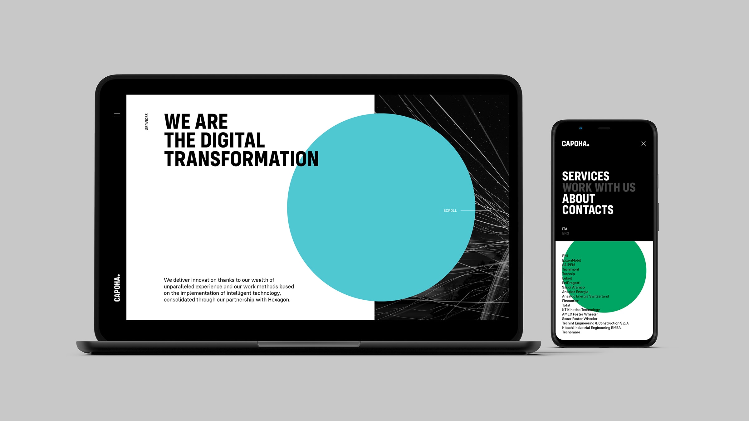
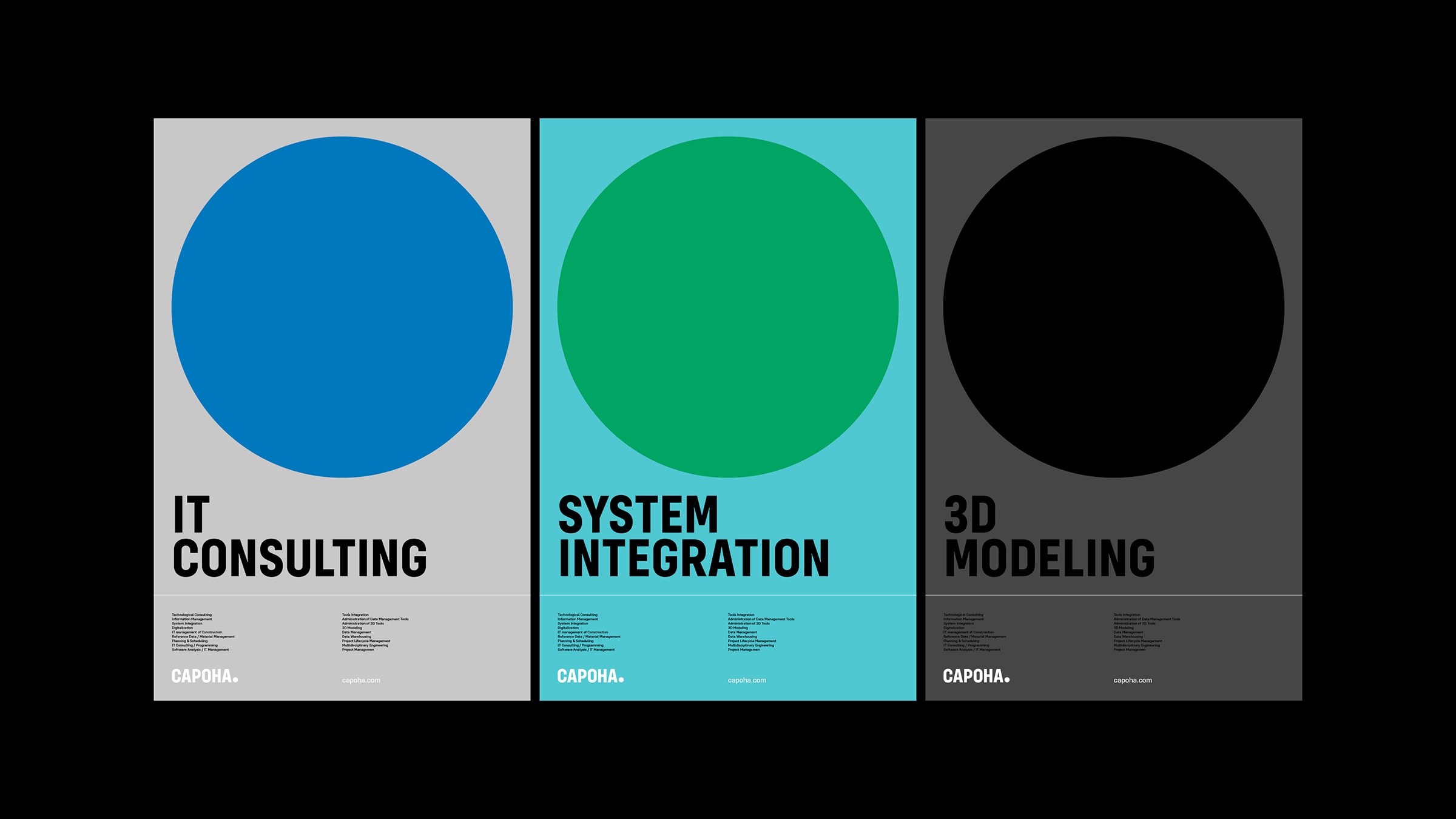
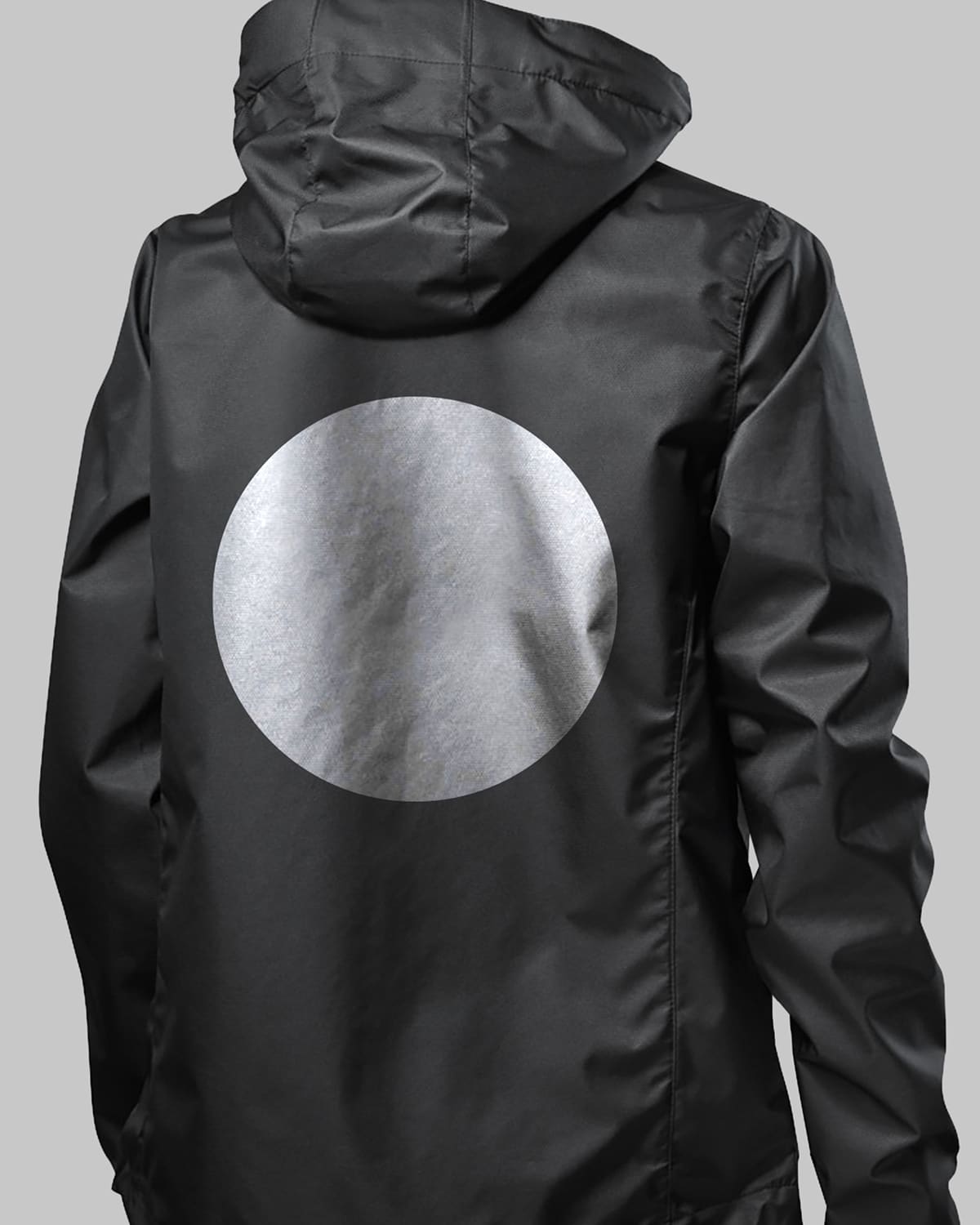
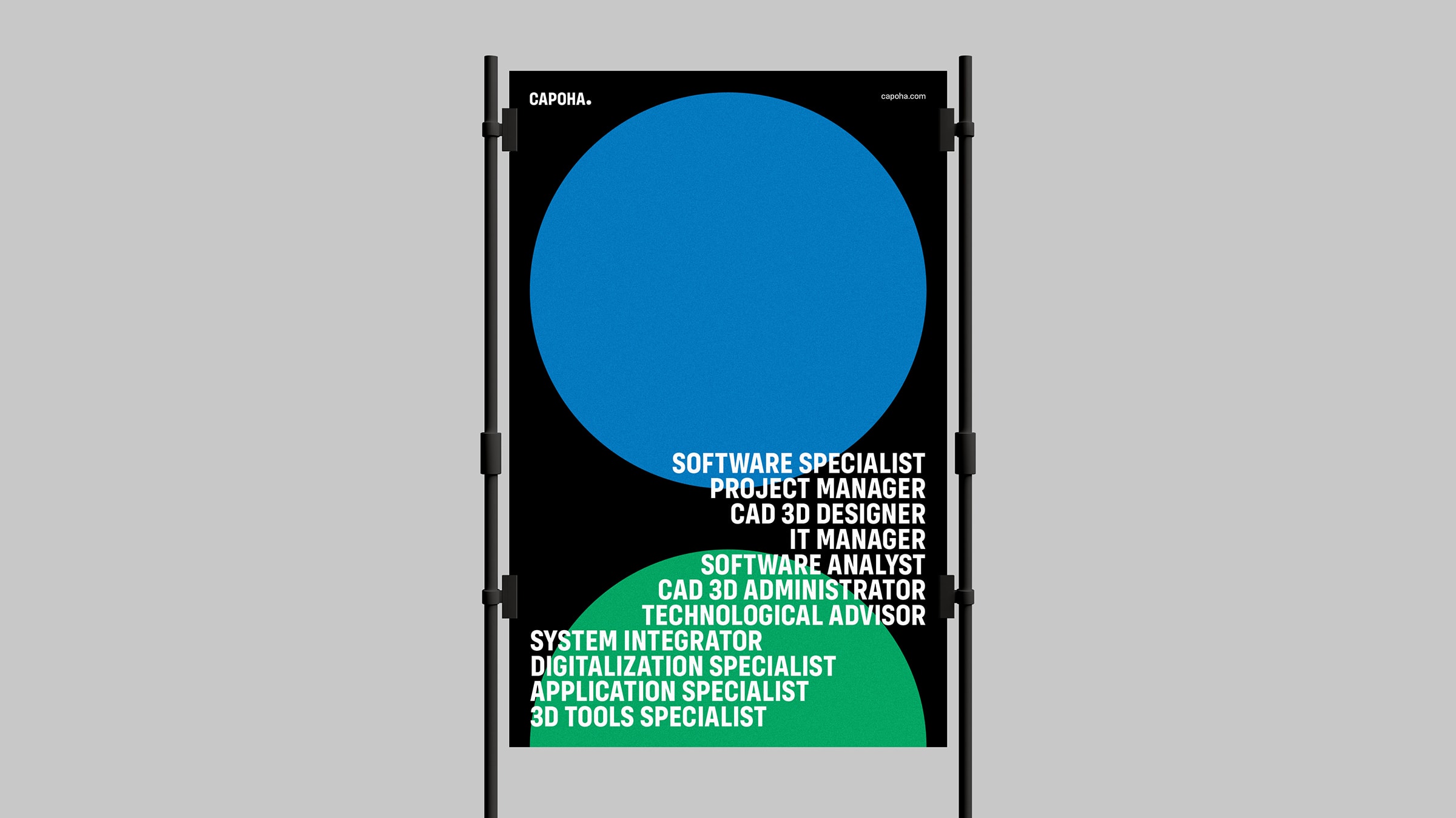
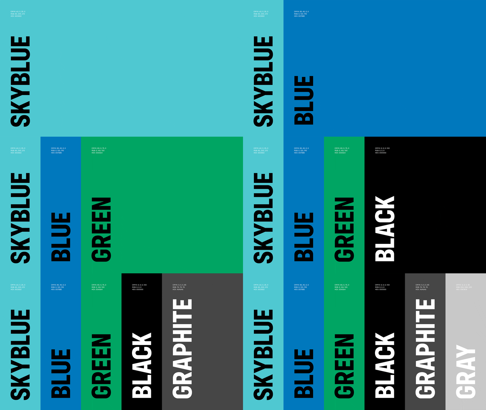
Capoha
Naming, Logo, Claim, Visual Identity, UI / UX, Web Development
Sometimes branding has to start from scratch, other times it takes a corporate rebranding that doesn’t betray the brand.
Not all branding projects pose the same problem. There are cases where the brand doesn’t exist yet and has to be built from scratch. And there are cases where it very much exists, but needs to regain consistency, intensity and relevance.
With Mnemo, for example, the work consisted in bringing a world to life. Finding a pleasant name or a tidy identity wasn’t enough. That project had to become the symbol of a small philosophy of the present. In a case like this, branding gives meaning even before visibility, and makes sure the startup enters the market as a universe and not as a function.
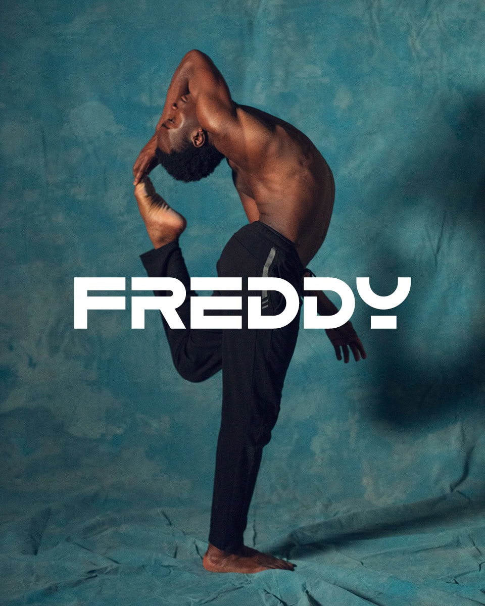
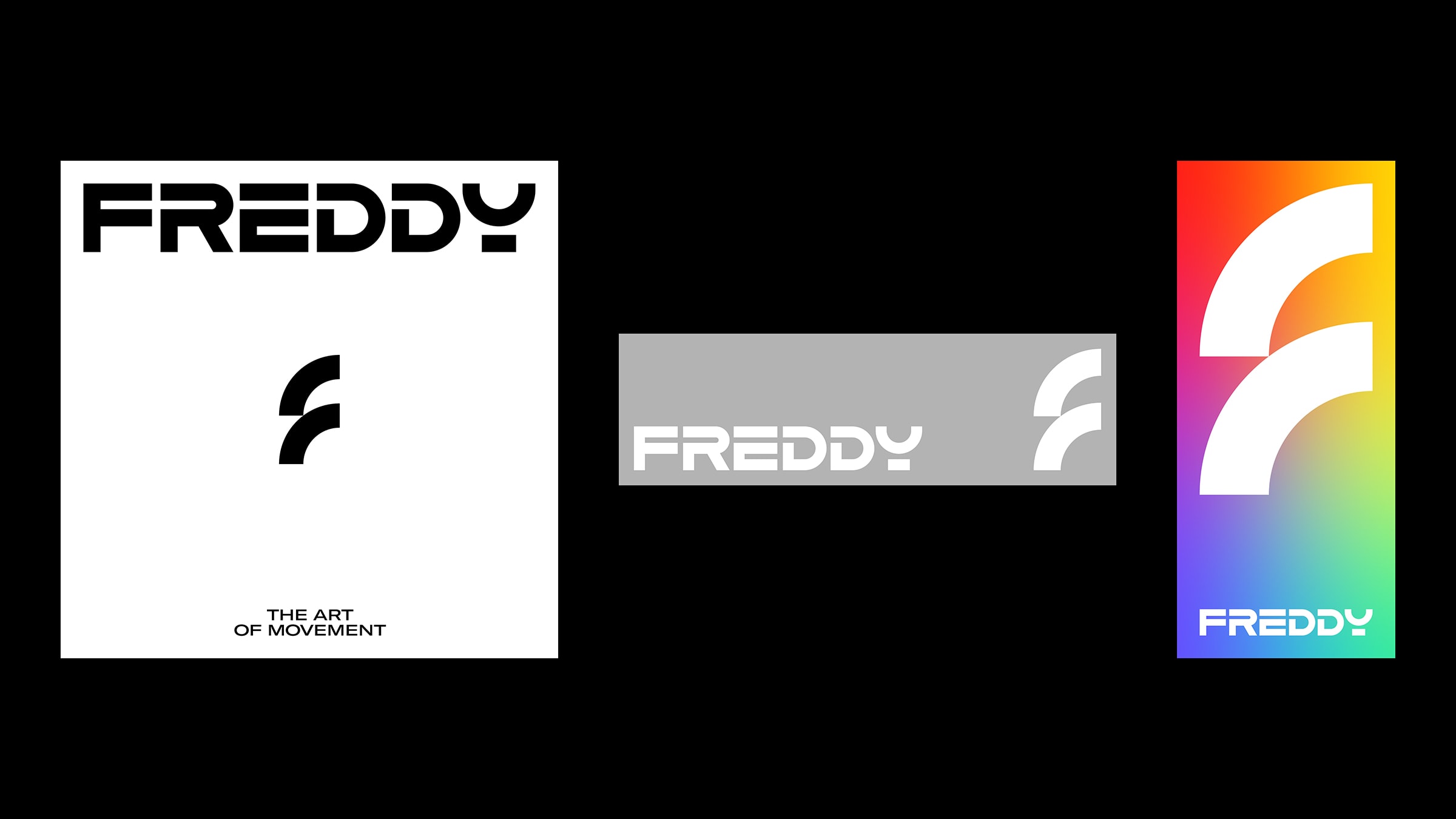
With Freddy, the challenge was completely different. Here it wasn’t about inventing everything from scratch, but about helping a brand with a strong history find its place in the present again. Corporate rebranding, in these cases, can’t be a gratuitous break. It has to change a lot without seeming to betray what the brand has been. The point, with Freddy, was to bring its most distinctive truth back to the center: the idea of sport as the art of movement. From there everything could fall back into line: identity, language, campaigns, content, social presence, all the way to the redesign of the logo itself.
This is a fundamental aspect of branding: understanding whether the project needs a birth, a break or a realignment. Because every identity lives in a different time, and the right work doesn’t consist in imposing a formula but in finding the exact degree of transformation needed.
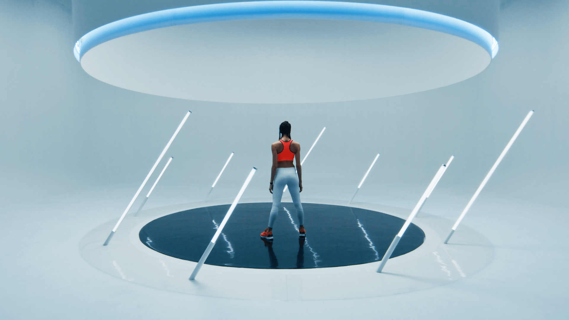
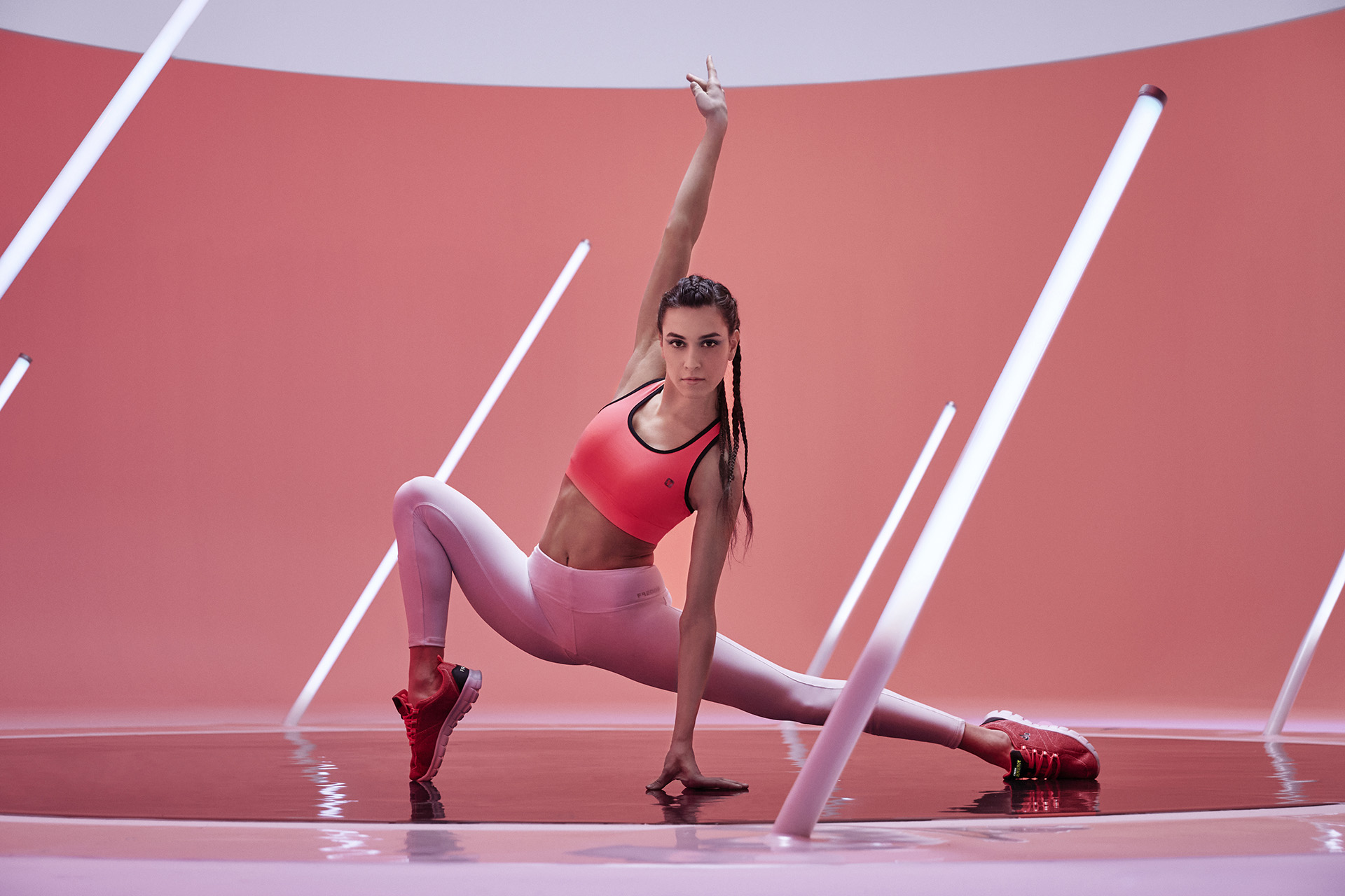
Freddy Energy
Film, Art Direction, Social Content
In certain markets, branding is above all a matter of language.
There are industries where branding isn’t played out first of all in form, but in language. Or rather: in the courage to break a language that’s already dead.
That’s the case with Ritocchini. In a field like aesthetic medicine, dominated by cold tones, standard formulas and lifeless rhetoric, the branding couldn’t stop at building a polished visual identity. Above all it had to find a different way of speaking: more contemporary and more direct, without losing authority. There the language was already identity, already positioning, already a break.
For us this is a decisive point. Often when people talk about branding they immediately think of logo, colors, fonts, visuals. All important, of course. But there are cases where the brand changes the moment the language it presents itself with changes. When it stops using automatic words and starts building a recognizable voice. This is branding too. In fact, in many cases it’s the deepest kind of branding.
Branding has to find the right balance between worlds that seem opposite.
There are projects where the main difficulty isn’t breaking a code, but holding together very different tensions. Brands that have to feel authoritative and accessible at once, contemporary but not trendy, reassuring but not childish.
That’s what happens in a project like Piccolo Soccorso. Here the branding had to find a very delicate balance: building an authoritative healthcare identity that spoke about children without becoming childish; reassuring for parents, but not distant; soft, but credible. In cases like this, branding is above all a matter of balance. Every choice, from the tone of voice to the visual system, has to hold a complex tension. And the result works only when neither pole crushes the other.
This, too, shows why we don’t believe in branding as the application of a style. Every project calls for a different balance. And our job is to find the right one.
Very different brands, one way of working on branding.
Looking at cases like Lunar, Freddy, Mnemo, Ritocchini, Piccolo Soccorso or Capoha together, one thing is clear: the results are very different from each other. And they have to be. If we had applied the same style to all of them, we would have got every project wrong.
What stays constant isn’t the final form of the branding. It’s the method we use to get there. Starting from a strategy built together with the client. Finding the point of difference. Understanding which perception needs to be built or changed. Turning that insight into a consistent system of name, identity, language, website and content. This is what holds the projects together, even when they move in markets that are worlds apart.
For us, branding is never a matter of taste. It’s a matter of strategy. And it works when it stops representing a company and starts making it recognizable.
Questions we often get.
What does a complete branding project include?
A complete branding path usually starts from strategy, moves through naming (if needed) and the construction of the brand identity system (logo, palette, typography, image treatment) and arrives at tone of voice, tagline and usage guidelines. It can extend to the website, content and campaigns. For us every project is a path built around the client: it’s better to define the scope together before talking about deliverables.
What’s the difference between branding and rebranding?
Branding builds an identity from scratch, for a new brand or a startup entering the market. Rebranding works on an existing brand that needs to regain consistency, relevance or a clearer direction. The challenge of rebranding isn’t breaking with the past, but understanding how much to change without betraying what the brand already is.
How long does a branding project with YOHOHO take?
It depends on complexity and scope. A complete branding path (strategy, naming, identity system, tone of voice) can take 6 to 12 weeks. Larger projects that include a website, content or campaigns obviously take longer. We don’t believe in ultra-fast projects: branding works only when it’s founded on a strategy that deserves to be built well.
Why choose a branding agency instead of a single freelancer?
A freelancer can design a logo or a visual identity. An agency like YOHOHO builds a complete system: strategy, naming, identity, tone of voice, website, content and campaigns. The value doesn’t lie in the individual elements, but in the consistency that holds them together. For startups, small businesses and brands that want to stand out, it’s this consistency that makes the difference.
Dare to challenge us?
Tell us about your brand project:
bebrave@yohoho.studio