Piccolo Soccorso: how to build an authoritative healthcare brand without feeling cold.

To launch Piccolo Soccorso (a play on pronto soccorso, Italian for emergency room) we built a healthcare branding that combines rigor and lightness, guidance and warmth, clinical credibility and genuine attention to children.
There are industries where healthcare communication almost always goes wrong at the same point. When a medical brand tries to look authoritative, it often becomes cold and more technical than necessary. When it tries to feel close and reassuring, it risks slipping into a generic tone, sometimes even a childish one. In between, little room is left for communication that is serious, human and credible all at once.
The answer couldn’t lie in a single element. A softer logo, a clearer website or a gentler tone wasn’t enough. The work had to go deep, bringing to the project not only vision, but also craft: graphic skills, writing, the ability to prioritize content, attention to user behavior, sensitivity to the right tone to use when talking about health and childhood. In a case like this, balance doesn’t come from a formula, but from a series of very precise choices.
The problem wasn’t just presenting a service, but building healthcare communication that would be perceived the right way.
Piccolo Soccorso wasn’t created to add one more medical facility to the market. It was created to occupy a very precise space in the minds and lives of families. It had to be perceived as a specialized, reliable practice, but also as one closer to the concrete needs of children and their parents than the rigidity and pressure of the hospital setting.
This point is decisive. Because in a project like this, healthcare branding isn’t simply there to stand apart from competitors: it’s there to prepare the encounter with the service and make it clear, even before the visit, that here the child will be taken seriously without being treated like a small adult, and that parents will be able to find their way without feeling lost or crushed by overly technical language. It’s the same kind of thinking that guides our approach to every branding project: before designing, you have to understand what perception you want to build.
In other words, we weren’t just designing an identity. We were building a condition of trust.


Piccolo Soccorso
Brand Identity, Logo, Claim, Website, Editorial Social Plan
The whole brand identity comes from a difficult balance: softness and rigor.
The main difficulty was holding together two qualities that rarely coexist well in healthcare communication: reassurance on one side, authority on the other; warmth on one side, clinical rigor on the other. And in between, the need to talk about children without sounding childish.
The whole brand identity of Piccolo Soccorso comes from here. Not from a decorative intent, but from the search for a point of balance. The logo and the visual system, for example, were designed to be soft and imaginative, but at the same time rigorous and minimal. And this direction rests on a very precise reference: Bruno Munari, in particular the Prelibri and his books dedicated to essential shapes (the square, the circle, the triangle). What interested us was precisely his rare ability to speak to childhood without ever trivializing it, through simple, tactile shapes, open to imagination but always controlled.
This reference was fundamental because it helped us find a lightness that isn’t silly, a softness that isn’t affected, a visual dimension that could evoke the world of children without falling into the clichés of the “pediatric brand” presented in a way that’s too illustrative or too sugary.
A logo that cares, but leaves room for imagination.
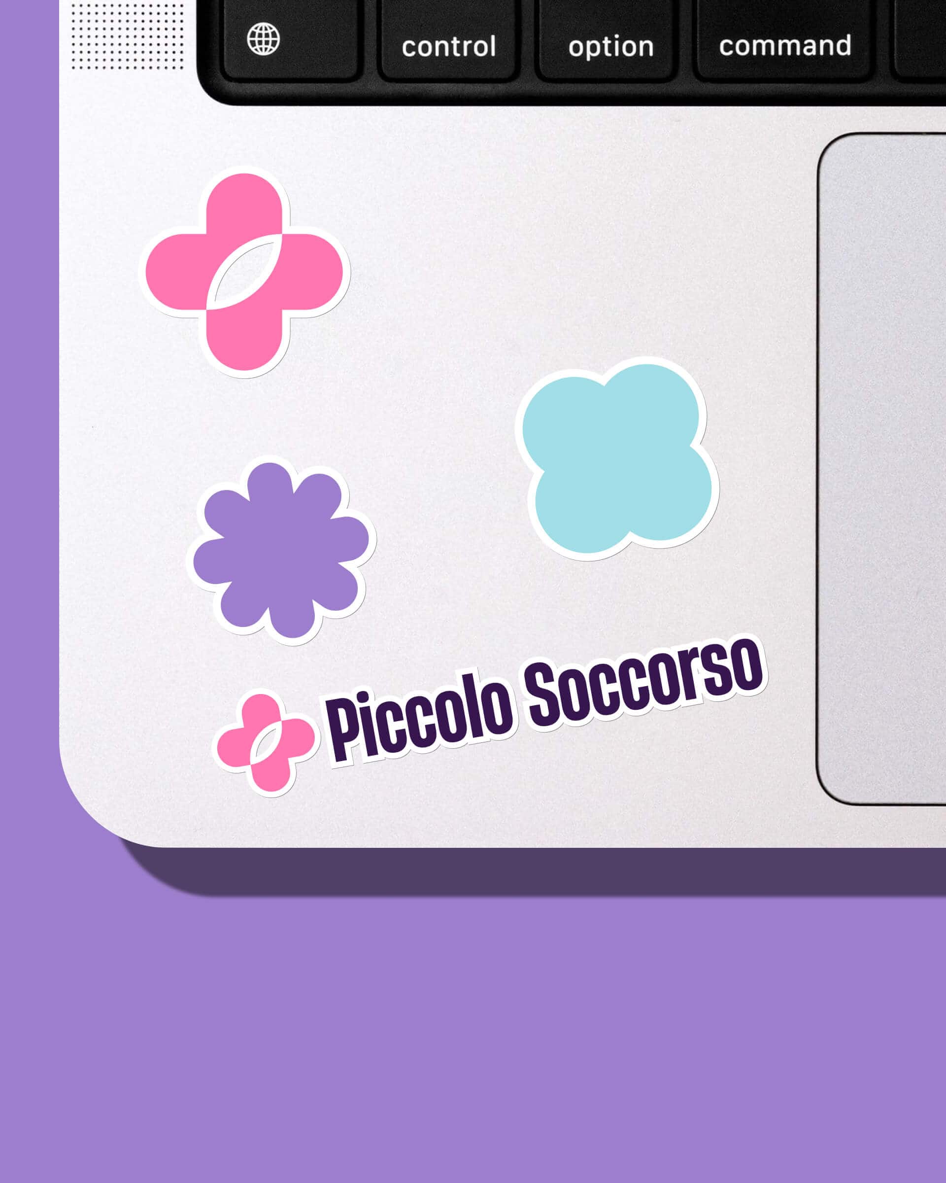
The logo is a good example of this logic. Its shape clearly starts from a medical cross, a symbol of care that’s immediately recognizable. But the way it’s drawn makes it more open: it can also recall a butterfly, and so evoke lightness, play, a child’s happiness.
Its strength lies in this ambiguity. It’s almost a small perception game, like the ones children know well: what do you see in this figure? A cross? A butterfly? A flower? The mark stays simple, but it’s never banal. It holds together medical function and imagination, recognizability and openness.
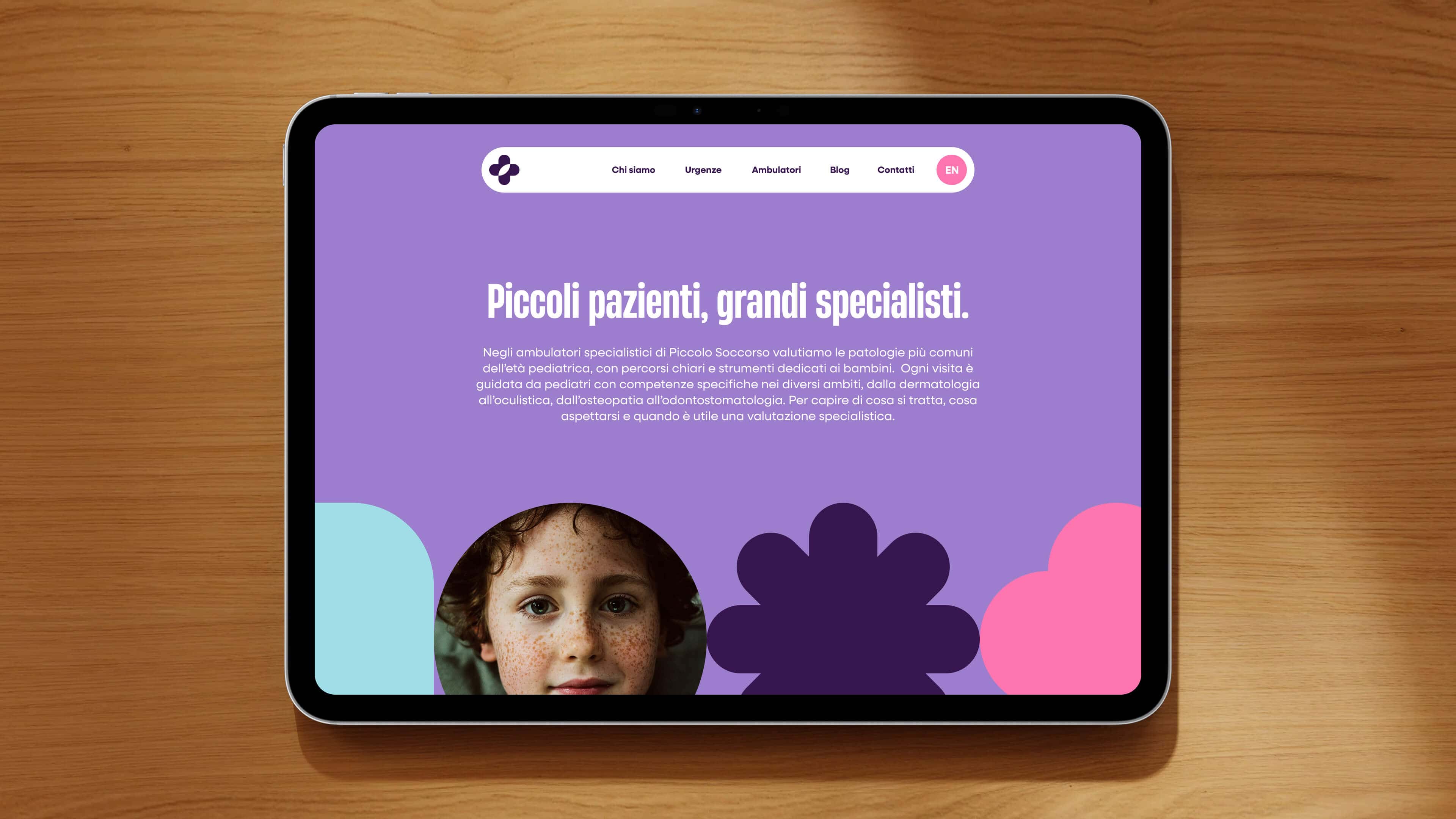
The palette works in the same direction. Bright pink, lilac, deep purple and light blue sit together decisively, without taking refuge in the usual pastel codes of the pediatric world. On the website pages and in the brand materials this graphic system is reinforced by rounded shapes, flat color fields and a full, very present typography, which gives the brand solidity instead of weakening it.
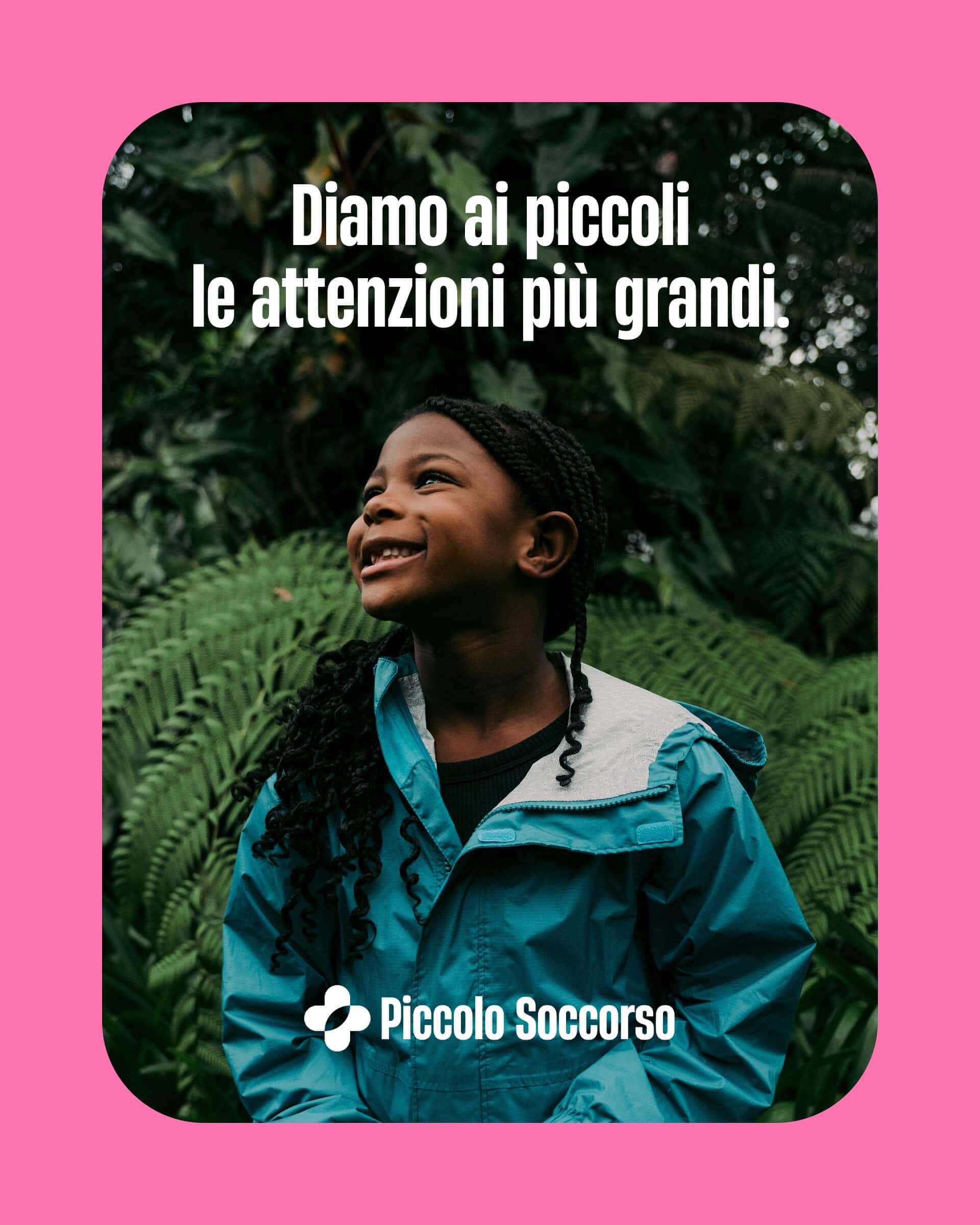
This is an important point, because it shows clearly that the project doesn’t look for sweetness through fragility. It looks instead for a structured, self-assured lightness. And here too the balance returns: the brand can speak to children without losing authority in the eyes of parents.

The tagline immediately clarifies the center of the project.
The same principle applies to the tagline. In Piccolo Soccorso the tagline isn’t an external addition. It’s an organic part of the verbal system. We placed Piccoli Pazienti before the brand name Piccolo Soccorso, so that the complete formula became: “Piccoli Pazienti, Piccolo Soccorso” (Little Patients, Little Emergency Room).
This construction is simple, but it does something important. It almost turns the brand name into a natural answer to a need. It brings the true recipient of the service to the center, with great clarity. And above all it sets the right angle from the start: here we’re not talking generically about emergencies, services or healthcare. Here we’re talking about children, and about how to take care of them at the moment they need rapid, specialized, non-traumatizing care.
Here too, then, it’s not about finding a nice line, but about giving the communication a clear center of gravity, which then returns in the rest of the project.
A measured tone of voice.
When you talk to parents about their children’s health, tone of voice is a very delicate matter. It takes very little to get it wrong. If it becomes too technical, it pushes people away. If it becomes too simplified, it loses credibility. If it tries to be “cute”, it risks lowering the level of trust.
With Piccolo Soccorso the work on tone of voice was exactly this: finding a voice that could guide without trivializing. A voice that explains clearly, without turning every message into a mini medical lecture. Close, but not affected. Reassuring, but not paternalistic.
This aspect matters because in the project the tone of voice isn’t a detail. It’s one of the ways the brand builds its balance. It talks about children credibly because it doesn’t try to “put on a baby voice”, and it talks to parents usefully because it doesn’t hide behind specialist language.
Here, more than elsewhere, writing well meant above all this: knowing how much to remove, how much to explain, how much to guide. And always doing it with measure.
The clinic’s website becomes a tool for guidance.
The website works in the same direction too. Not as a simple container of information, but as a real tool for guidance. What we say about website design applies: a website shouldn’t just present a brand, but make something happen. Here, reducing anxiety and increasing families’ trust.
This, in our view, is one of the most successful points of the project. Because the website doesn’t just say who Piccolo Soccorso is. It guides parents step by step. It explains which emergencies are treated, how the visit works, what to expect once they arrive at the clinic. In other words, it uses design, information architecture and content to reduce uncertainty, anxiety and opacity.
Here web design stops being a matter of aesthetics and becomes part of the service, and therefore of the brand’s promise. A website like this isn’t only there to present a clinic well: it’s there to make people feel they’re entering a place that knows how to guide them clearly.
In an industry like this it’s a huge difference. Because trust often comes from the fact that someone lets you understand what’s going to happen, in what order, and with how much care.
Social media, too, does a job of clarity and reassurance.
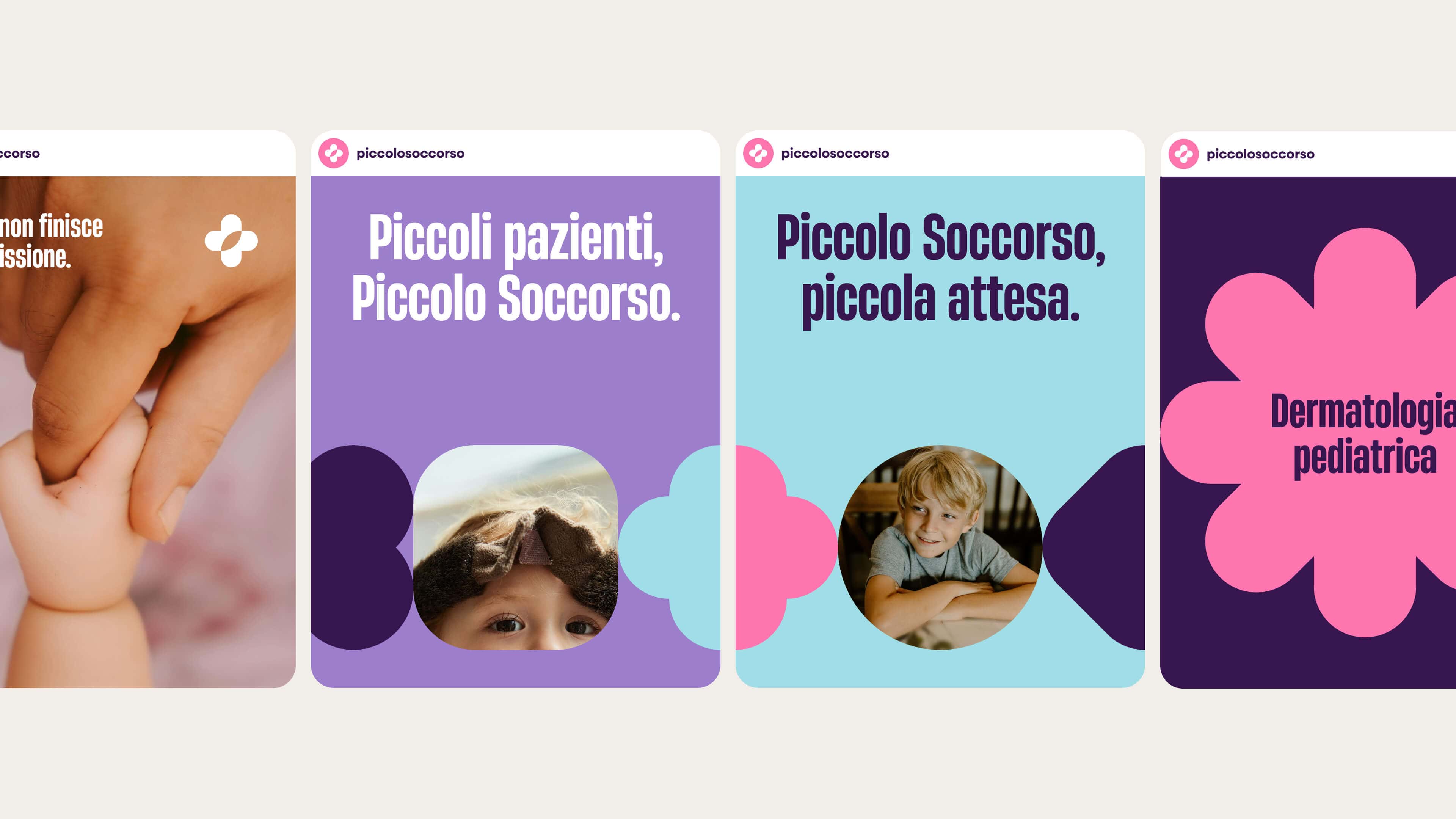
The same logic extends to the social media content plan. Here too the point wasn’t simply to be present on the channels. The point was to translate clinical content into accessible language, with educational columns, clear explanations and service content designed to support families outside the clinic as well.
This is a very important aspect of the Piccolo Soccorso case. Because it shows that branding doesn’t end with the visual identity or the website. It also lives in the way the brand keeps being there over time. And here the social media presence isn’t built for entertainment or sensationalism, but to consolidate a precise position: less distance, more guidance; less jargon, more usefulness; less anxiety, more trust.
In this case too, then, communication doesn’t just add visibility, but consistency.
Piccolo Soccorso succeeds where the medical industry often fails.
In the end, the point of the project is all here. Piccolo Soccorso doesn’t try to look like a “kinder” healthcare brand than the others. It succeeds at something harder: building communication that holds rigor and warmth together without sacrificing either.
That’s why the project works. Because every choice works toward the same delicate but essential balance. “Piccoli Pazienti, Piccolo Soccorso” immediately puts the recipient of the service at the center. The logo, with its ambiguity between medical cross and butterfly, holds care and imagination together. The palette, the typography and the entire visual system build a cultured, controlled softness that’s never banal. The Munari references give the project a rare visual intelligence. The tone of voice guides without infantilizing. The website orients instead of merely showing. The social strategy turns clinical content into useful tools for families.
It’s this consistency that makes the project strong. Not the single brilliant choice, but the fact that everything helps say the same thing: here children feel safe, and parents feel they’ve entrusted themselves to specialists who also take care of the way they guide them.
For a pediatric clinic, it was exactly what was needed.
In short, this is how we worked for Piccolo Soccorso.
Piccolo Soccorso is a pediatric urgent care clinic for which we at YOHOHO handled the entire healthcare branding project: naming, logo (inspired by the ambiguity between medical cross and butterfly), a brand identity system with visual references to Bruno Munari, the tagline “Piccoli Pazienti, Piccolo Soccorso”, tone of voice, website and social media content plan.
The project is a case of healthcare communication that holds together clinical authority and human warmth, medical rigor and pediatric lightness, without sacrificing either.
Dare to challenge us?
Tell us about your healthcare brand idea:
bebrave@yohoho.studio