Why, in professional website design, every brand needs a digital experience of its own.
YOHOHO is a web agency in New York and Milan that designs and develops professional websites for brands that want more than a beautiful site: a digital experience that makes the brand stronger. Here’s how we work together with clients to build websites that don’t just present a brand.
When it comes to websites, many companies still start from a very simple request: we need a new site. Sometimes because the old one is outdated, or because it no longer reflects the brand’s real level. Other times because it doesn’t convert enough, or because the project is just starting and finally needs a credible online presence.
All legitimate reasons. But the real problem is almost never just having a website.
The point is usually something else: what does this website need to make happen? Does it need to build trust? To make a complex offer easier to read? To make a brand come across as more authoritative and more desirable? To turn an identity into a concrete experience, to sell, to generate leads? To make people feel that behind that brand there’s a precise world?
That’s why at YOHOHO we never think of the website as an isolated object. We think of it as a decisive part of the brand project: a space where strategy, tone of voice, images, structure and development have to work in the same direction.
The point, then, isn’t to make a website that’s beautiful in the abstract, but one that’s right: a website that makes the brand stronger.
An effective company website comes after the strategy, not before.
When a client asks us for a website, we almost never start from the layout. We don’t start from visual references, or from pages to fill. We start from a more important question: what role should this website play in the brand’s growth?
It may seem like a detail, but it changes everything. Because a website meant to build trust isn’t designed like one meant to amplify a brand’s world. A website that has to explain a new technology doesn’t work like one that has to make a product desirable. A website that has to help a startup look credible from day one doesn’t follow the same logic as one that has to restore intensity to a small business with a strong heritage.
That’s why, for us, the website always comes after the creative strategy. First we understand, together with the client, what problem needs solving, what the brand’s positioning is, what perception we need to build, which goals we want to reach. Only then can the company website take shape. And at that point everything changes: architecture, UX, UI, web design, written and visual content, e-commerce, development. Every choice stops being arbitrary and starts working.
A website works when it doesn’t just organize information. It works when it makes the idea at the center of the project clearer, more concrete and more memorable.
When the website first of all has to build trust in the brand.
Ritocchini: a professional website for a healthcare brand that speaks a different language.
There are industries where the main challenge isn’t to impress, but to be believed. And in these cases the website becomes a very delicate tool, because it has to be reassuring without feeling standardized, authoritative without turning cold, clear without seeming anonymous.
That’s what happens with Ritocchini. In a field like aesthetic medicine, dominated by rigid language, impersonal tones and formulas that never change, the website couldn’t just present a service. It had to make people feel right away that the brand spoke a different language: more contemporary and closer to them, without losing precision or reliability.
Here the work on the website becomes work on trust. The structure has to be simple and booking-oriented. The copy clear, but not stereotyped; the aesthetic polished, but not distant. Everything has to help say: this project is serious, but it doesn’t talk like all the others. When that happens, the website becomes the place where the brand proves it’s credible.
It’s a very important function, especially for startups or new business models. Because when a reputation is still being built, the website is often the first place where a person decides whether to trust you or not.

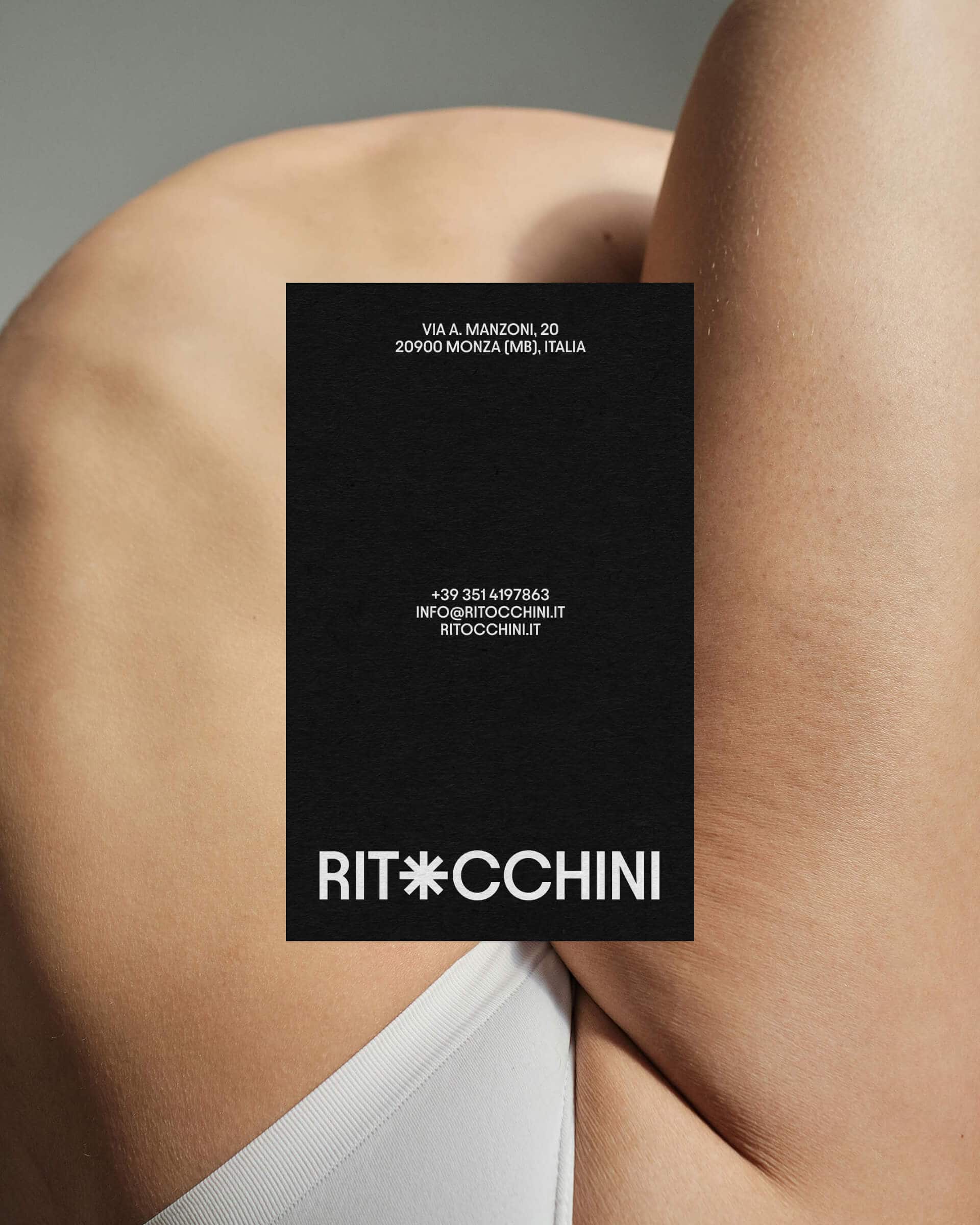
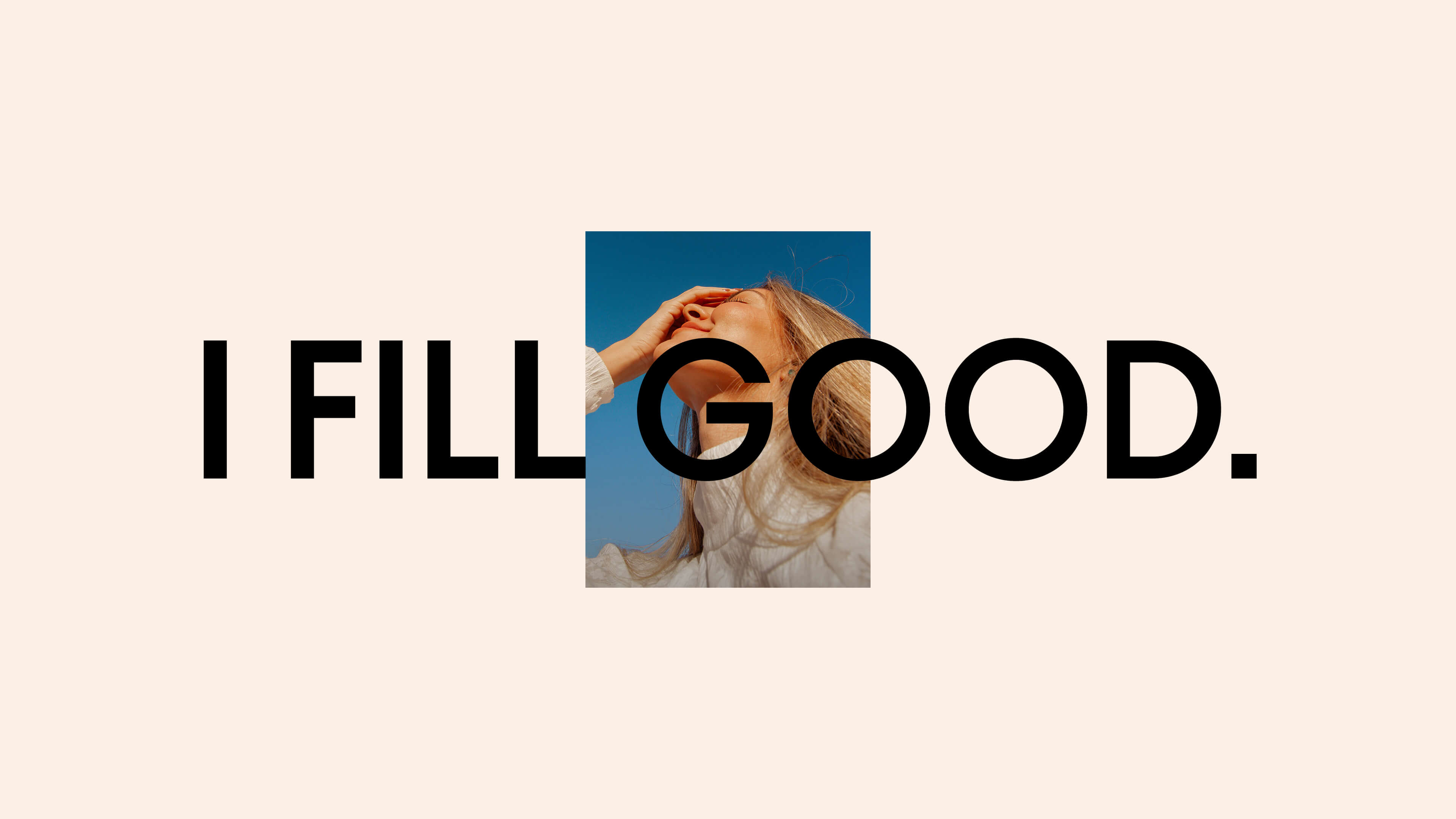
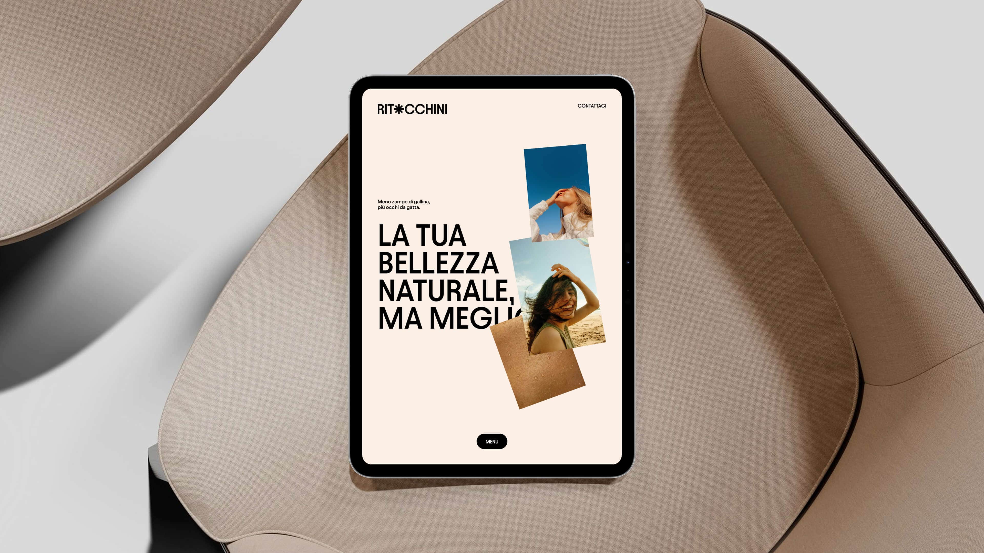
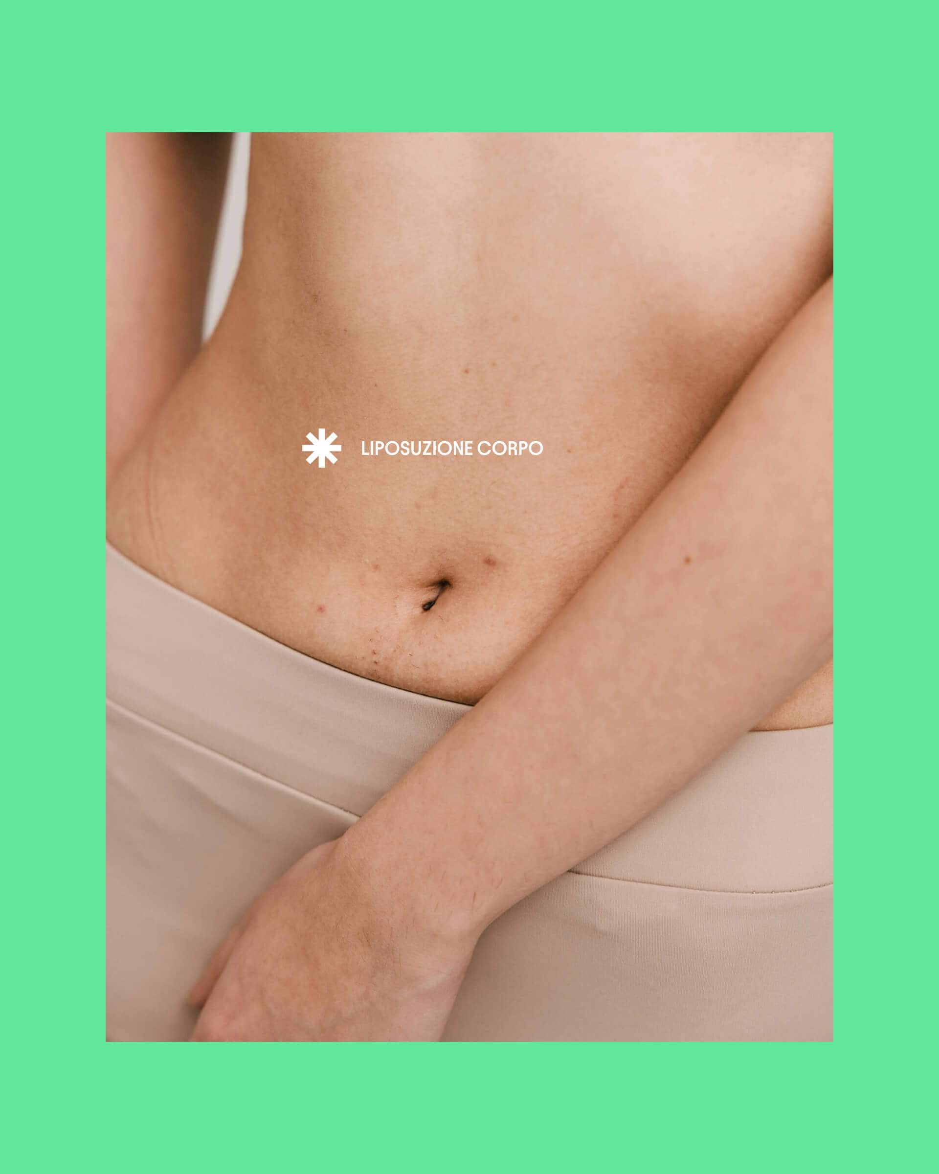
Ritocchini
Brand Identity, Logo, Claim, Website, Social Content
When the website has to turn an identity into a universe.
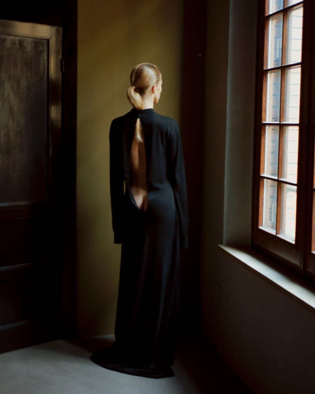
ROT: web design as the narrative surface of a fashion brand.
Then there are brands for which the website doesn’t so much have to explain as to make people feel: feel that behind the brand there’s a precise world, with an aesthetic and narrative tension so clear that the browsing experience becomes an integral part of the brand.
That’s what happens with ROT. In a saturated industry like fashion, having an interesting identity or a strong collection isn’t enough. People need to understand right away that the brand inhabits a universe. In ROT’s case, the website couldn’t just show garments or set up a shop. It had to take part in building a precise tension between luxury, radicalism, elegance and friction.
In a project like this, the website becomes a narrative surface. The order of the content, the rhythm of navigation, the way images occupy space, the relationship between empty and full, between text and visuals, between information and atmosphere: everything helps turn the brand’s positioning into a tangible experience. You’re no longer in front of an interface: you’re entering a world.
This, in our view, is what sets websites that work apart from those that are merely correct: the former don’t just translate a brand, they make it stronger.
When the website has to make something complex desirable.
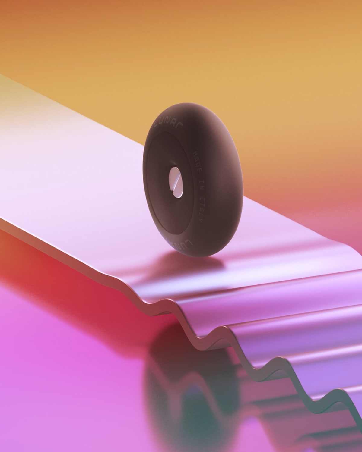
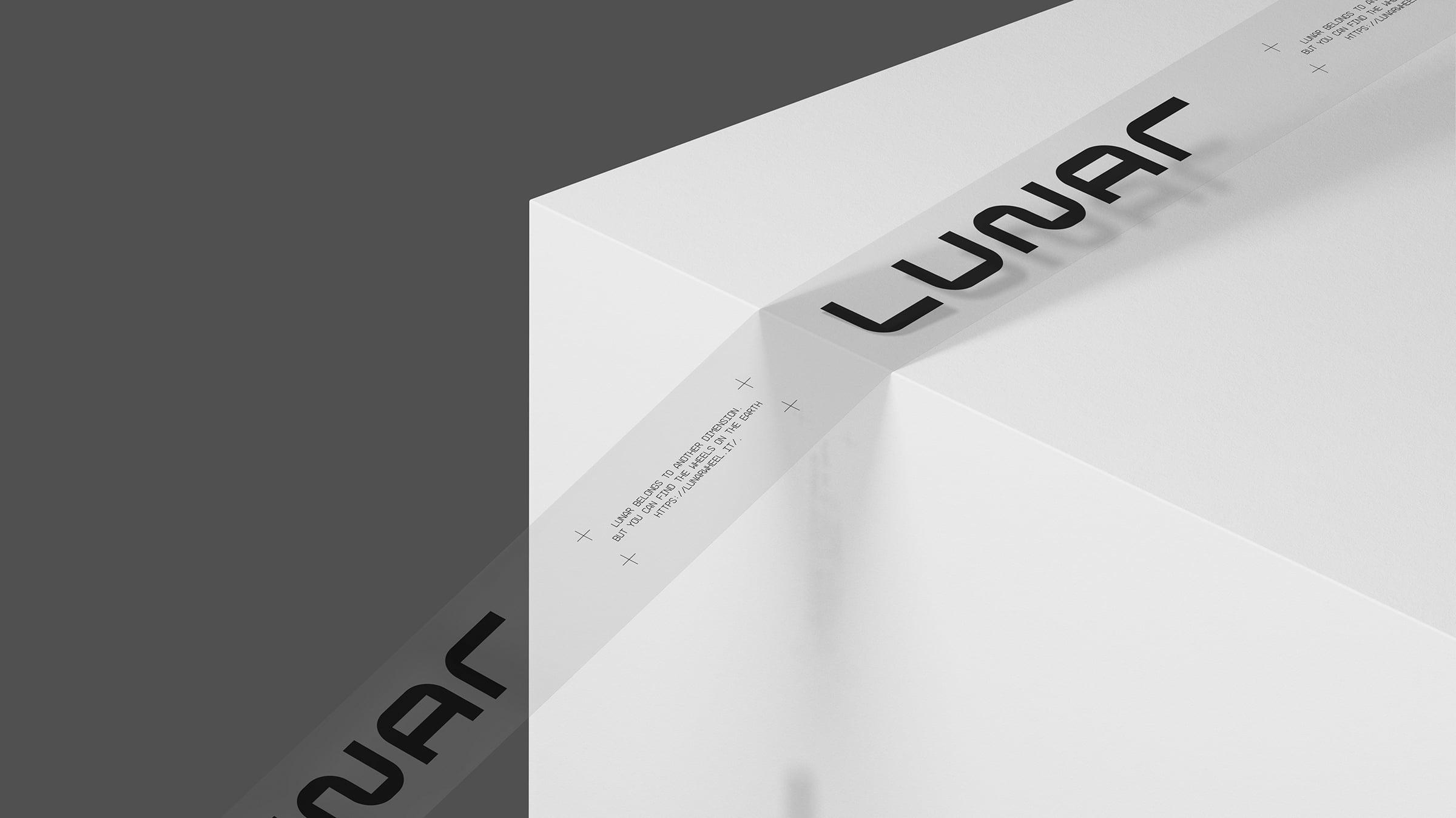
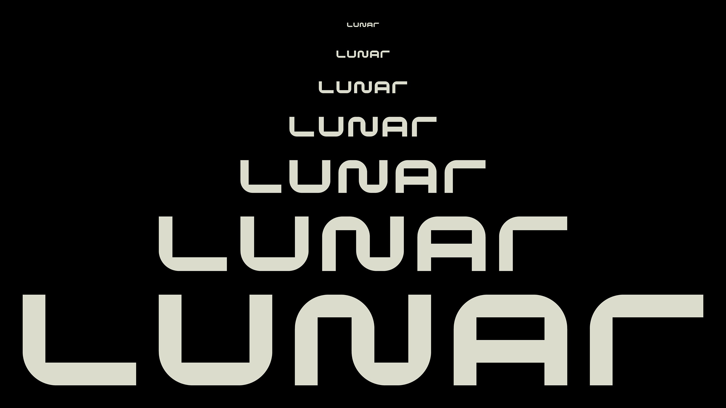
Lunar: UX design and web design to make a B2B patent memorable.
One of the most interesting jobs a website can have is this: taking something technical, intricate or not immediately obvious and making it suddenly clear, memorable, even desirable.
That’s what happens with Lunar. Here it wasn’t simply about presenting a patent or explaining a technology. The website had to help the brand break out of the communication cage of technical B2B, where almost everything is correct but almost nothing sticks. And to do that, simplifying wasn’t enough: a whole world had to be built.
This is where the website becomes decisive. Because it brings explanation and atmosphere together. On one side it makes the product understandable, on the other it builds around it a universe strong enough to lift it beyond the fate of a technical object: the structure guides the reading, the images open up a sci-fi world, the tone of voice holds together authority and self-irony. And in the end the website doesn’t just say that a revolutionary wheel exists, but that there’s a brand willing to present innovation in a way no one else in that industry would have dared.
This is a fundamental function especially for tech startups, patents, B2B products or complex offers. Because often the point isn’t to reduce complexity, but to give it, through careful UX design and web development, a form people actually want to follow.
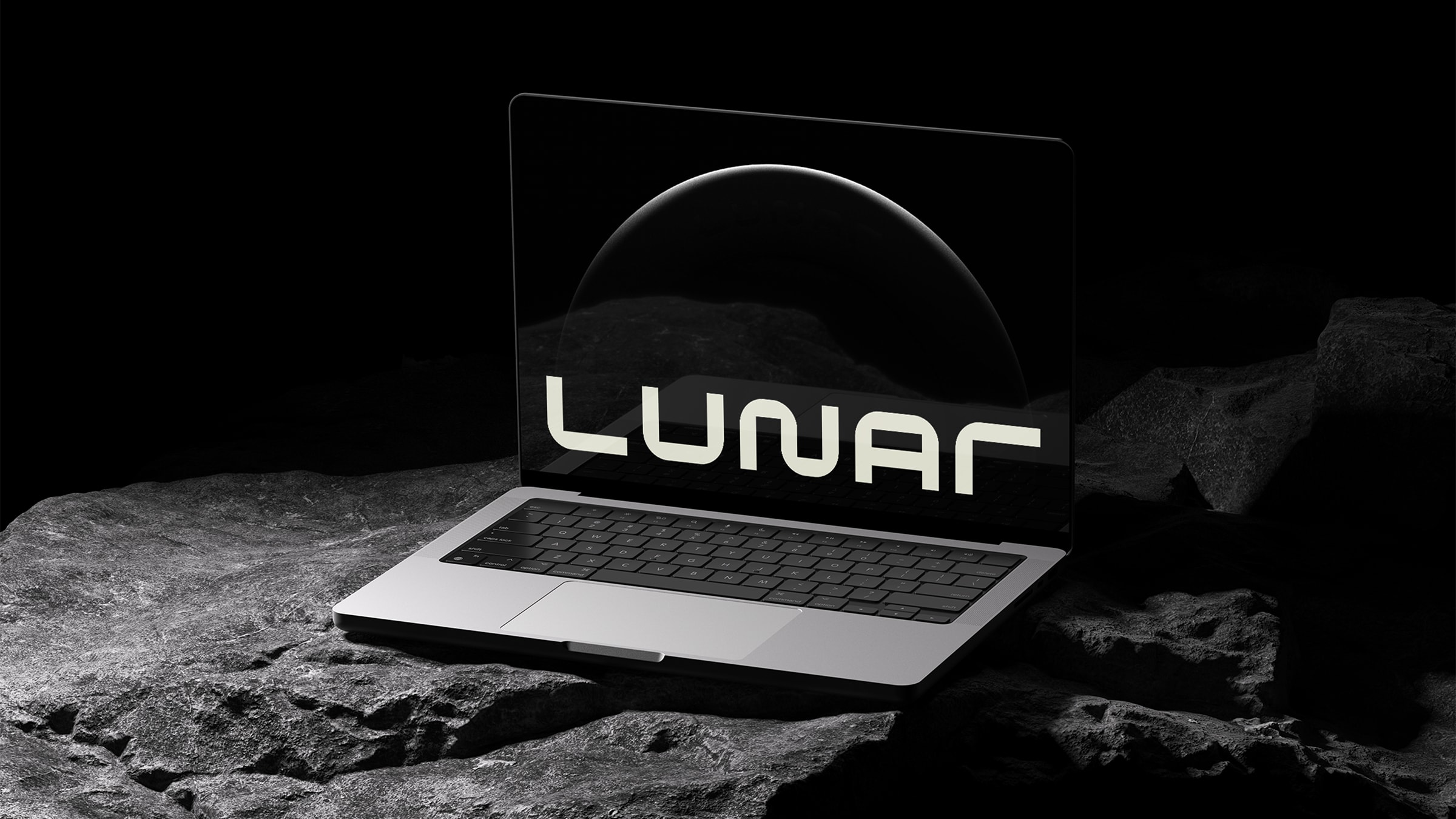
Lunar
Logo, Claim, Art Direction, 3D Animation, Web Design
When digital has to make people feel the material.
Kreoo: a website that lets you feel the marble before explaining it.
There are also brands for which the website has to do something different again: not build trust, not explain a technology, not convey a fashion tension, but turn a material, a product, a physical world into digital perception.
That’s the case with Kreoo. Here the question wasn’t how to inform people well about a marble design brand. The point was to convey online the sensory and symbolic value of marble, making people feel the brand before explaining it. In a project like this the website has to select and give space: let the images, the rhythm and the quality of the interface create an impression of luxury and material intensity.
That’s why a website like Kreoo’s works on the essential. It reduces copy to the bare minimum, relies heavily on images, builds a navigation that doesn’t interrupt the immersion. And in doing so it amplifies the brand’s positioning: it doesn’t just describe it, it makes it felt.
It’s an important step, because it reminds us that a website doesn’t communicate only through what it says. It also communicates through what it chooses not to say, through the way it measures out attention, silence, vision and material.
When the website has to hold opposing needs together.
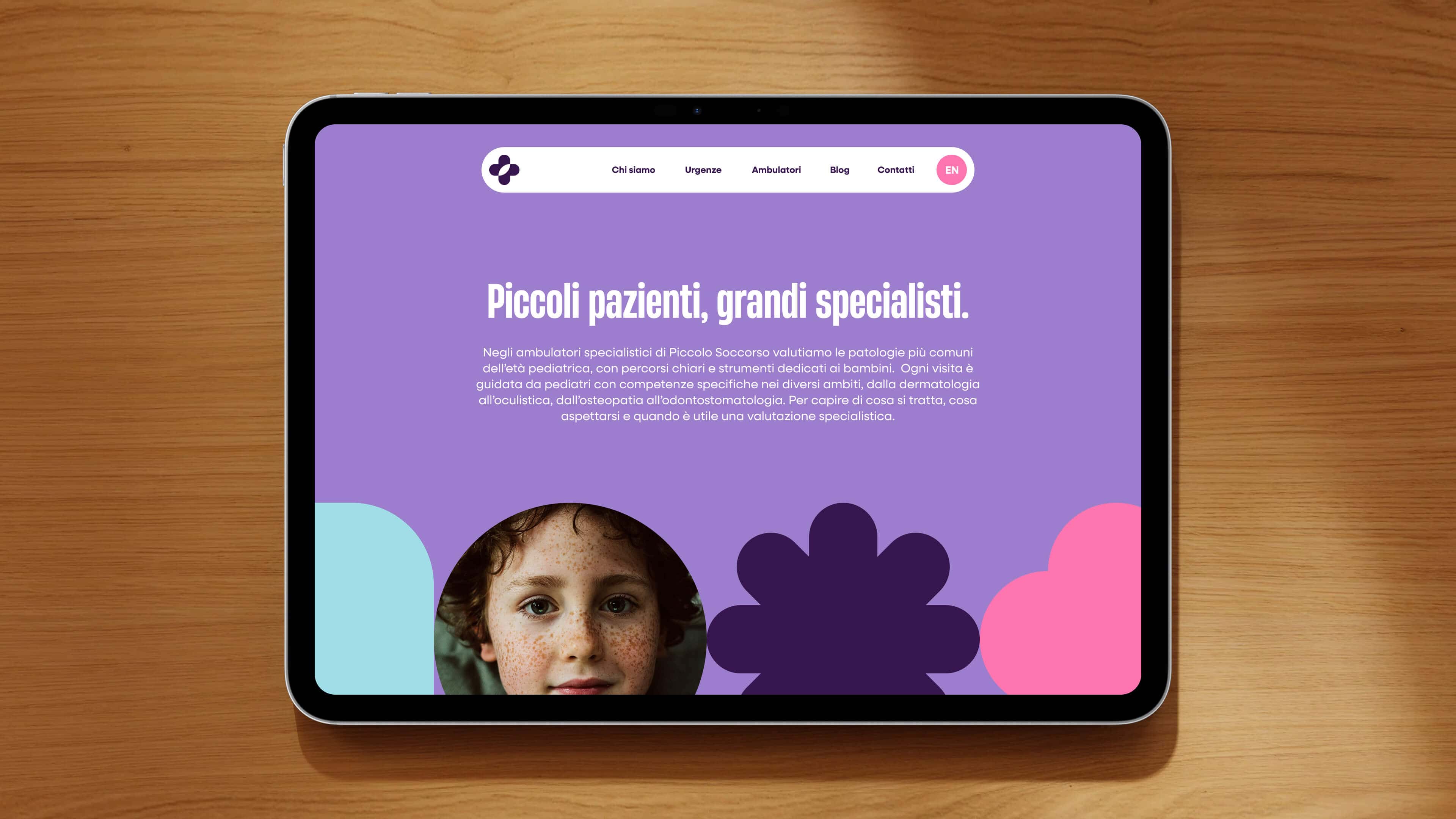
Piccolo Soccorso: web design for pediatrics, between authority and reassurance.
Finally, there are projects where the website doesn’t have to push everything in one direction, but find a complex balance between seemingly opposite needs. This is often where web design gets interesting.
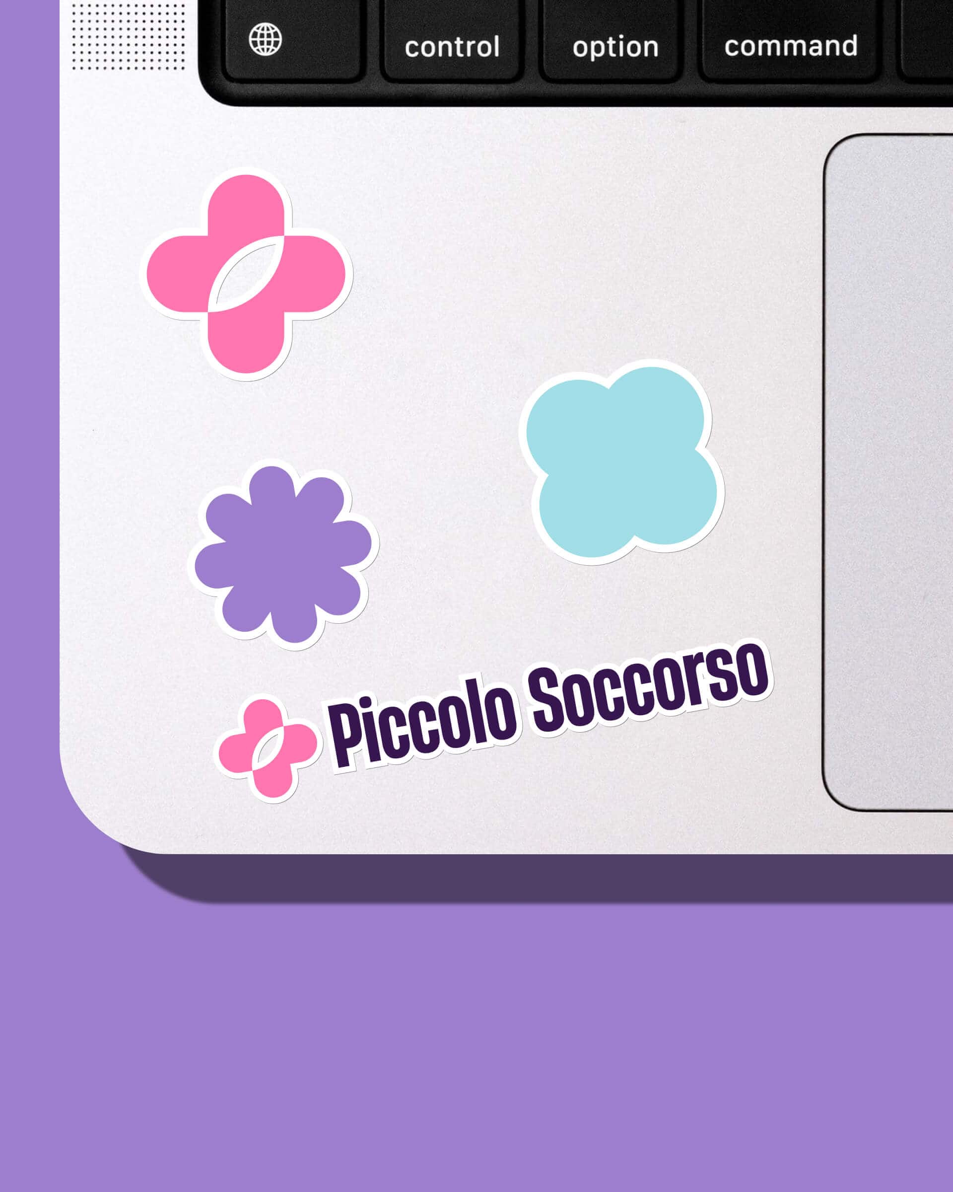
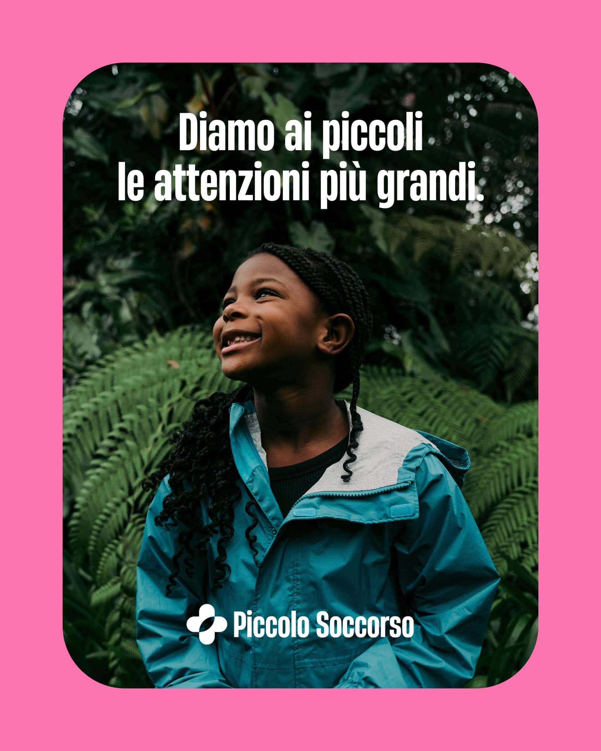
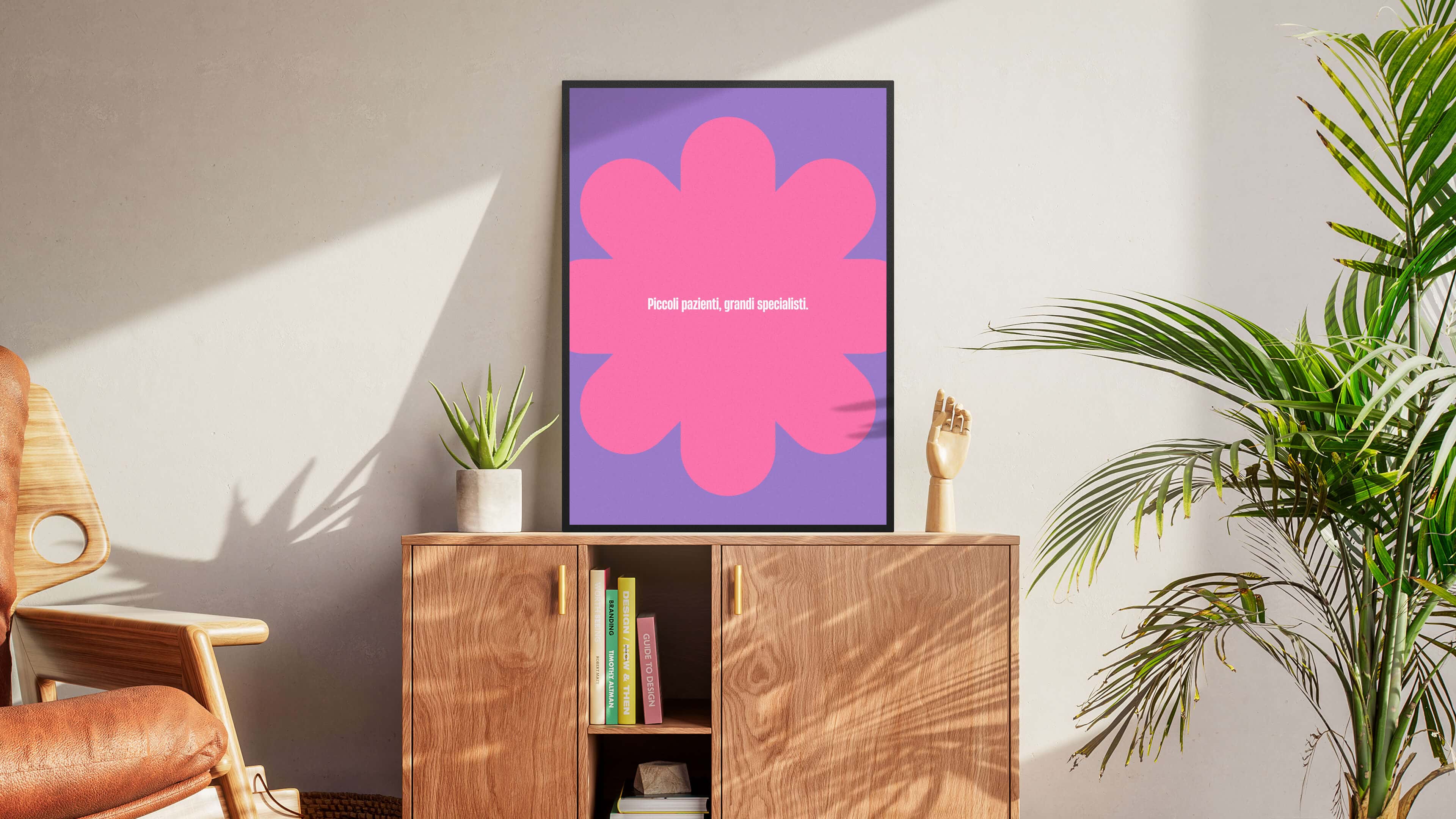
Take Piccolo Soccorso. In a case like this the website had to be authoritative, because we’re talking about health. But also reassuring, because it speaks to parents: clear without being cold, dedicated to children without feeling childish, contemporary without becoming trendy.
A project like this shows clearly that a website is never a matter of aesthetics, but of balance. Every choice, from the visual system to the tone of voice, from the information hierarchy to the UX, has to hold different tensions together without letting any of them collapse. And when it succeeds, the result is more than a good website: it’s an experience that immediately puts the visitor in the right frame of mind.
This, too, is ultimately one of the most important jobs of digital: setting up the encounter with the brand well.
Piccolo Soccorso
Brand Identity, Logo, Claim, Website, Editorial Social Plan
That’s why we never build company websites the same way.
If we look at Ritocchini, ROT, Lunar, Kreoo and Piccolo Soccorso together, the most interesting thing isn’t how different the layouts, tones or visual solutions are. The most important thing is that each website answers a different problem.
Ritocchini has to build trust in a stiff industry. ROT has to amplify a brand’s world. Lunar has to make a technology desirable. Kreoo has to turn material into perception. Piccolo Soccorso has to hold authority and reassurance together.
That’s why we’re not interested in applying formulas. We’re interested in understanding what role the company website should play in the brand’s growth. Because a website works when it isn’t just tidy, elegant or well developed, but makes something happen: when it makes the brand clearer, more desirable, more memorable.
This is where the work we do together with clients begins.
When we work on a website, we never start by asking what it should look like. We start from a conversation with the client. From a working day where goals, audience, business, critical issues, opportunities and ambitions are brought into focus. That’s where we understand whether the website will have to build trust, clarify a complex offer, strengthen a brand’s world, generate leads, sell better or give the brand a level of intensity it doesn’t have yet.
Only then come structure, web design, content and web development. Because everything depends on the right idea and the form we give it: online it has to keep working with the same precision as the rest of the brand.
This is the kind of work we want to do: professional websites built together with clients, one by one, as digital experiences that leave a mark. Every brand comes with a different challenge, and from that challenge can come a website that makes the project grow.
Questions we often get.
How much does a professional website cost?
From $3k to $60k, depending on the project. A company website with strategy, design, content and custom development is a very different path from a template site. For us every website comes after a strategy shared with the client: the cost depends on the scope of the project, the features required and the extent of the creative work. It’s better to talk about goals before talking about budget.
How long does it take to build a website?
A carefully built brand website (strategy, UX design, web design, development, content) usually takes 8 to 16 weeks. Timing depends on the complexity of the project and on how quickly the client can provide feedback and materials. We don’t believe in rushed websites: a site that has to work for the brand deserves the right amount of time.
What’s the difference between a professional website and a template site?
A template site starts from a predefined structure and adapts the brand to the model. A professional website does the opposite: it starts from the brand, its strategy and its goals, and builds a tailor-made digital experience. The difference shows in the perceived positioning, in the consistency with the identity and in the results in terms of leads generated and trust built.
Does YOHOHO also handle website maintenance and updates after launch?
Yes. After launch we can look after the website with updates, new content, optimizations and technical work. In many cases we keep working with the client on communication too (ad campaigns, social media, content), so the website isn’t a finish line but part of a broader growth path.
Why choose YOHOHO as your web agency?
Because we’re not just a web agency in New York: we’re a creative studio that integrates strategy, branding, web design and development under one direction. The website we design comes from the same vision as the brand and works toward the same goals. For brands, startups and small businesses that want a consistent digital experience, this is the difference that counts.
Dare to challenge us?
Tell us about the idea for your website:
bebrave@yohoho.studio