Ritocchini: how to break the language taboo in aesthetic medicine.

The Ritocchini case shows that, in an industry caged in cold, stereotyped codes, tone of voice alone doesn’t make the difference: what does is a creative strategy that changes the way a brand presents itself.
There are industries where the problem isn’t a lack of communication. It’s the fact that everyone communicates in the same way. Aesthetic medicine is one of them. On one side there’s a cold, almost clinical language that tries to convey authority but often ends up feeling distant. On the other there’s an excessive, sensationalist language, full of easy promises, standardized images and formulas without personality. In between, very little room is left for a brand that wants to be competent and human at the same time. A problem we also find in the pediatric sector, where the solution, however, was the opposite.
This is exactly where Ritocchini comes from. And with it a question that was crystal clear to us from the start: how do you make aesthetic medicine pop and accessible without losing medical authority?
No single element could be enough: not a good name, not a brighter tone, not an elegant website. The point was more radical: a creative strategy had to be built from scratch to break the taboo of how this industry is talked about today. And to do it in every detail of the project.
The communication problem in aesthetic medicine: not just what it says, but how it presents itself.
When you look at the communication of many aesthetic medicine brands, the feeling is often the same: either everything looks excessively cold, or everything looks excessively artificial. In both cases the brand loses touch with people’s real lives.
On one side there are the codes of conventional seriousness: technical vocabulary, neutral tones, clean but impersonal aesthetics, tidy but soulless websites. On the other there are winking formulas, easy promises, content built more to grab attention than to truly reassure. Neither path, in our view, was right for the project we were building. It’s the trap we wanted to avoid, as in all our branding work: finding a territory that belongs to the brand, instead of copying the industry’s codes.
Ritocchini was born with a much more interesting goal: redefining the way aesthetic medicine is talked about, bringing it back to a more authentic, more accessible, more human dimension. Not trivializing it, but freeing it from a stiff narrative. Not taking away its authority, but making it finally feel alive.
Ritocchini is born from a branding strategy that breaks the industry’s language.
That’s why with Ritocchini we didn’t work on simple branding. We built a complete creative strategy, designed to make the brand come across differently at every touchpoint.
The break starts with the naming and the tagline. Ritocchini (Italian for “little touch-ups”) – Your natural beauty, only better is an ironic, immediate choice. The name defuses the preconceptions that often weigh on aesthetic medicine. The tagline makes the positioning clear right away: not transformation, not artifice, not excess. Rather an idea of beauty that is respectful and conscious.
But the fundamental point is that the project doesn’t stop there. Because the same intention runs through everything else. The branding, the website, the social media content and even the performance campaigns all work toward the same goal: making people feel that here aesthetic medicine speaks a different language.

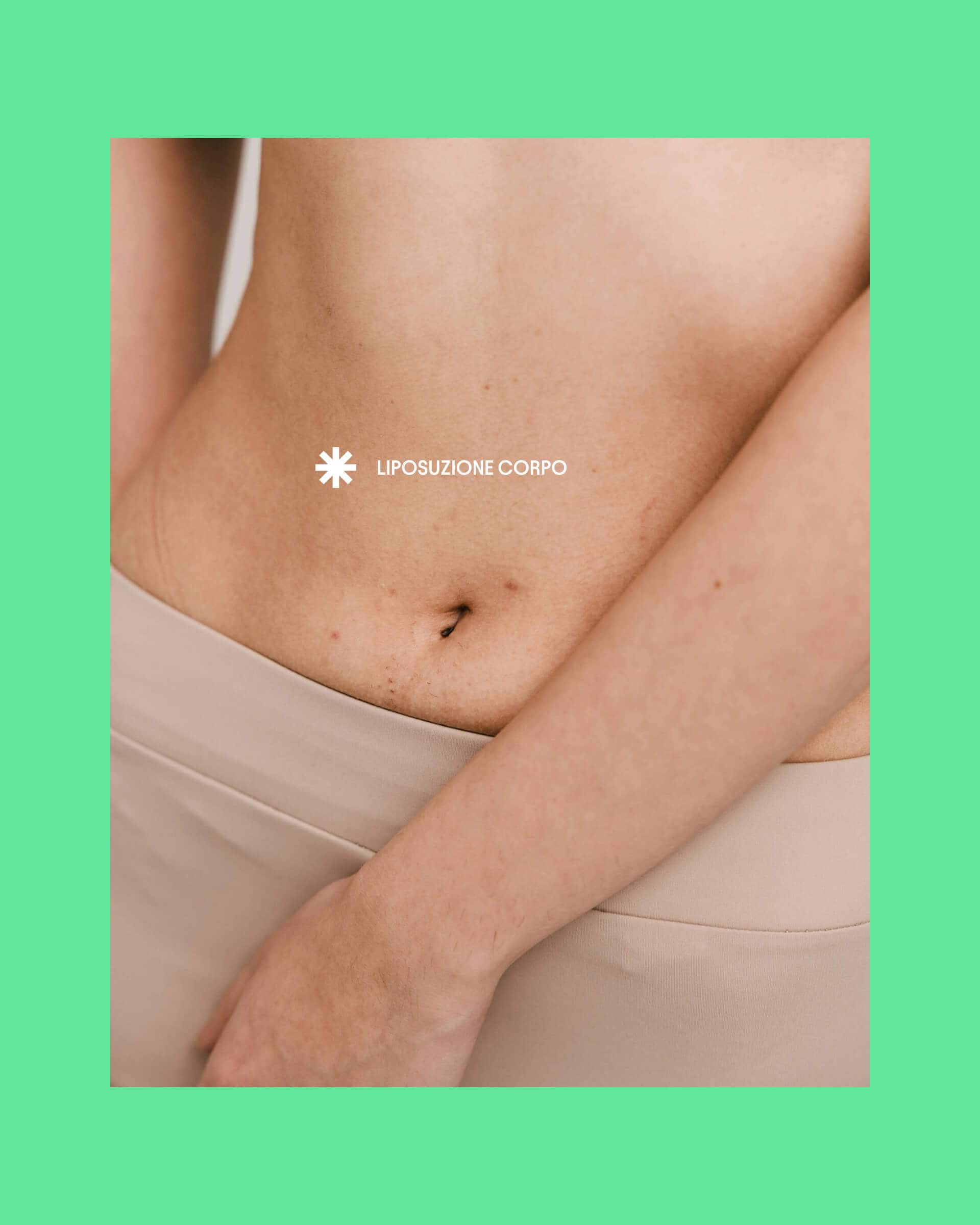
Ritocchini
Brand Identity, Logo, Claim, Website, Social Content
A brand identity that makes the brand contemporary without making it look fake.
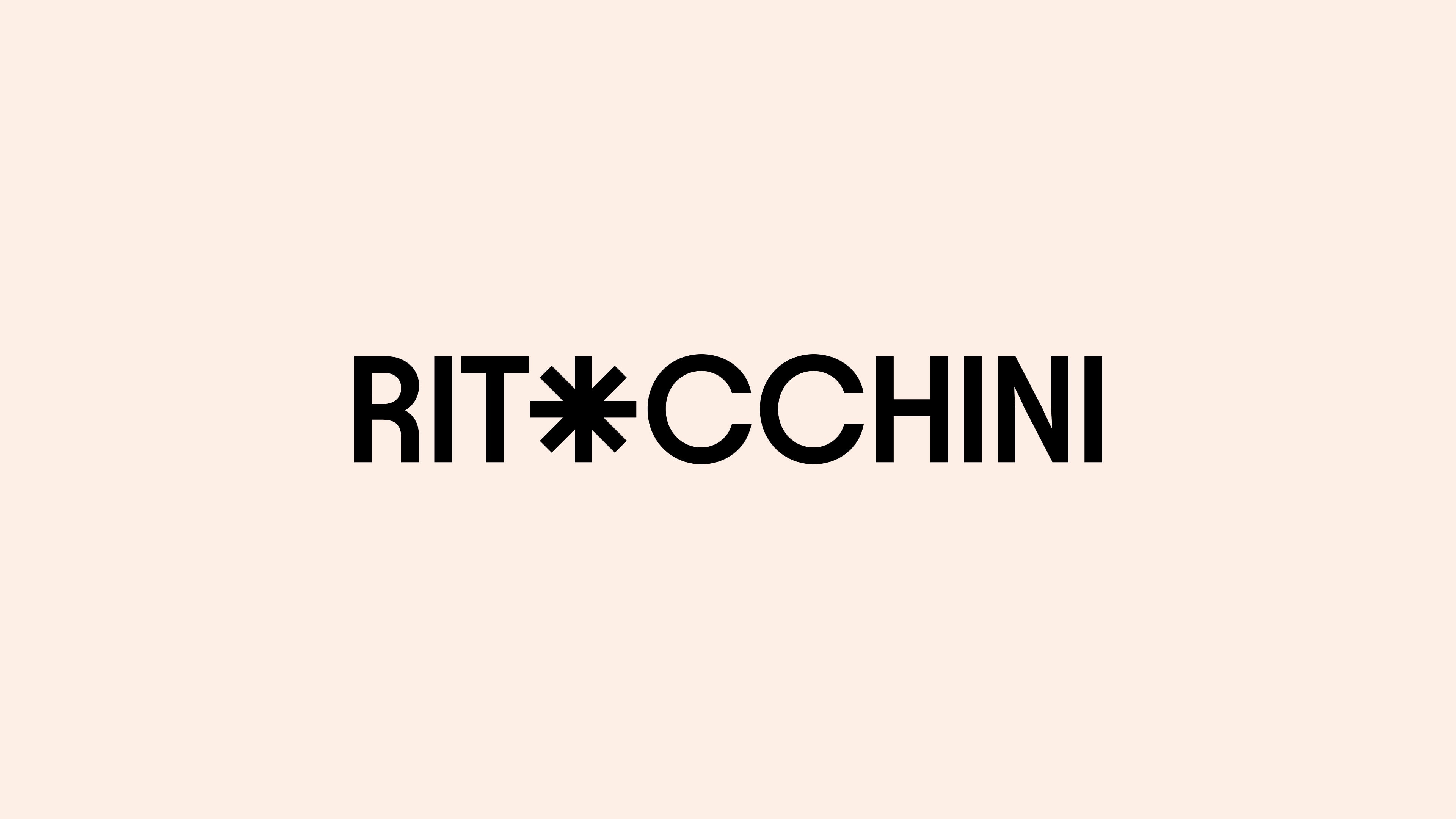
The brand identity comes from the same logic. The logo is flat, ultra-modern, built around an asterisk that becomes a recurring element across all branding applications. It’s a very interesting choice because it gives the system a simple, almost editorial mark that holds together cleanliness and character.
The visual identity is minimal, but not impersonal. The palette recalls skin tones on one side and the green of natural beauty on the other. Here too the consistency is very strong: there’s none of the coldness of certain medical codes, but none of the glamorous, artificial aesthetic that often dominates the industry either. There is instead a precise balance between elegance, naturalness and contemporaneity.
This is what makes Ritocchini’s identity interesting. It doesn’t try to look “more beautiful” than the industry. It tries to look more right for what the brand wants to say.
The ironic tone of voice works because it’s a position.
One of the most visible aspects of the project is of course the tone of voice. But here too it’s not the joke itself that counts: what counts is that irony, in Ritocchini, isn’t decoration but a strategic position.
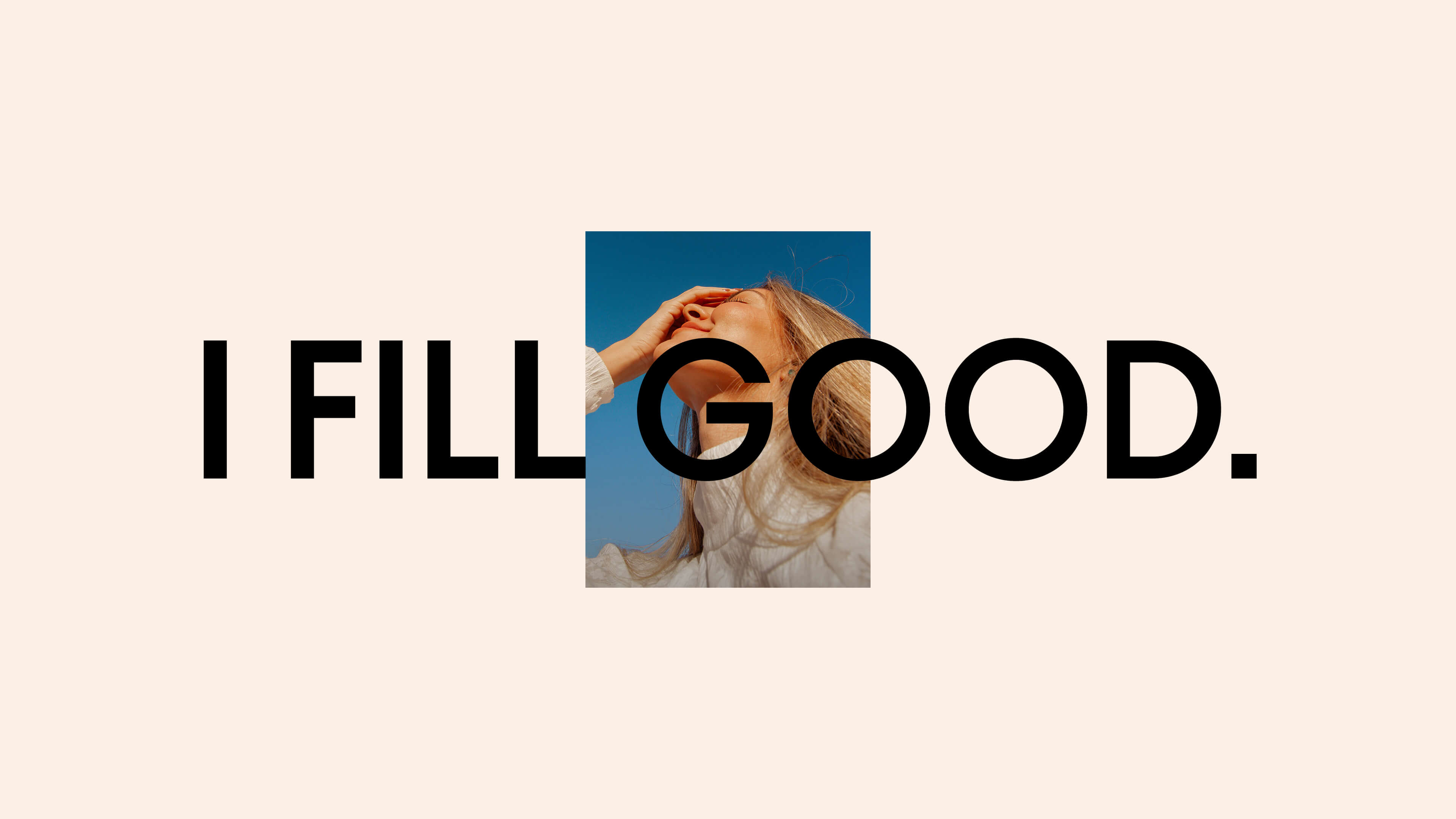
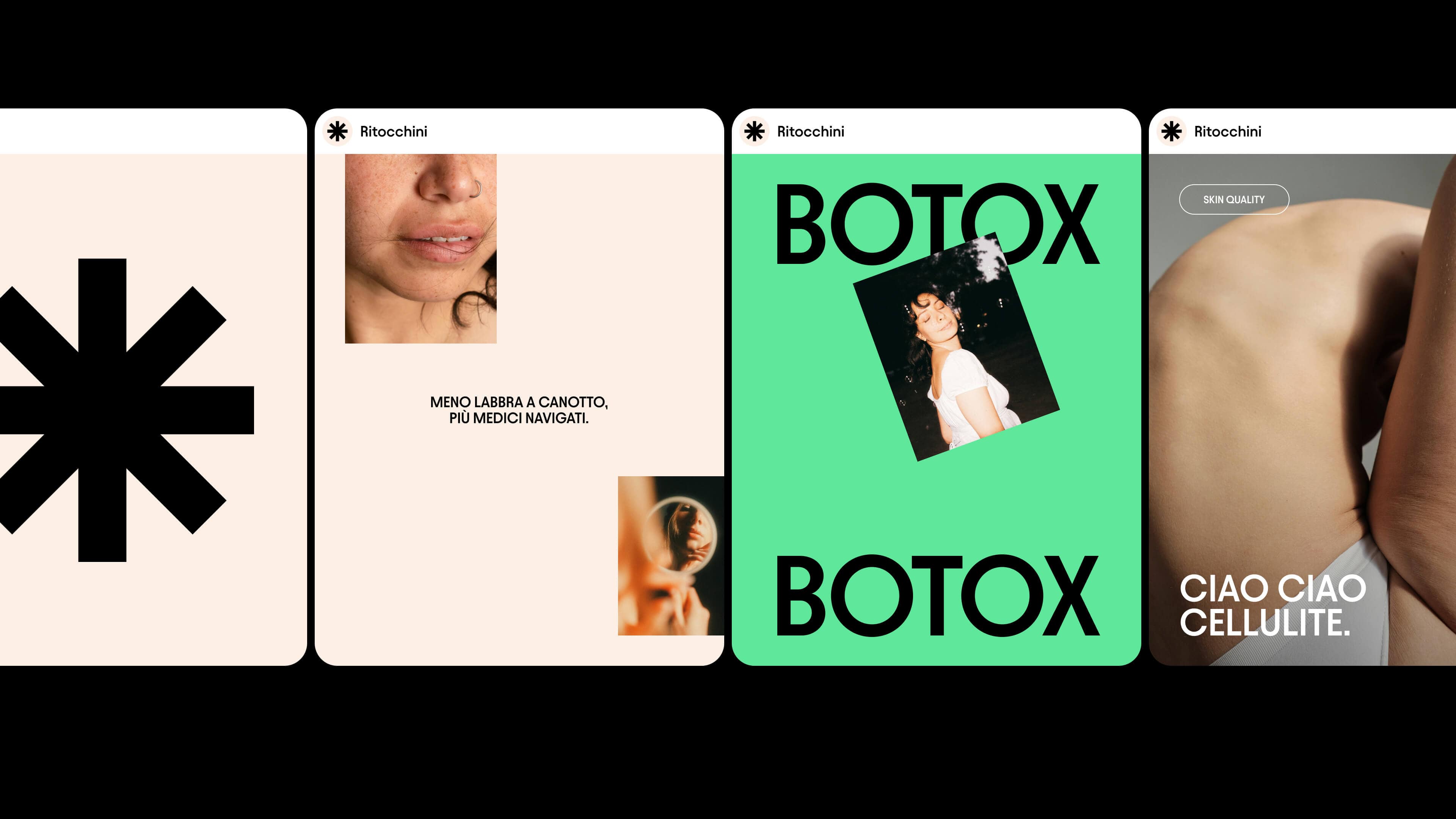
Headlines like “Fewer duck lips, more seasoned doctors” or “Fewer random jabs, more shots of self-esteem” aren’t just there to make people smile. They put a very precise message at the center: relying on a competent doctor is the first form of prevention. In other words, the lightness of the tone doesn’t lower medical credibility: it makes it clearer and closer.
This is where the project breaks the taboo of the industry’s language. Because it shows that you can talk about fillers and botox without falling into either cold rhetoric or sensationalism. You can be smart and authoritative. Bold, but not superficial. Pop, but not trivial.
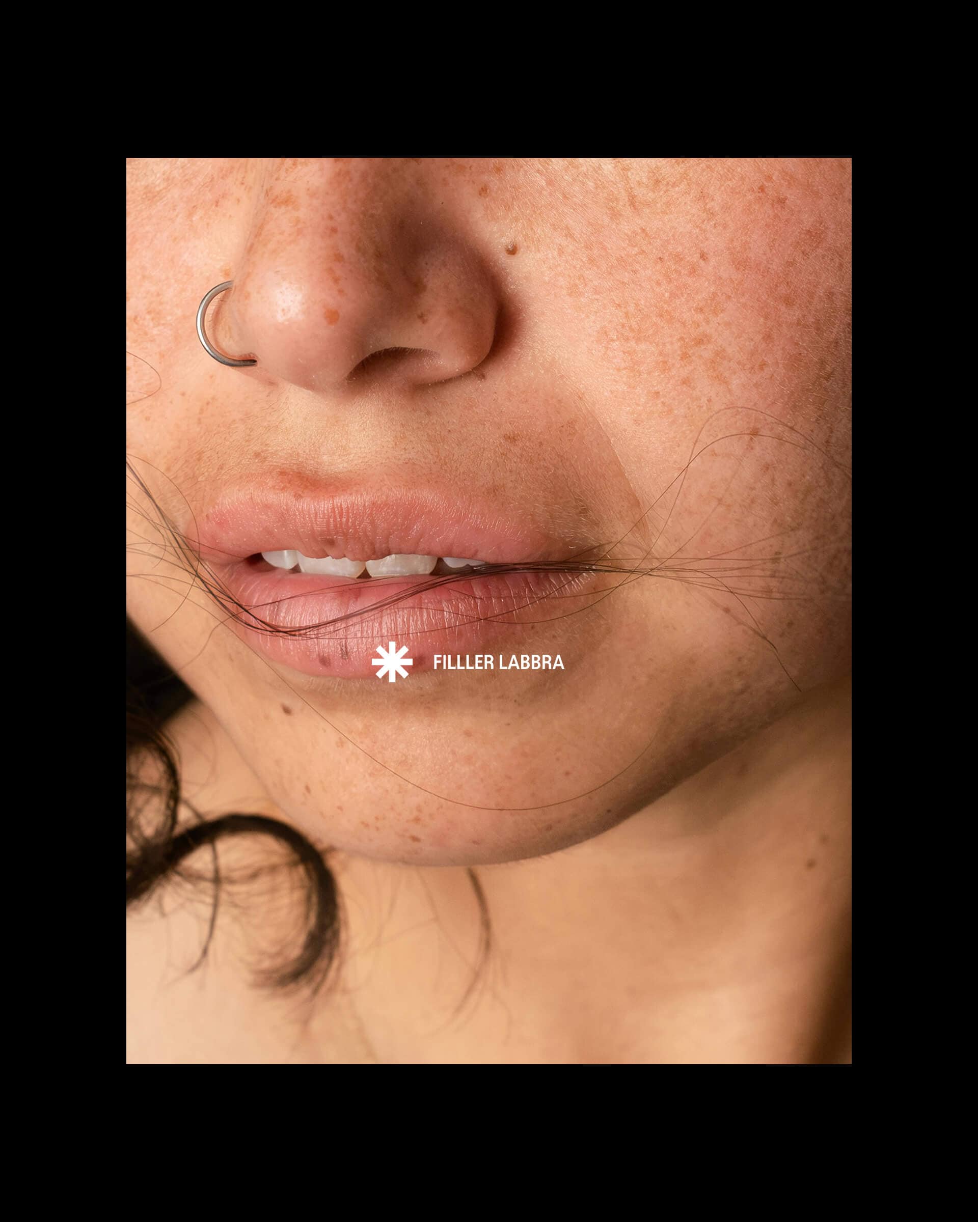
The website translates the positioning into an elegant, booking-oriented experience.
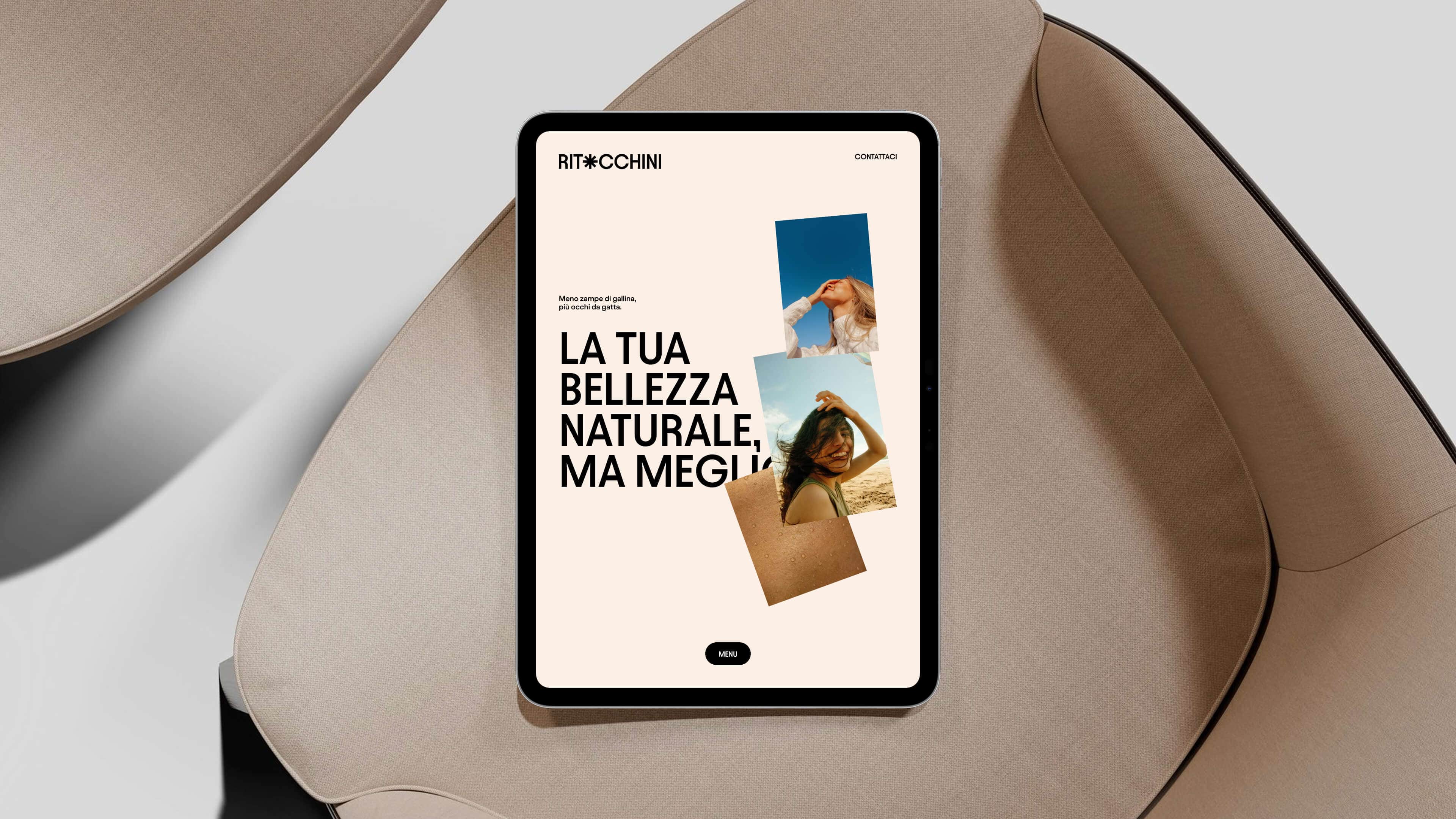
The website works in the same direction too. Not as a simple container of information, but as the digital translation of the entire positioning. As in all our website design work, the website doesn’t just present the brand: it stages it.
The experience is elegant and minimal. The architecture is designed to guide the user toward booking a visit with Dr. Savinelli. The treatments, Ritocchini for the face and Ritocchini for the body, are presented clearly, but without weighing the story down with the typical codes of traditional medical communication. Everything is built to highlight an approach that is non-invasive, respectful of natural features, precise but not distant.
This is one of the strongest points of the project. Because the website doesn’t just explain the services well: it makes people feel that this brand has a language of its own. And in an industry where websites often all look like variations of the same clinical or beauty aesthetic, this consistency makes a big difference.
Social media, too, helps change the perception of the industry.
The same goes for the launch social media content plan. The 16 launch posts weren’t conceived as simple calendar material, but as a consistent extension of the brand’s positioning.
The goal wasn’t to publish pleasant content. It was to build a clear narrative: less sensationalism, more competence. Fewer stereotypes, more authority. Less fear or confused fascination around aesthetic medicine, more understanding of what makes it useful, measured and sensible when guided by a competent professional.
This matters too, because it shows that branding doesn’t live only in the logo or the website, but in the way the brand keeps telling its story over time. And with Ritocchini this story stays consistent in every format.
Ritocchini breaks a taboo, and that’s why it works.
In the end, it all comes down to this. Ritocchini doesn’t try to look like the usual aesthetic medicine practice presented a little better. It tries to become something else: a brand that strips the industry of part of its rigidity, its coldness and its automatic language, giving it back to people in a more human, more competent and more contemporary form.
The break doesn’t lie in a single creative detail, but in the fact that everything works in the same direction: the ironic but precise name, the tagline, the minimal, natural visual identity, the smart, authoritative tone, the elegant, booking-oriented website, the consistent content plan and the Google Ads campaigns that turn the positioning into concrete results. The creative strategy doesn’t stop at the brand’s image. It goes all the way to performance.
This is what makes Ritocchini such a strong case. It doesn’t simply show that fresher communication is possible in aesthetic medicine. It shows that the way that world presents itself can be rethought from scratch, without losing medical credibility. On the contrary, making it finally clearer, more desirable and more effective.
In short, this is how we tackled the creative challenge of Ritocchini.
Ritocchini is an aesthetic medicine practice in Monza, Italy, for which we at YOHOHO handled a complete branding project: ironic naming (Ritocchini – Your natural beauty, only better), a minimal brand identity with an asterisk as a recurring element, a smart, authoritative tone of voice, a booking-oriented website, a launch social media content plan and Google Ads campaigns.
The case shows how communication for aesthetic medicine can be done in a contemporary, ironic and credible way, without falling into either cold rhetoric or sensationalism.
Dare to challenge us?
Tell us about your healthcare brand:
bebrave@yohoho.studio