CAPOHA: why copying your competitors is the best way to become invisible.
The Capoha case shows that even in engineering consultancy, building a disruptive B2B brand identity doesn’t mean looking less serious. It means building an identity so sharp that it sticks.
There are industries where almost every company seems afraid to take a stand. It often happens in B2B, especially when it comes to technical consultancy, engineering, processes, industrial innovation. The websites look alike, the names blur together, the tones of voice seem written by the same invisible marketing department. Everyone wants to come across as reliable and solid. And so, in trying to look serious, they end up looking interchangeable.
It’s a far more widespread problem than it seems. Because when a brand chooses to speak like its industry, it almost always gives up the chance to be remembered. It adapts to the dominant codes, repeats them, maybe executes them well. But meanwhile it disappears into the background.
For us, Capoha is an interesting case for this reason. Because it let us work on a question that matters enormously in B2B: how do you build a recognizable brand identity in an industry where everyone thinks standing out is risky?
In B2B, conformism disguises itself as credibility.
Many technical or consulting companies reason more or less like this: if competitors present themselves a certain way, then that must be the right way to look credible. A sober name, neutral language, a measured identity, a clean website, a vocabulary full of correct words but with no energy at all. It’s an understandable logic. But it often produces a fragile result.
Because credibility doesn’t come automatically from conformism. Quite the opposite. When everyone adopts the same codes, no one manages to stand out. And then the brand may well be serious and structured, but in terms of perception it stays in the background: it doesn’t leave a mark, doesn’t create memory, doesn’t build a stance.
This, in our view, is where creative strategy becomes decisive. Not to make a company eccentric at all costs, but to understand where its real difference lies and finally give it a sharp form. It’s exactly the kind of work we describe in our approach to branding.
Capoha comes from a precise break within the industry’s language.
In working on Capoha, the first point was exactly this: keeping a new engineering consultancy holding from ending up looking like yet another company in its industry.
The project started from a very strong base: a group of leading engineering consultancy companies, including PPC, Alcadia, Paros, Agorà and Genios, had joined forces to build a new holding, with a very clear goal: becoming an inspirational point of reference for the best young engineers coming out of universities.
The problem, then, wasn’t just creating a correct corporate identity. It was building a brand that could assert itself: authoritative, yes, but also new and ambitious, and able to stand apart not only from competitors, but also from the somewhat tired world through which engineering consultancy often presents itself.
That’s where Capoha comes from.
A Dante-inspired company name, bold and impossible to mix up.
The first decisive choice was the name. Capoha comes from Dante, from the saying “Cosa fatta capo ha” (roughly, “what’s done is done”). But in the form CAPOHA that quotation changes nature: it stops being merely literary and becomes an exotic, modern, almost unexpected neologism.
Here the project does something rare in B2B: it finds a name that is cultured, authoritative and surprising all at once. Not an acronym, not a merger of corporate words, not an exercise in standardized international English, but a statement.
This point is fundamental. Because Capoha doesn’t seek brand differentiation through extravagance. It seeks it through precision. The name carries a very clear idea: something that has been decided, done, accomplished. It’s a name that closes, that asserts, that leaves no room for vagueness. And from there you already understand that the brand doesn’t want to talk like everyone else.
An identity that doesn’t allow the conditional.
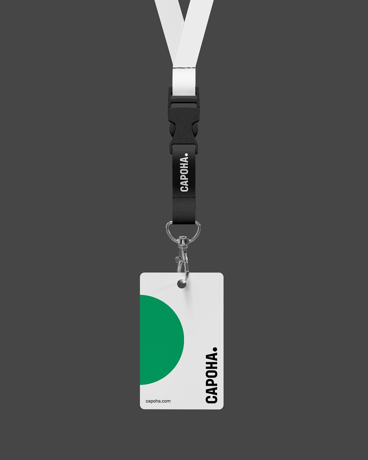
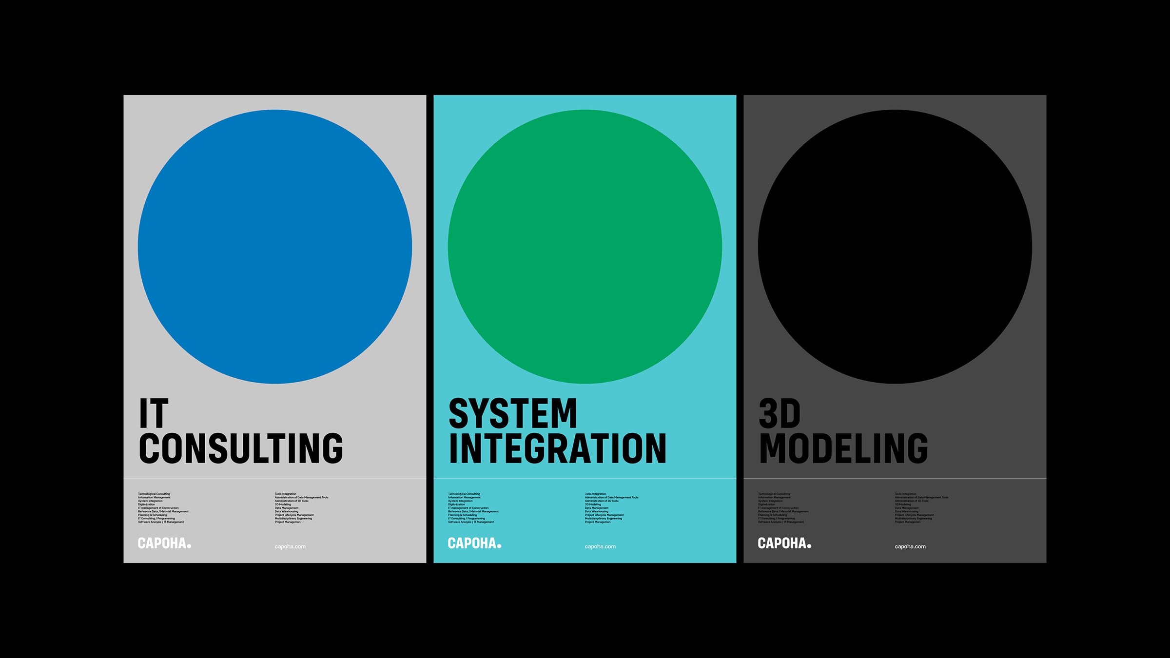
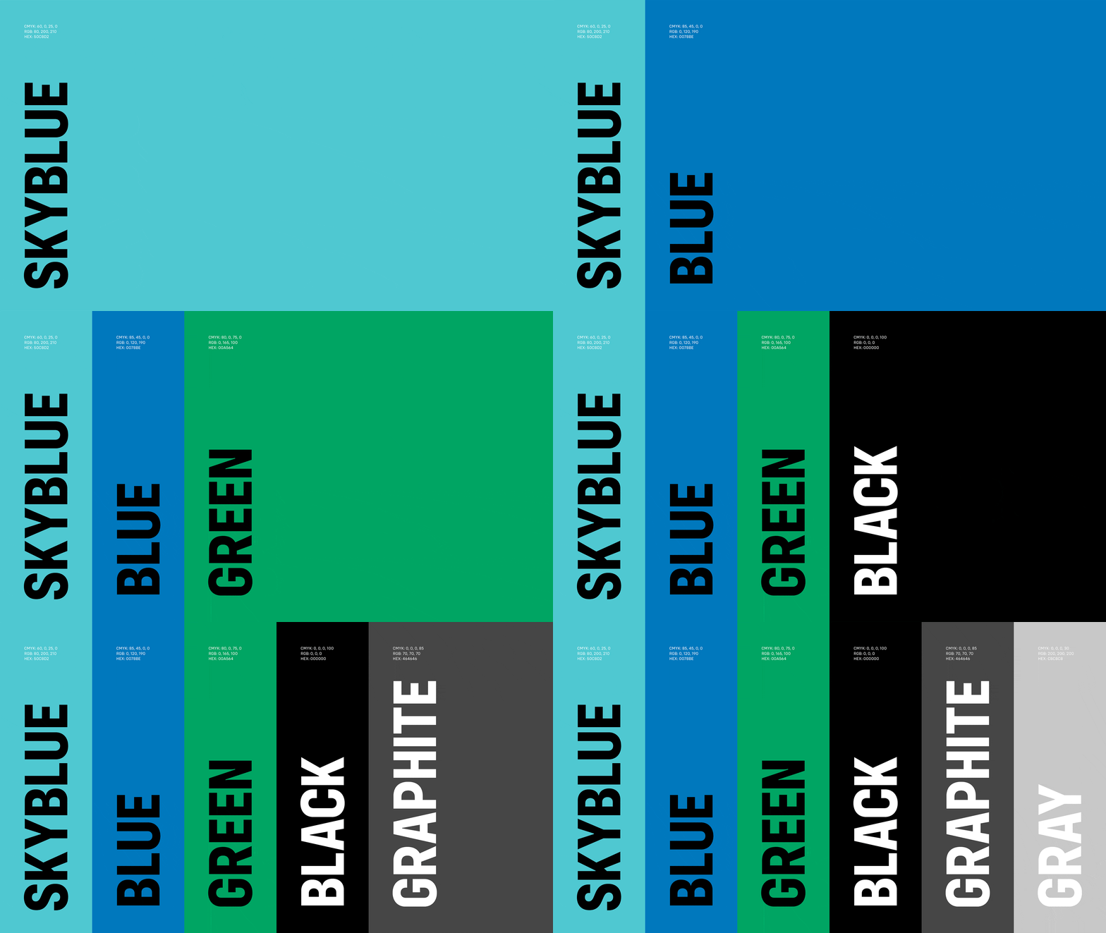
Once the name was found, everything else took shape with great consistency. We built a bold corporate identity and a pragmatic, authoritative tone of voice, a language that doesn’t allow the conditional. Here too the difference doesn’t lie in making more noise, but in coming across as sharper.
This, in our view, is the interesting point of the project. Many B2B brands think they have to look cautious to be credible. Capoha does the opposite: it chooses a decisive, lean stance. It doesn’t try to reassure through neutrality, it builds authority through clarity.
And it’s a huge difference. Because in an industry where so many speak impersonally, being crisp is already a way of standing out.
The period as a sign of certainty.
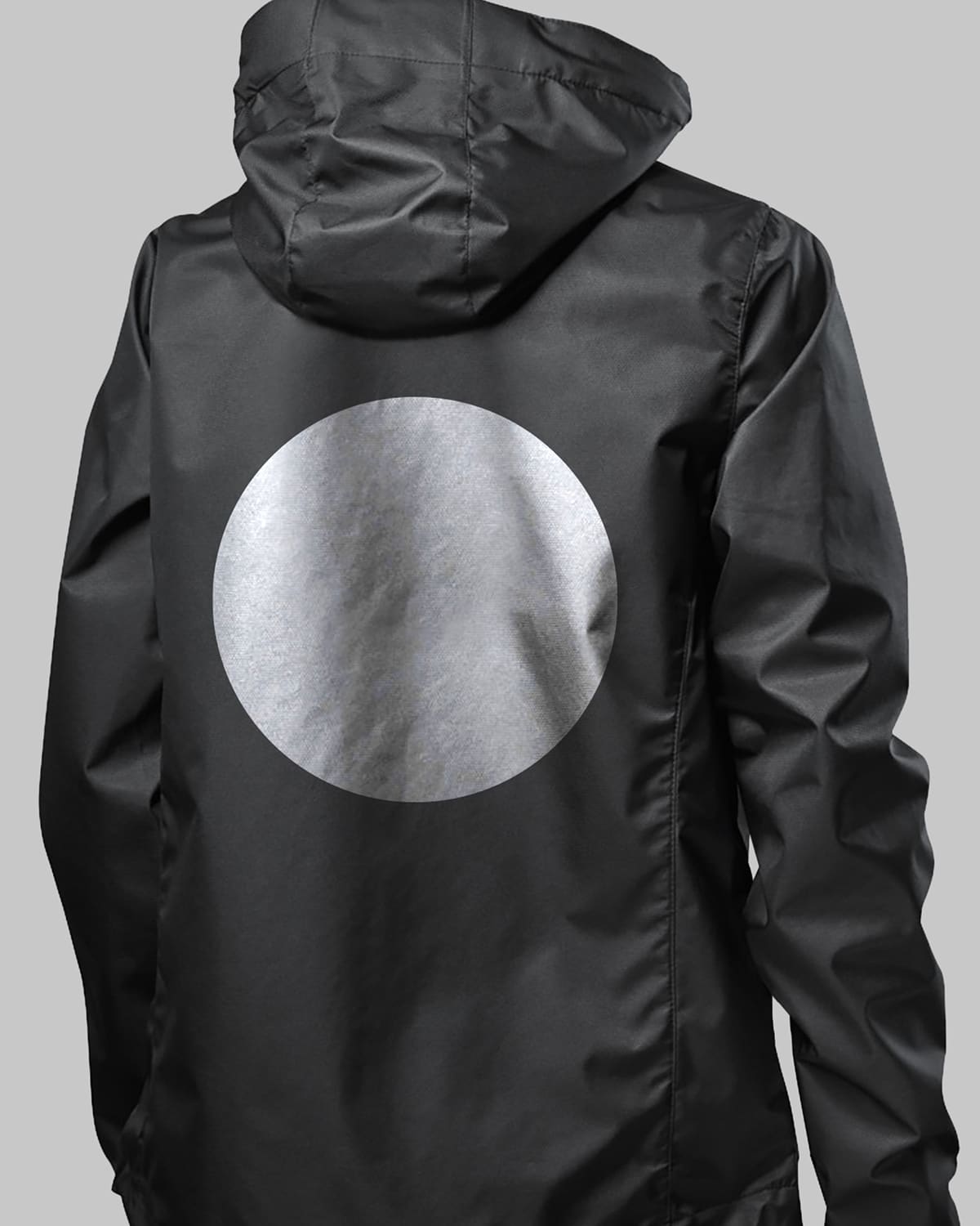
The visual identity works in exactly the same direction. The key element of the system is the period: a seemingly minimal mark, but in fact a very powerful one. It’s the period of a company aware that it can bring any project to completion, even the most complex. It’s the sign of conclusion, of certainty, of the sentence that closes without hesitation.
We like this a lot, because it shows that difference doesn’t always come from a complicated graphic gesture. Sometimes it comes from a very simple mark, as long as it’s loaded with the right meaning and supported by the rest of the brand.
With Capoha that’s exactly what happens: the period isn’t a decorative detail, but a synthesis of the positioning. It visually translates the same attitude the name and the tone of voice had already built.
The website says it too: here we’re not like the others.
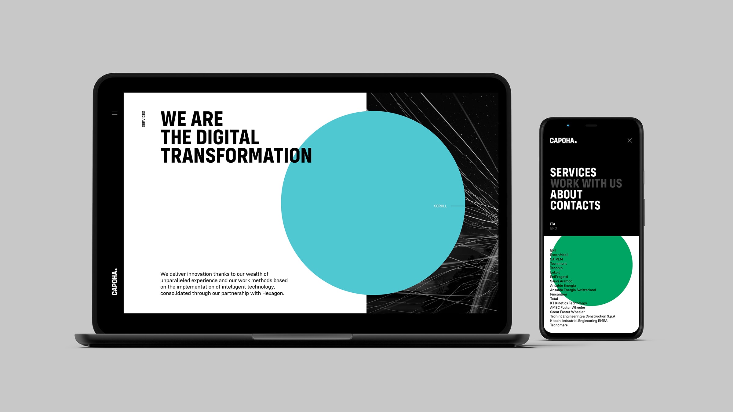
The work of differentiation didn’t stop at naming or visual identity. It reached the website, where we tried to make Capoha different from any competitor in every detail, even the smallest. It’s the same principle that guides our approach to website design: the website is never a neutral container, but a space where the brand’s positioning becomes a concrete experience.
Not only in the clarity of the messages, but also in the browsing experience. The horizontal scroll, for example, isn’t a quirk, but a choice that immediately signals a different design intention: it says we’re not looking at yet another B2B website built on a grammar we’ve seen before, and that the brand has a presence and a form of its own even in the way you move through it.
And this is another important point. Because when a project is well built, the difference isn’t concentrated in a single element. It’s spread everywhere: in the name, in the tone, in the graphic mark, in the website, in the rhythm of the experience. Every part confirms the others.
What the Capoha case really shows.
For us, Capoha shows one simple thing: in B2B, copying your competitors’ codes isn’t a form of caution, but often a form of invisibility. It’s the same logic we apply to every communication project for startups and small businesses: standing out is never a risk, when the difference comes from a clear strategy.
Of course standing out doesn’t mean inventing something arbitrary or decorative. It doesn’t mean making noise, or being creative for no reason. It means identifying what makes a brand different and finding the most precise, most memorable form to bring it out.
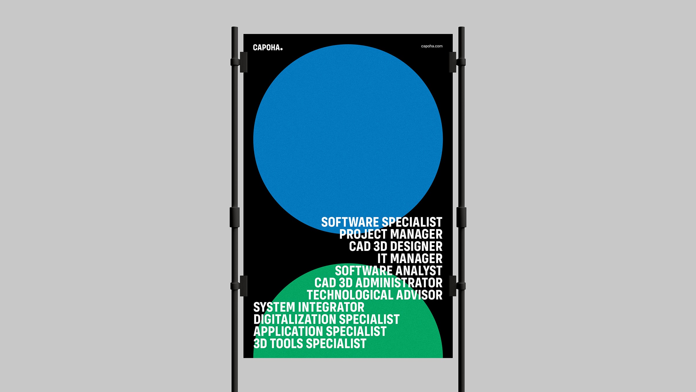
In Capoha’s case, this form comes from a very rare combination: a Dante quotation turned into a contemporary company name, a tone of voice that doesn’t hesitate, a bold identity and a visual system founded on the period as a symbol of certainty and completion. Everything works in the same direction. Everything says: here’s a brand that knows who it is.
Capoha
Naming, Logo, Claim, Visual Identity, UI / UX, Web Development
Capoha doesn’t look like anyone else, and that’s the point.
The center of the project is perhaps here. Because in the end Capoha doesn’t only tell the story of an engineering consultancy holding. It tells a different way of being in its own market.
Not the way of those who copy the outward signals of credibility, but of those who build a voice, a form, a presence of their own. In an industry where so many look for reassurance through worn-out codes, Capoha chooses a sharper path: staying serious, technical, authoritative, but without becoming invisible.
This is its difference: it doesn’t try to look “the way it’s supposed to”, it tries to look like itself. In the B2B landscape, that’s no small thing.
In short, this is how we worked for Capoha.
Capoha is an engineering consultancy holding born from the union of five leading companies in the industry: PPC, Alcadia, Paros, Agorà and Genios. At YOHOHO we handled the entire B2B brand identity project: from the company name (inspired by Dante’s saying “Cosa fatta capo ha”) to the bold visual identity, the assertive tone of voice and the website with horizontal scroll.
The project shows that even in a technical, conservative industry like engineering consultancy it’s possible to build a brand positioning that breaks the mold, recognizable and hard to forget, without giving up authority.
Dare to challenge us?
Tell us about your B2B project:
bebrave@yohoho.studio