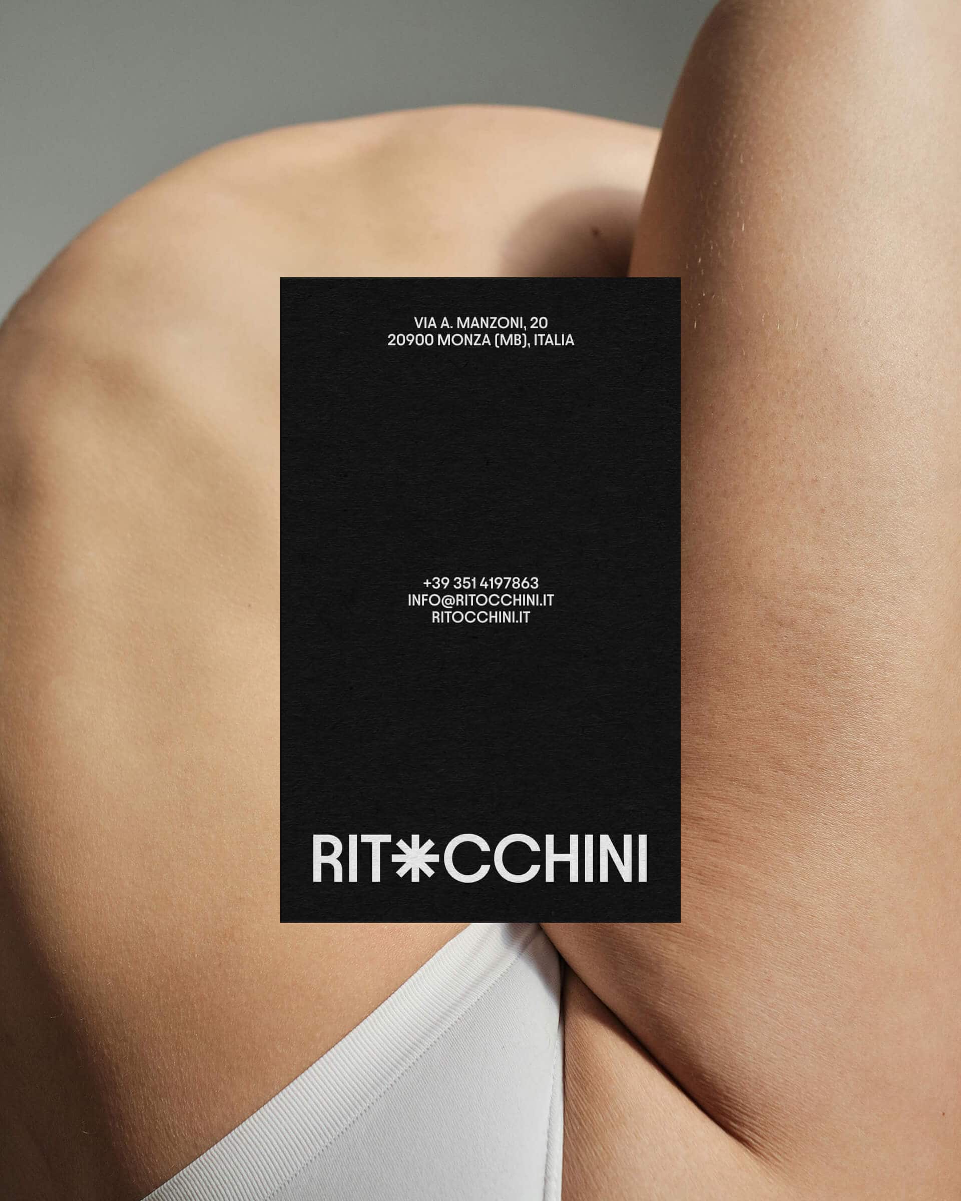
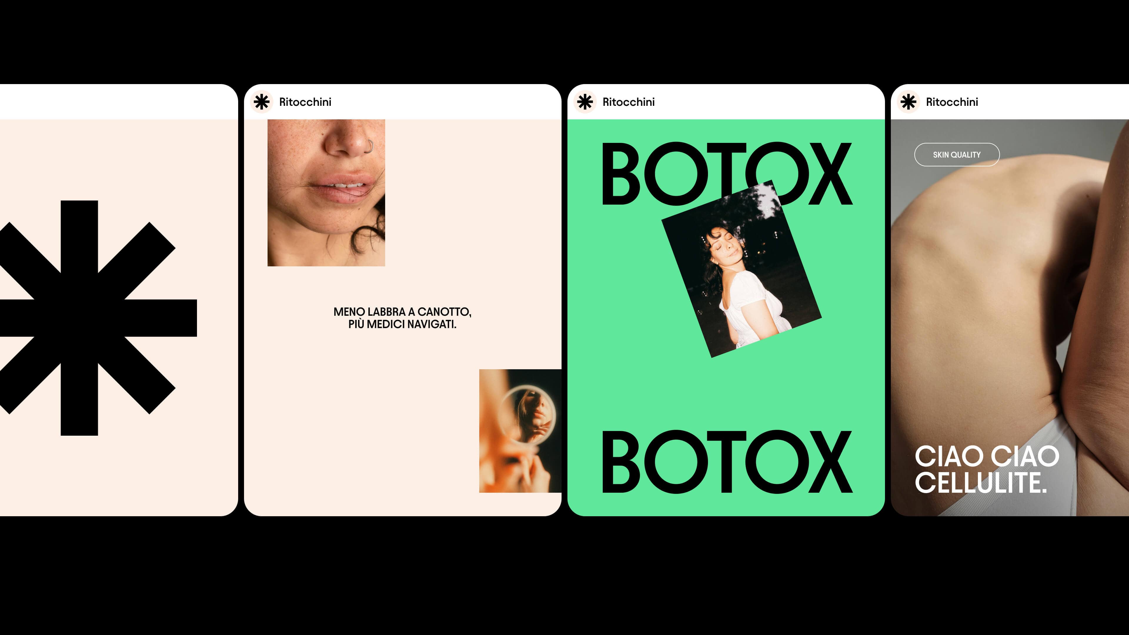
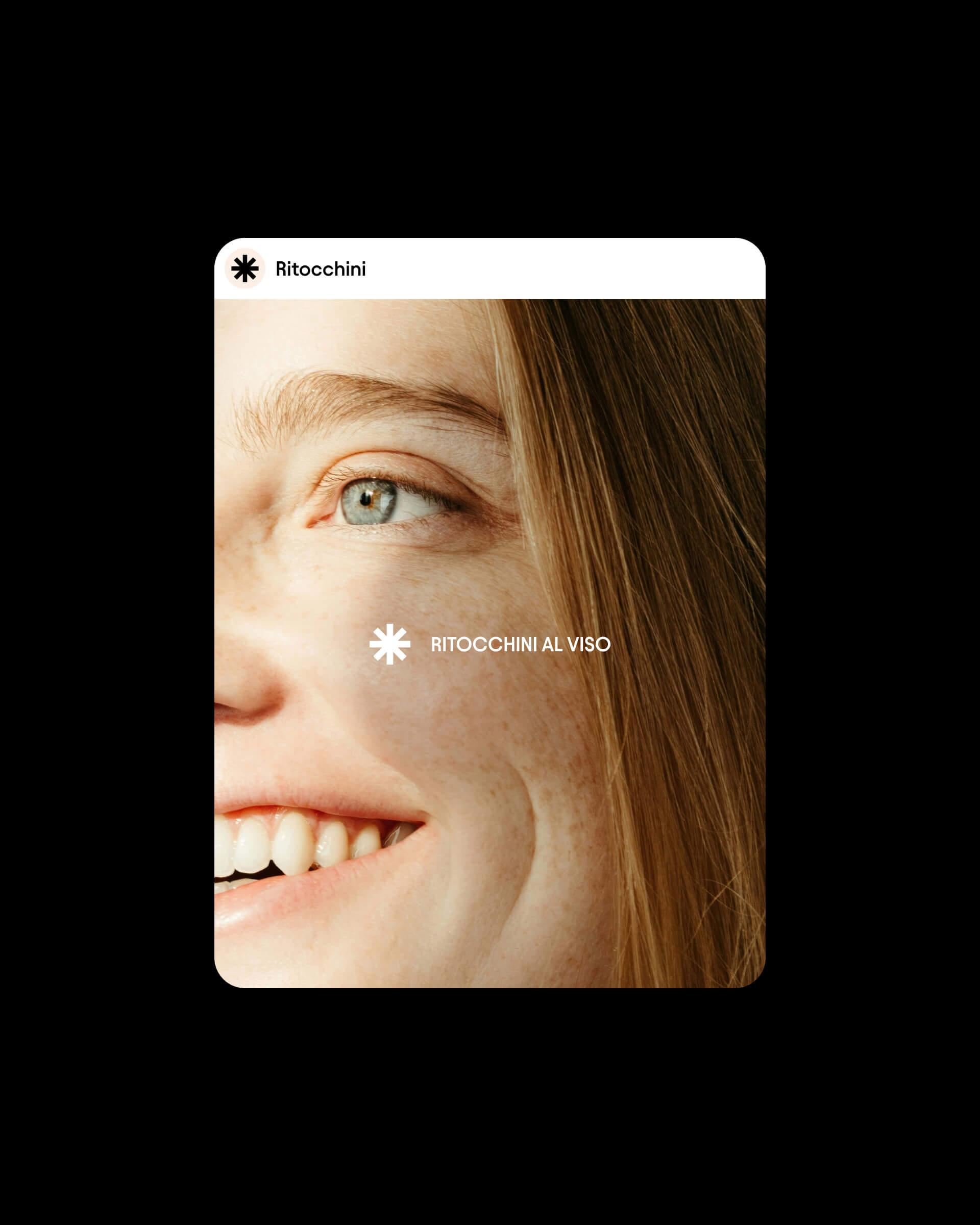
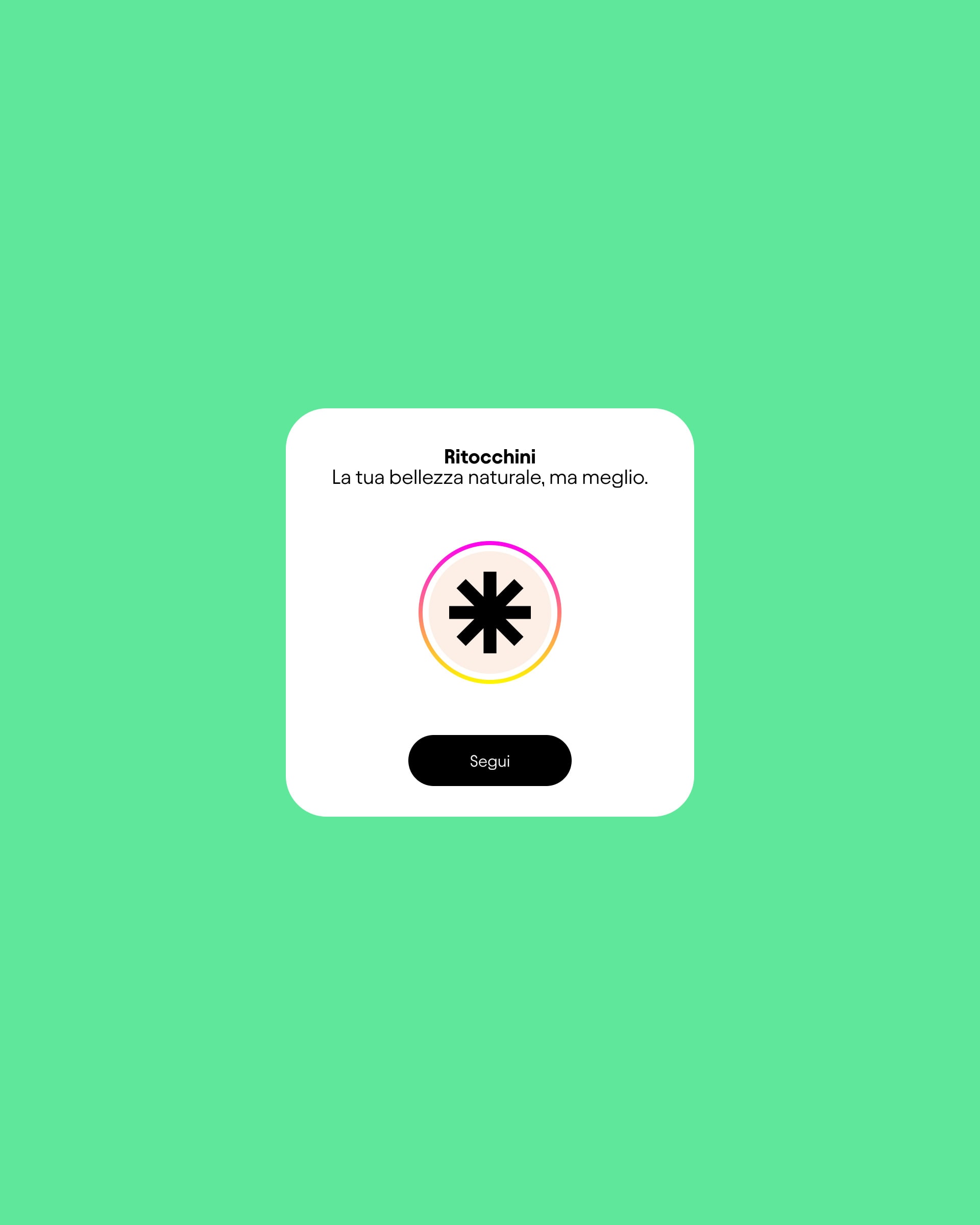
Ritocchini
When we were asked to build the Ritocchini brand from the ground up, the challenge was clear: how could we make a sector often trapped in overly serious language feel pop and accessible, without losing authority and medical credibility?
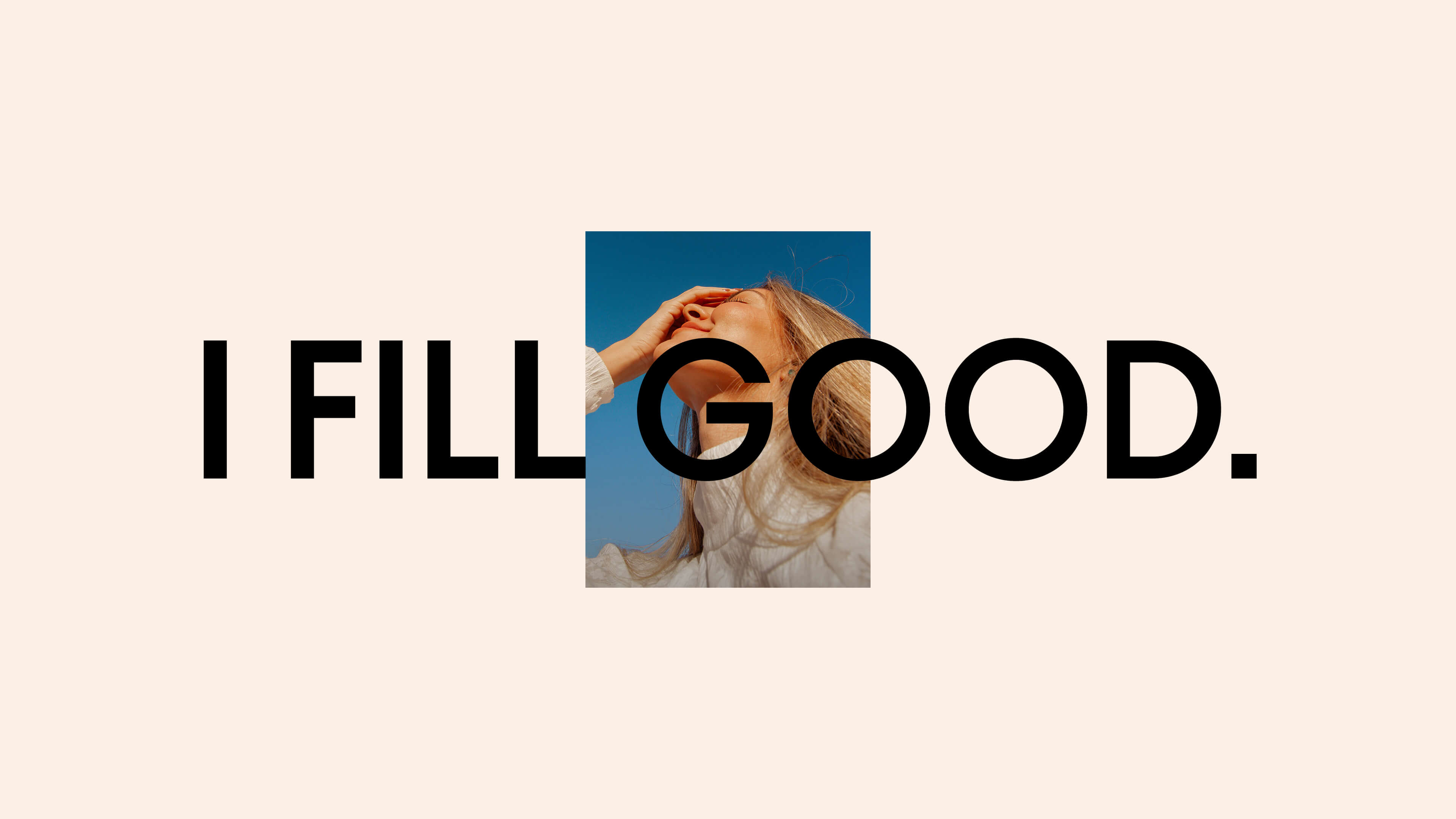
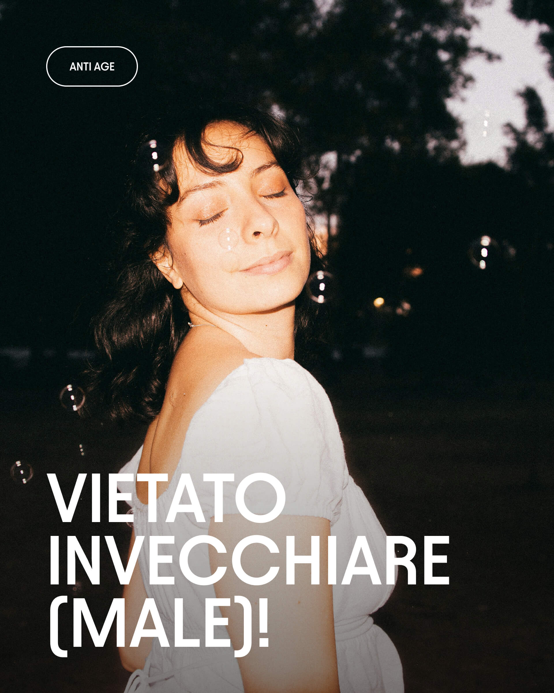
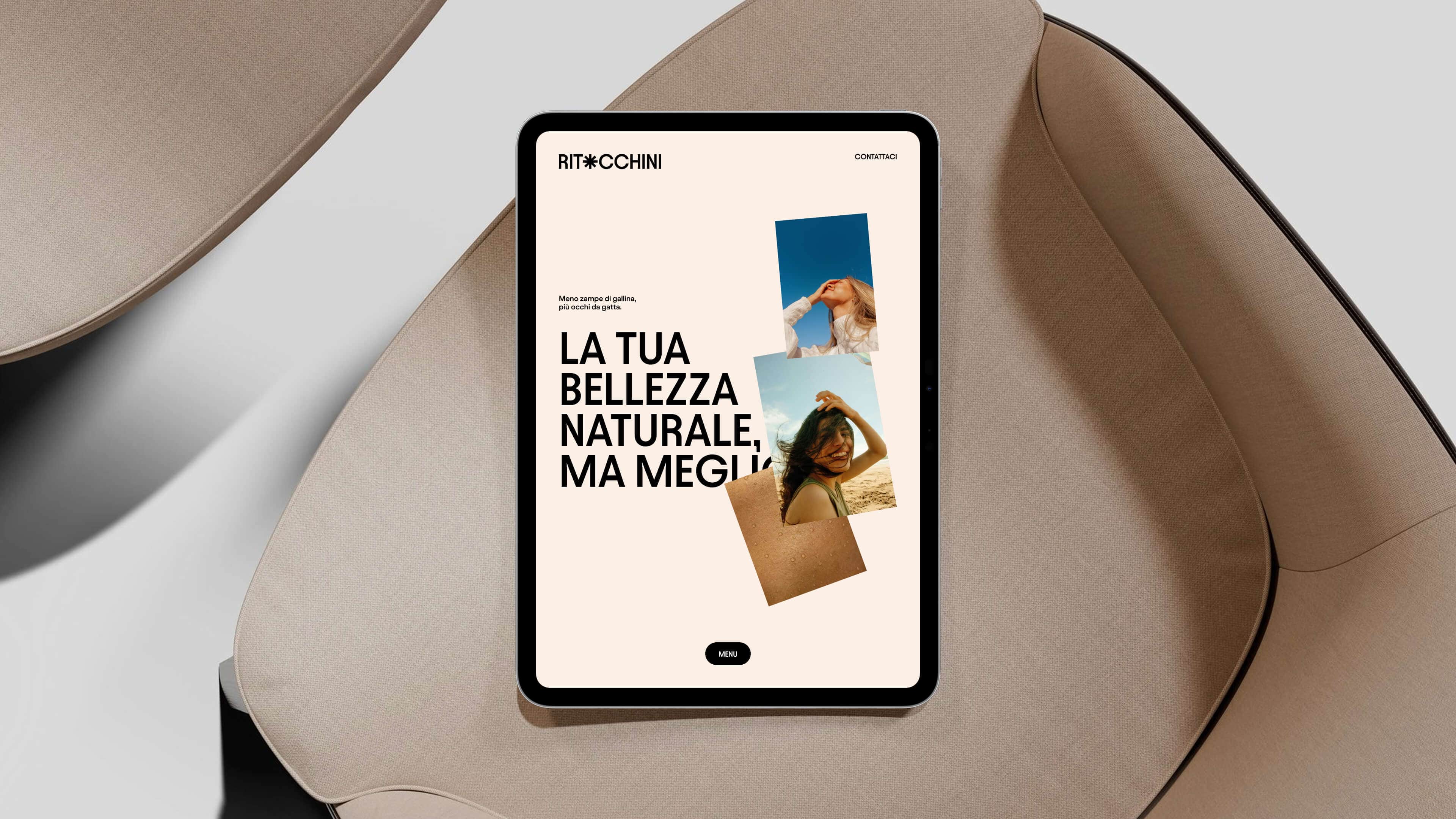
We started with the naming and the claim. “Ritocchini – Your natural beauty, only better” is an ironic and striking choice, designed to soften the prejudices surrounding aesthetic medicine and bring it back to its most authentic dimension.
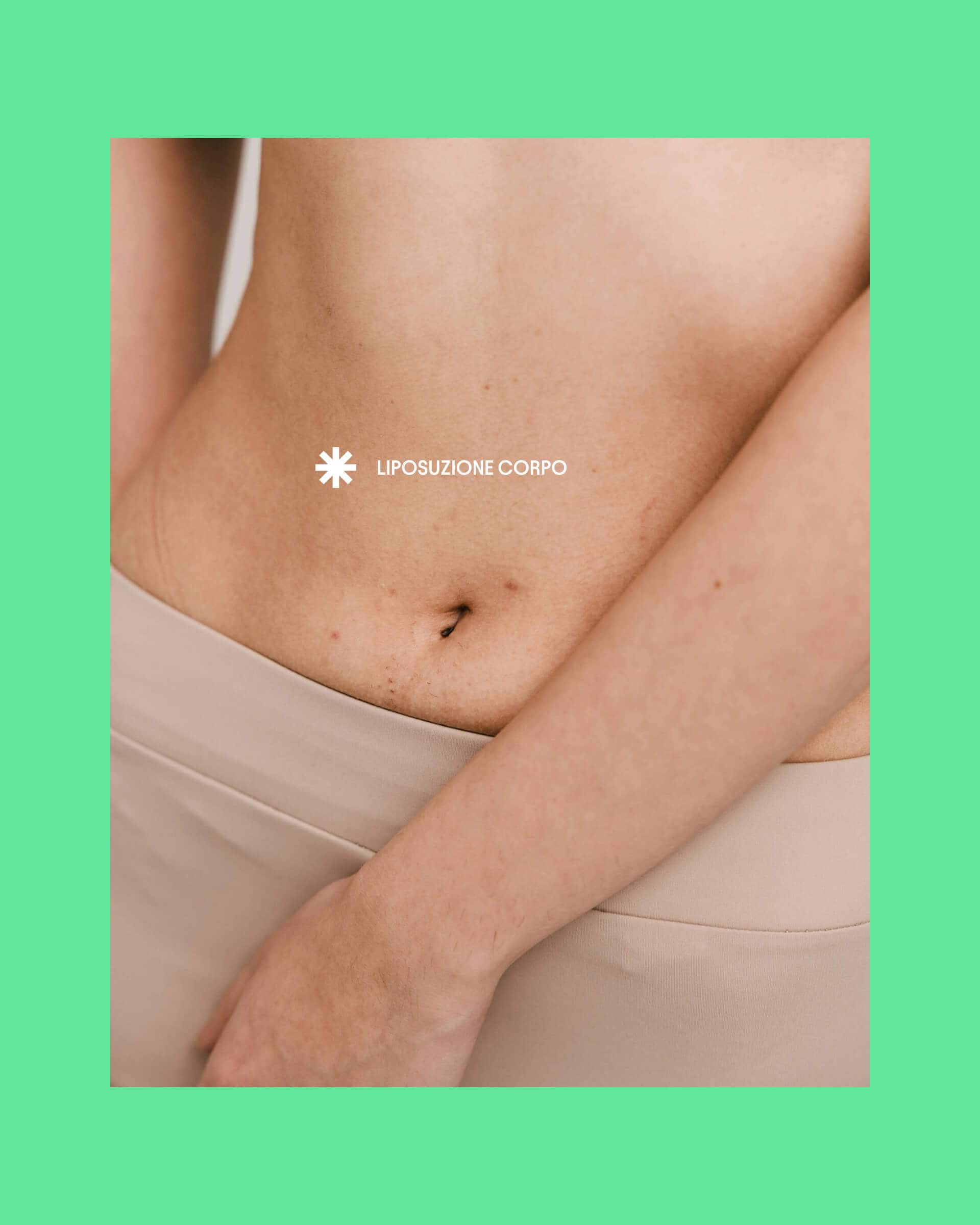
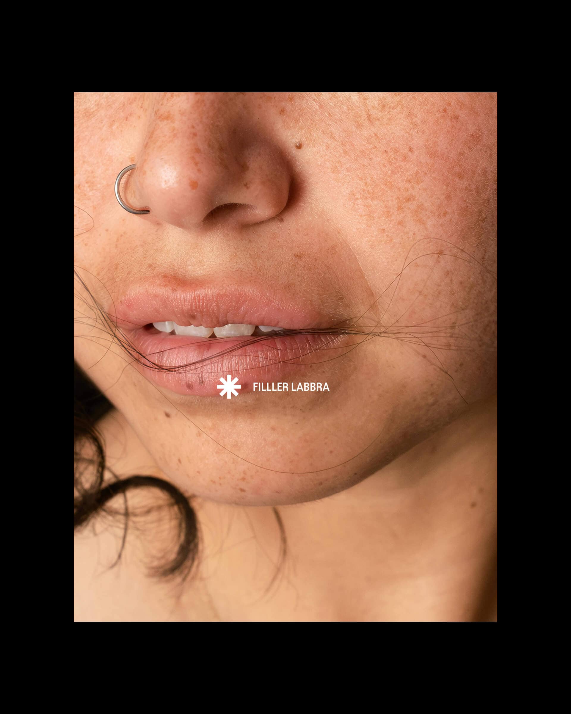
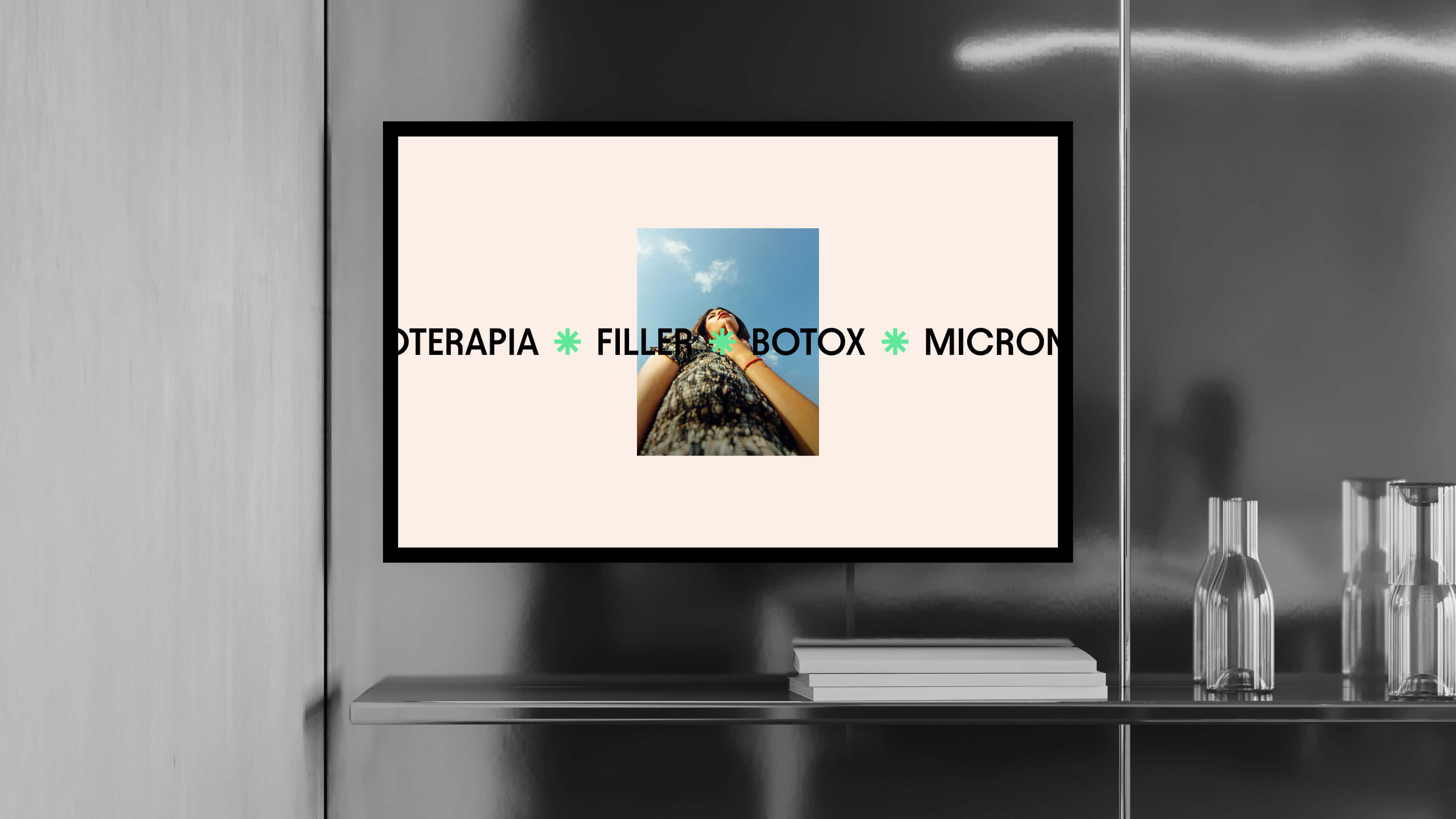
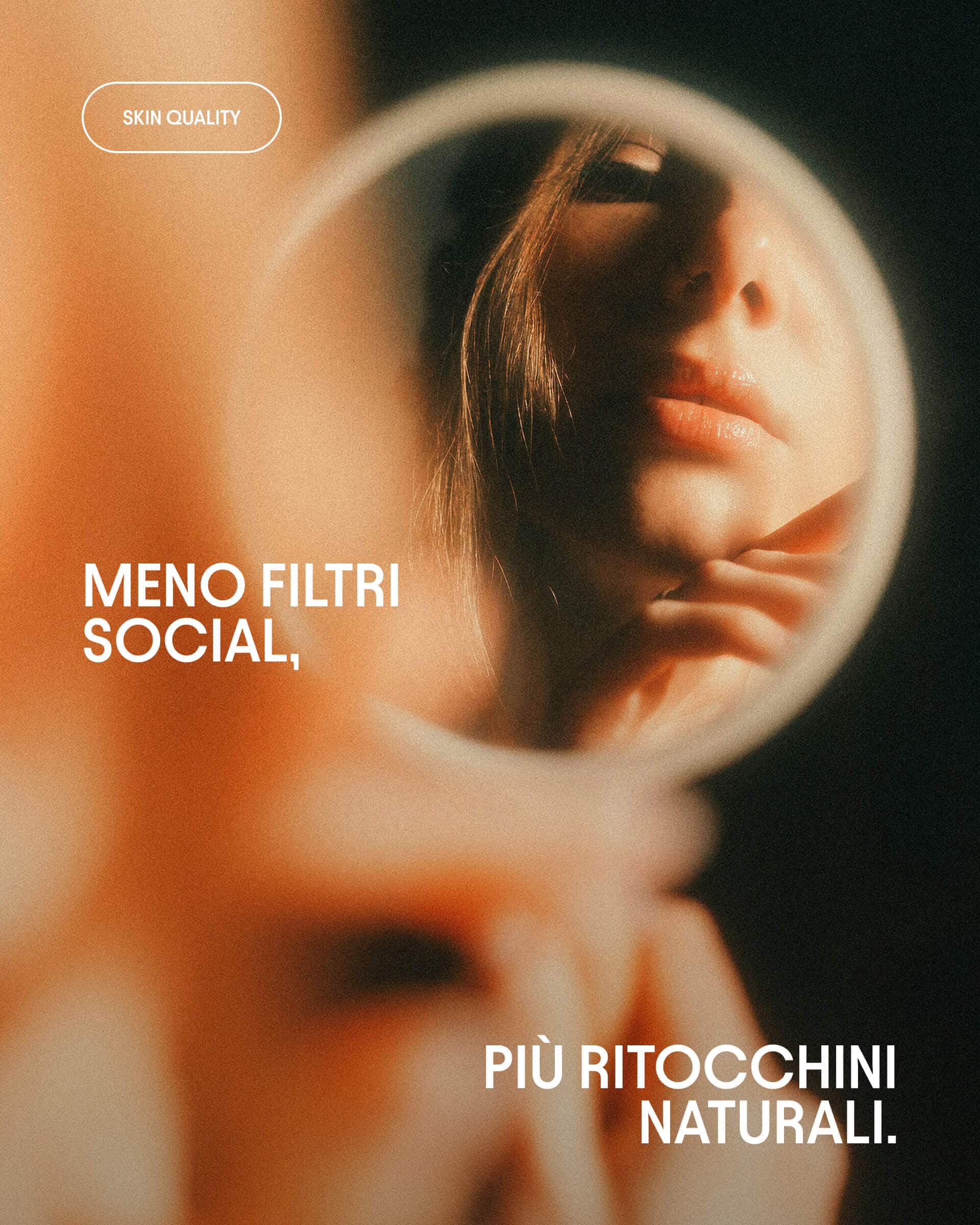
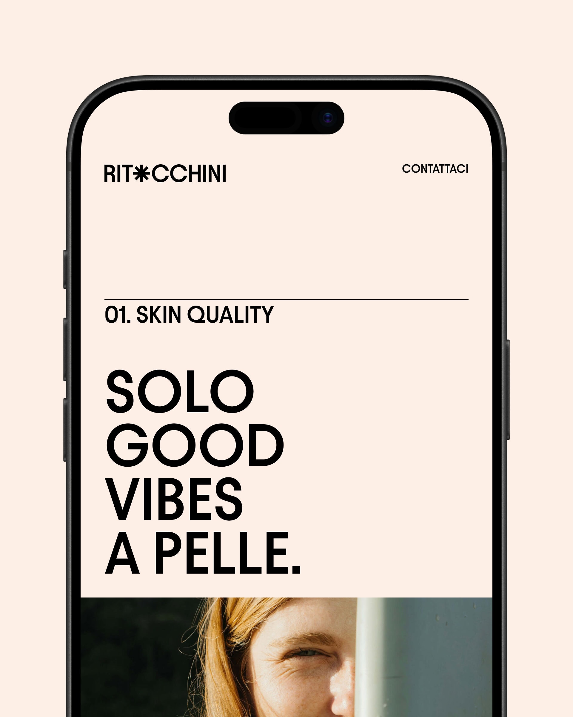
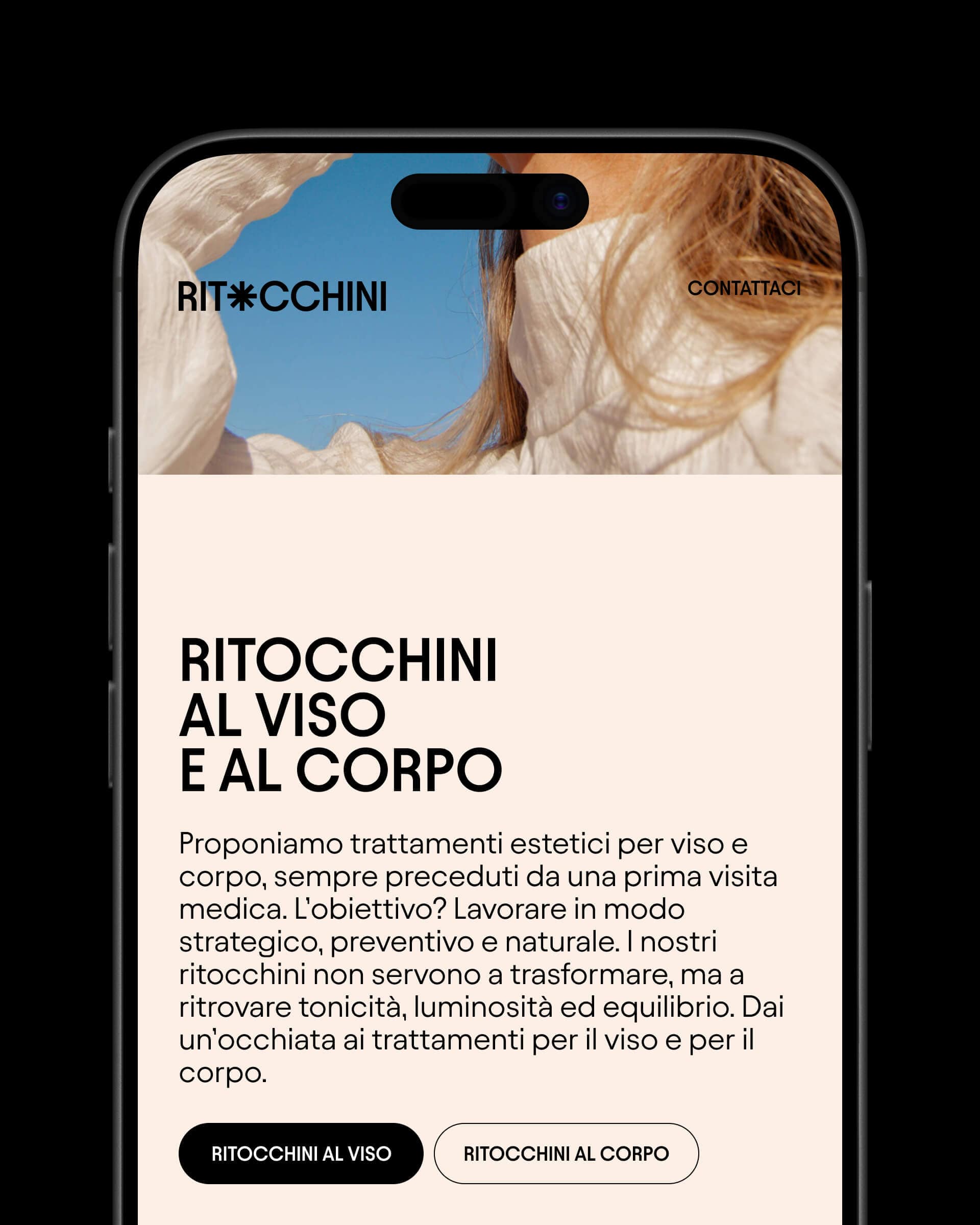
The website, elegant and minimal, highlights Dr. Savinelli’s non-invasive approach while respecting the natural harmony of the features.
We launched a social plan fully aligned with the brand’s positioning. We also rolled out a Google Ads campaign that generated more than one booking request per day between Monza and Milan.
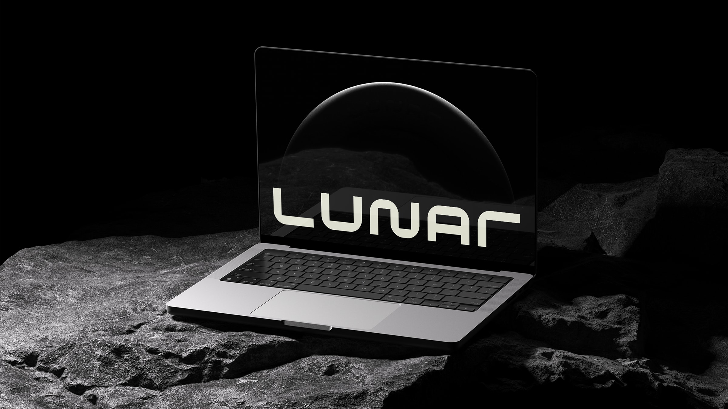
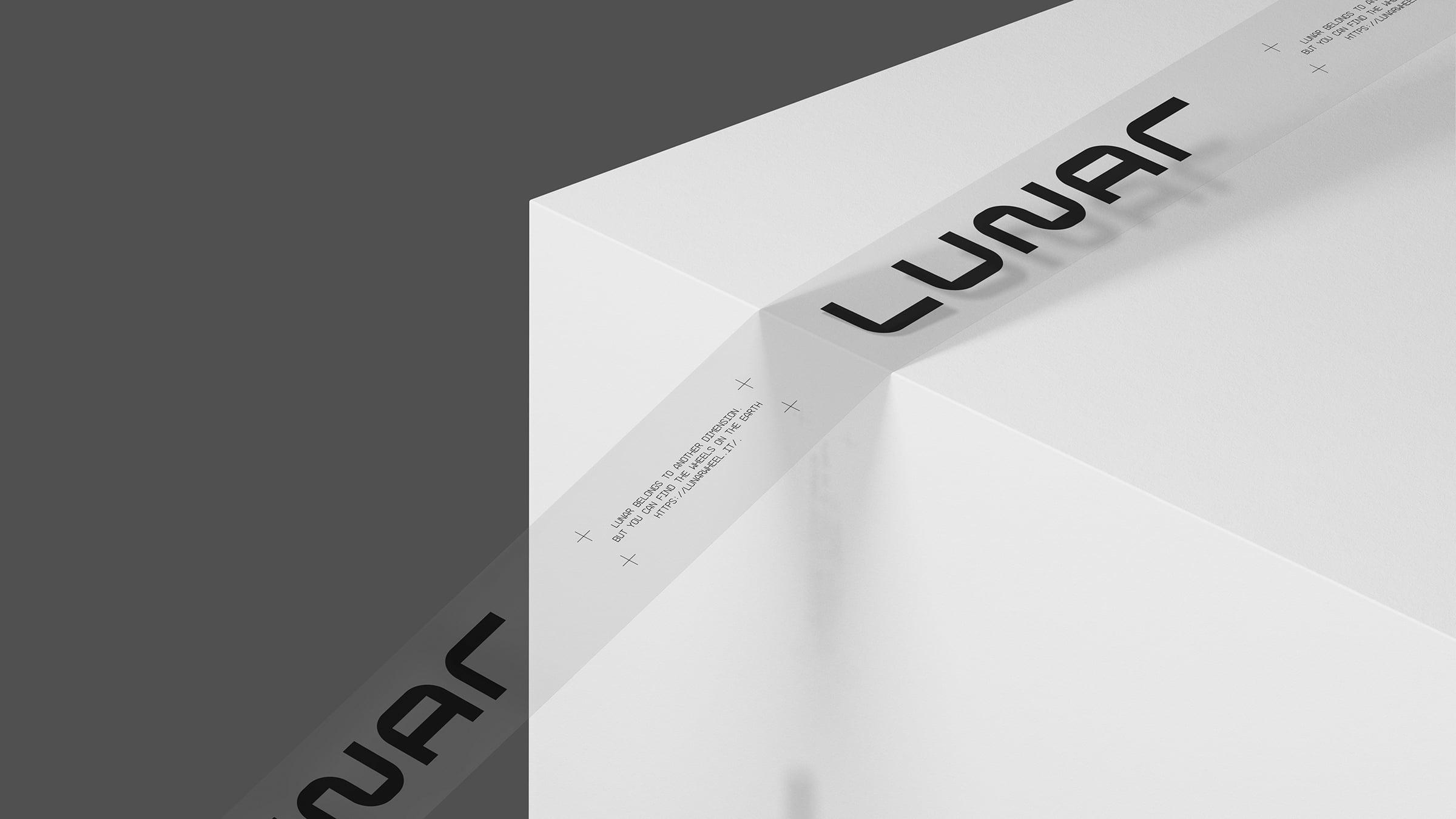
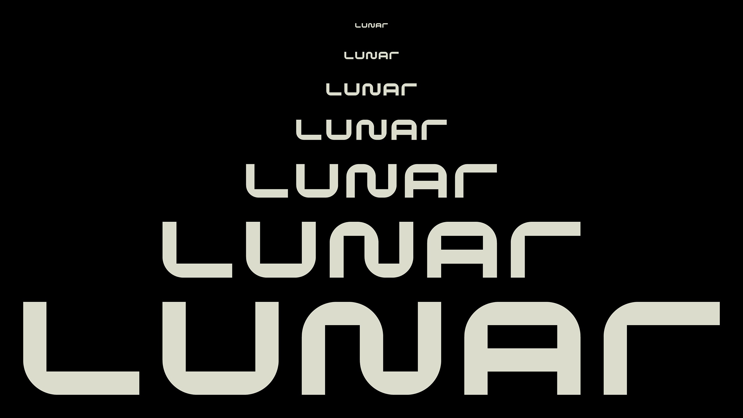
Lunar
Logo, Claim, Art Direction, 3D Animation, Web Design
We launched Lunar. It has the space-like style of great space missions and it’s the quietest wheel in the universe.
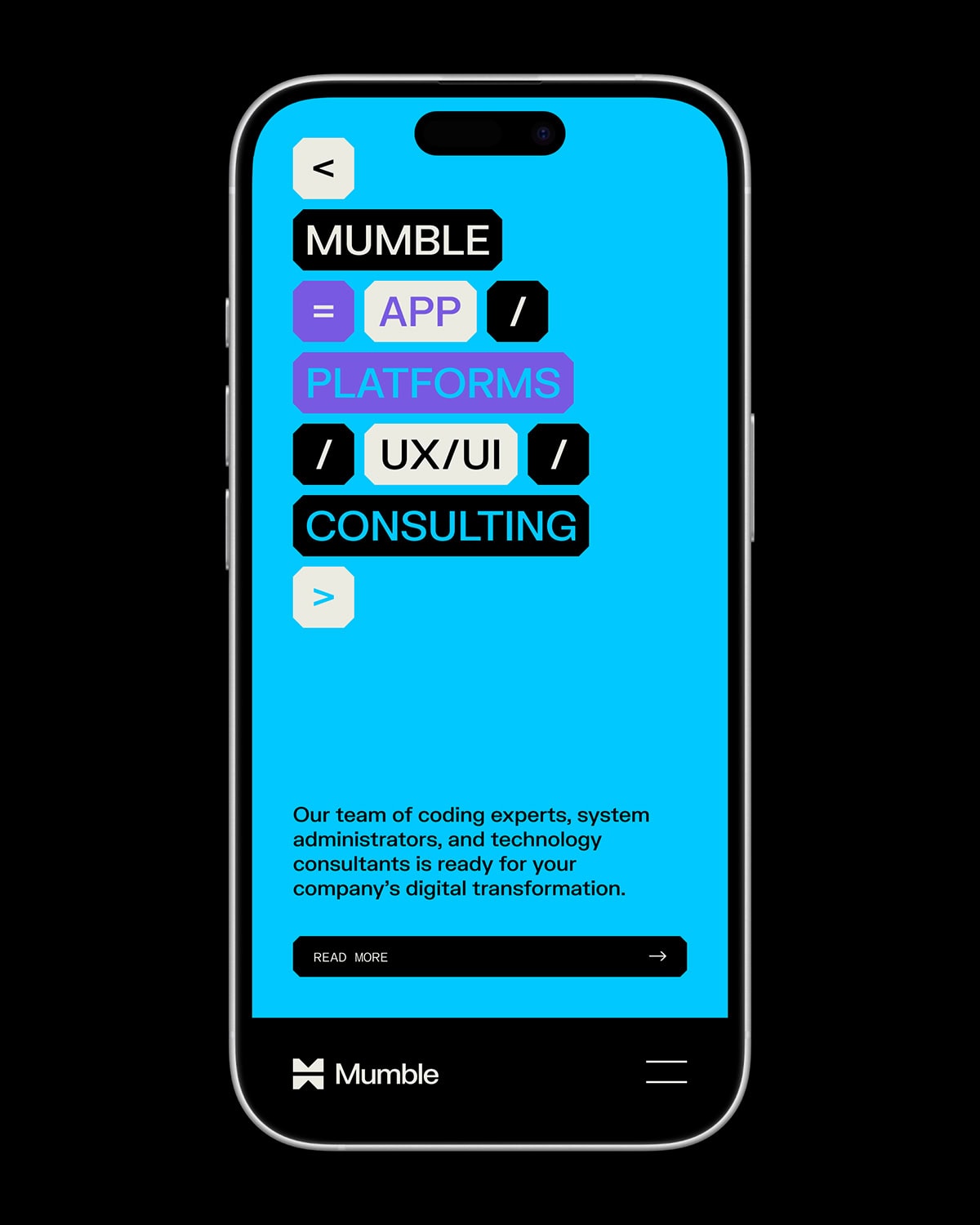
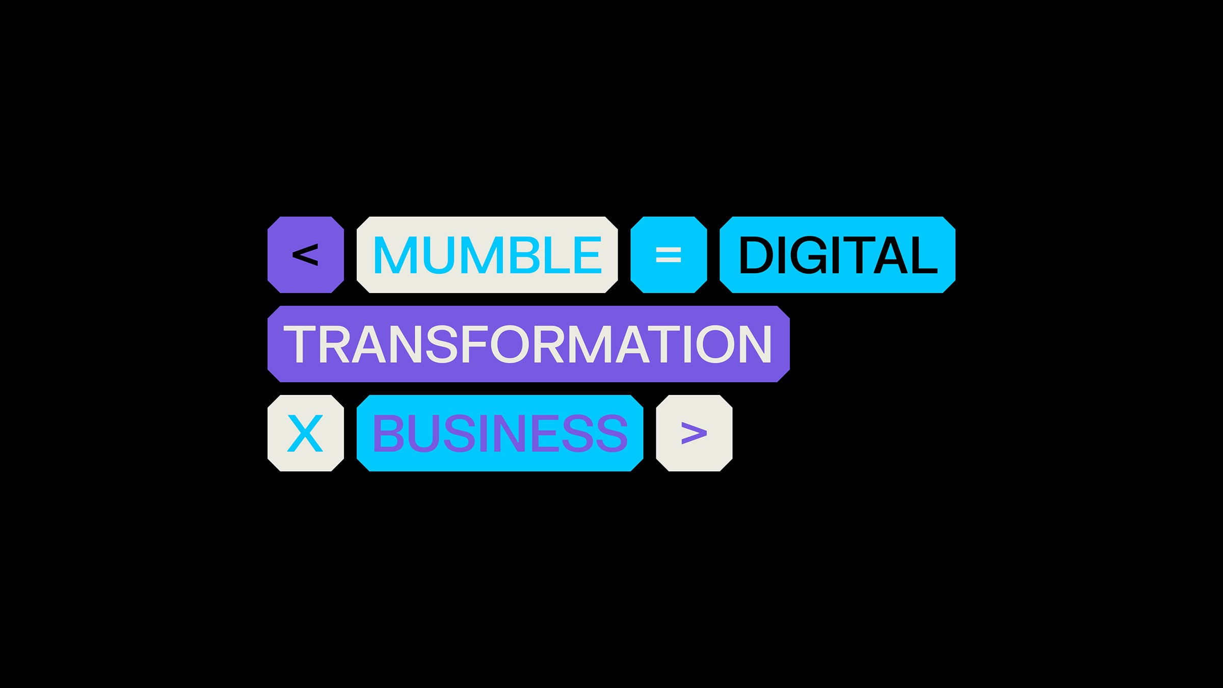
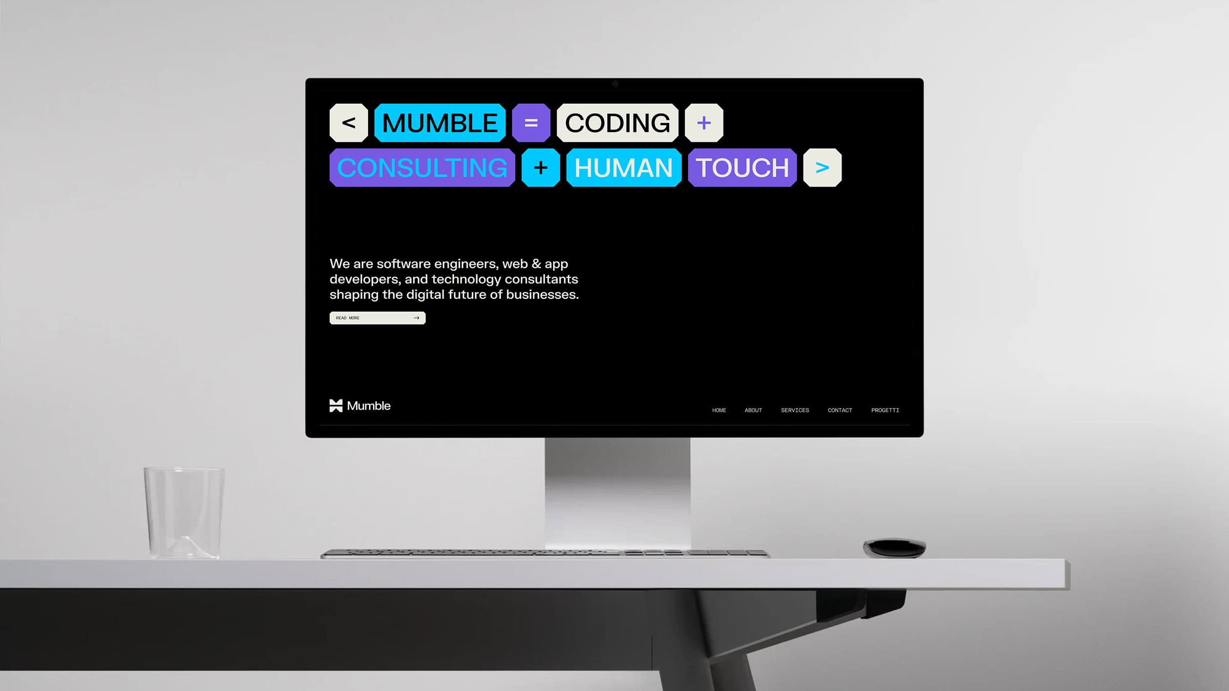
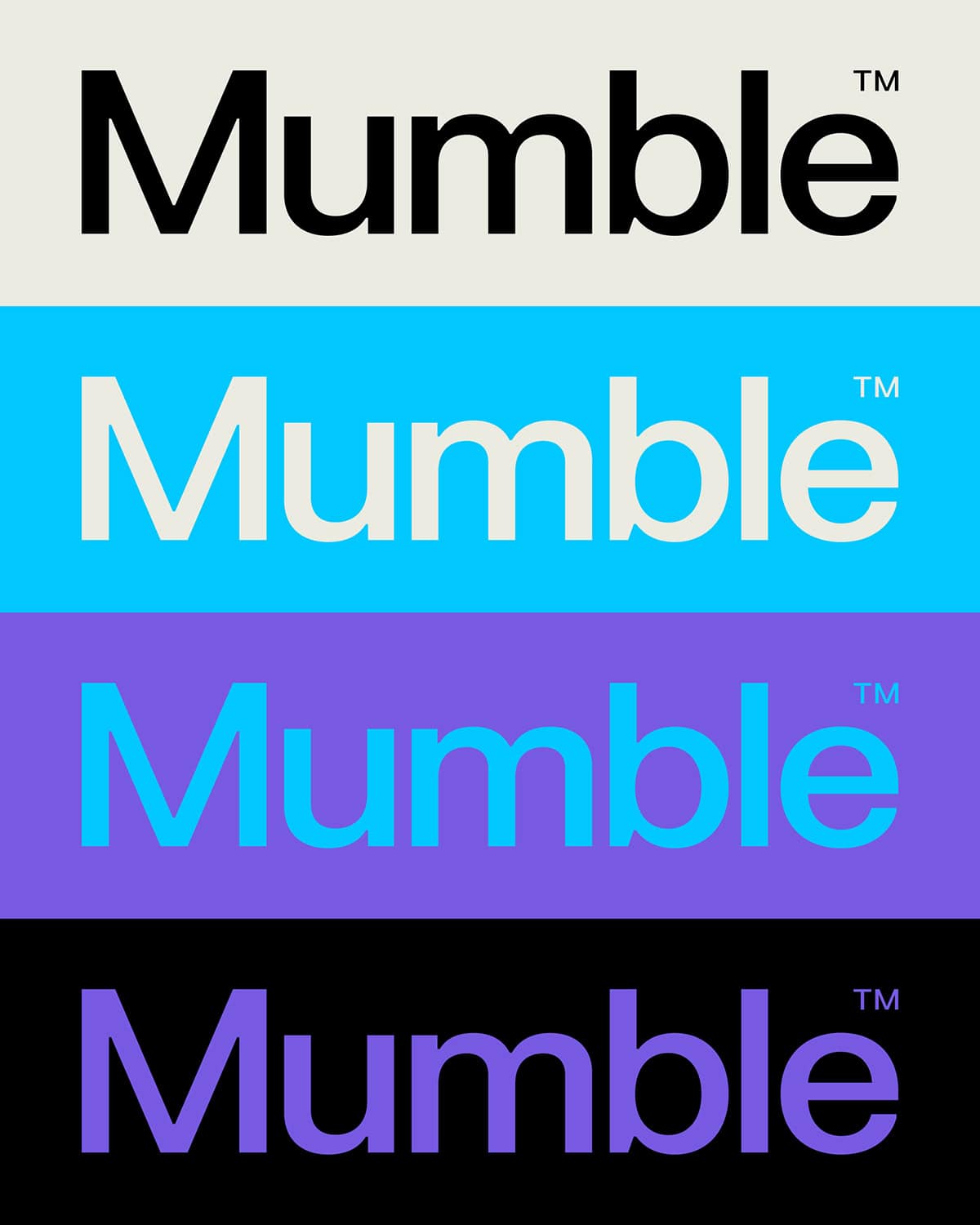
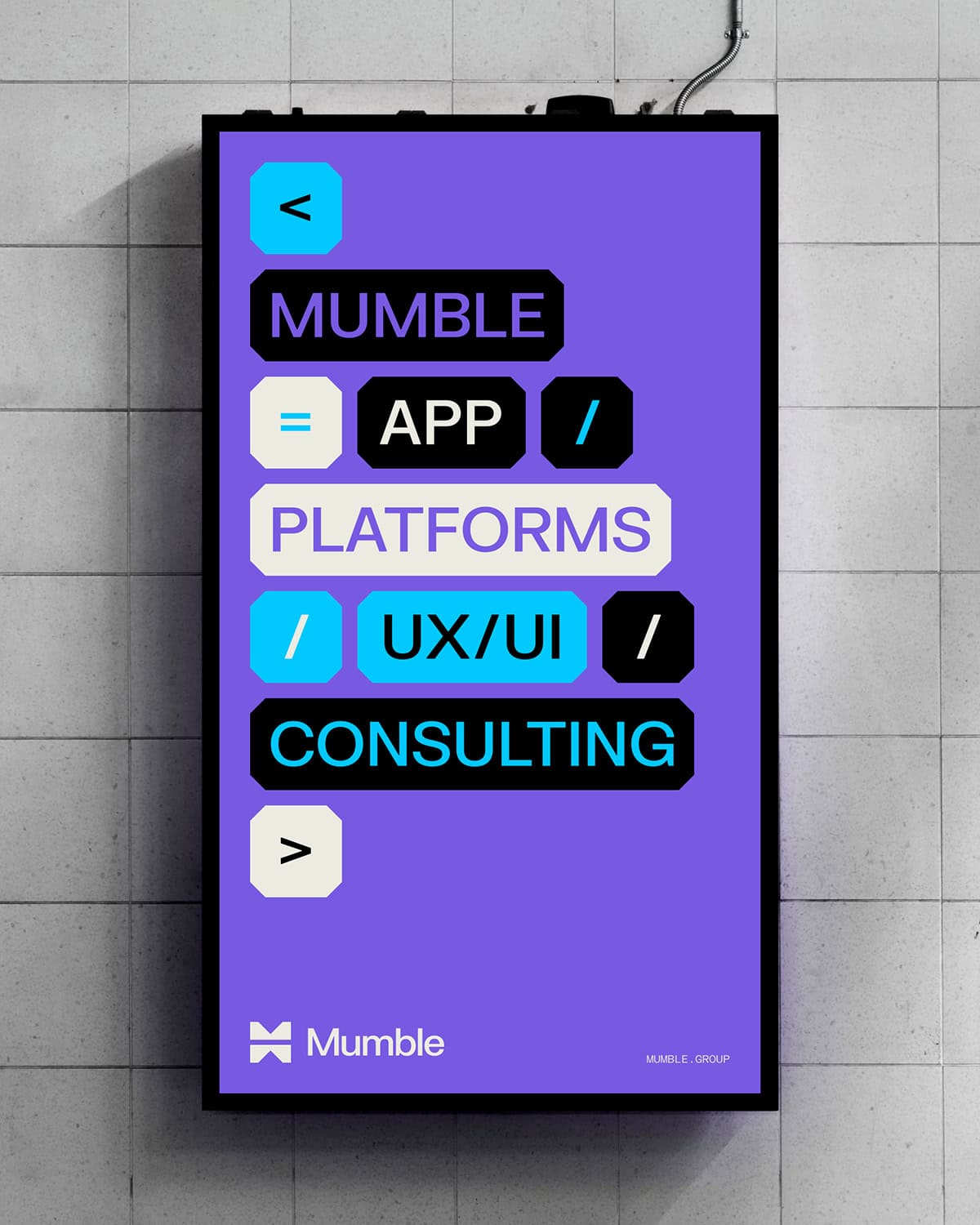
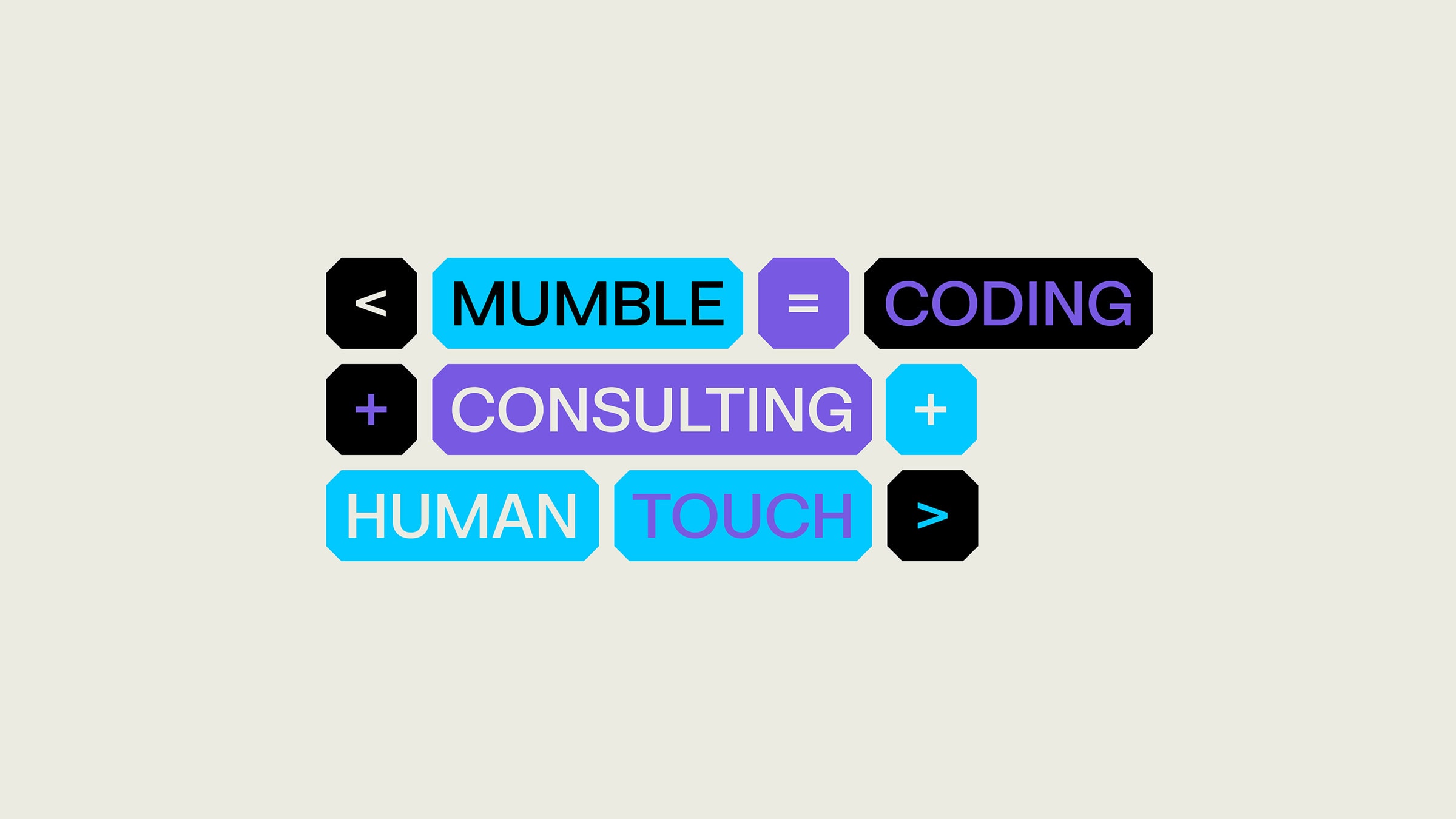
Mumble
Logo, Brand Identity, Web Design, Copywriting
The logo and visual identity we designed for Mumble: the software house that blends coding and tech consulting with a human touch.
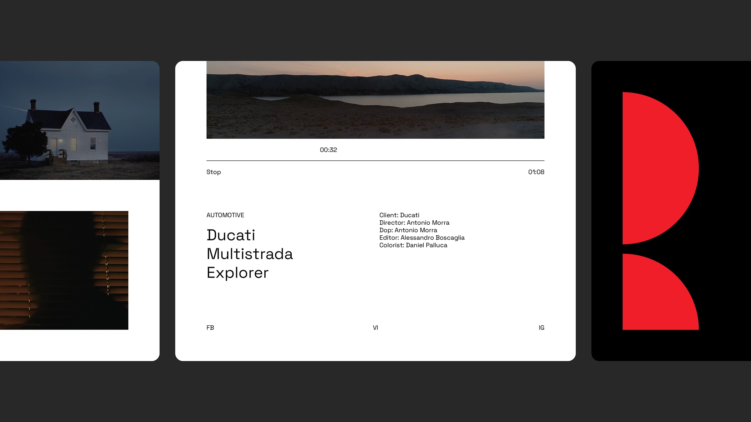
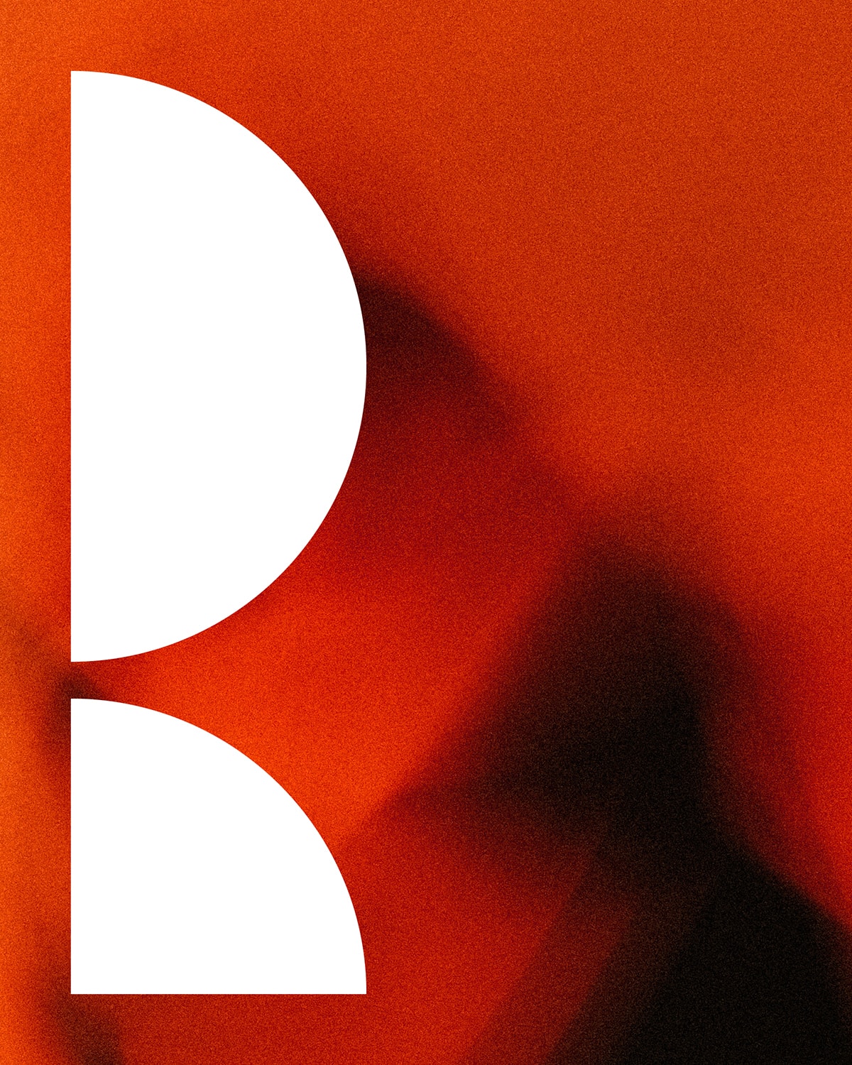
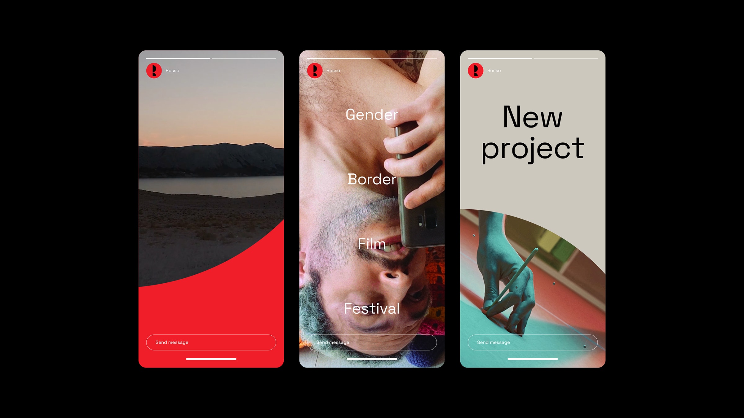
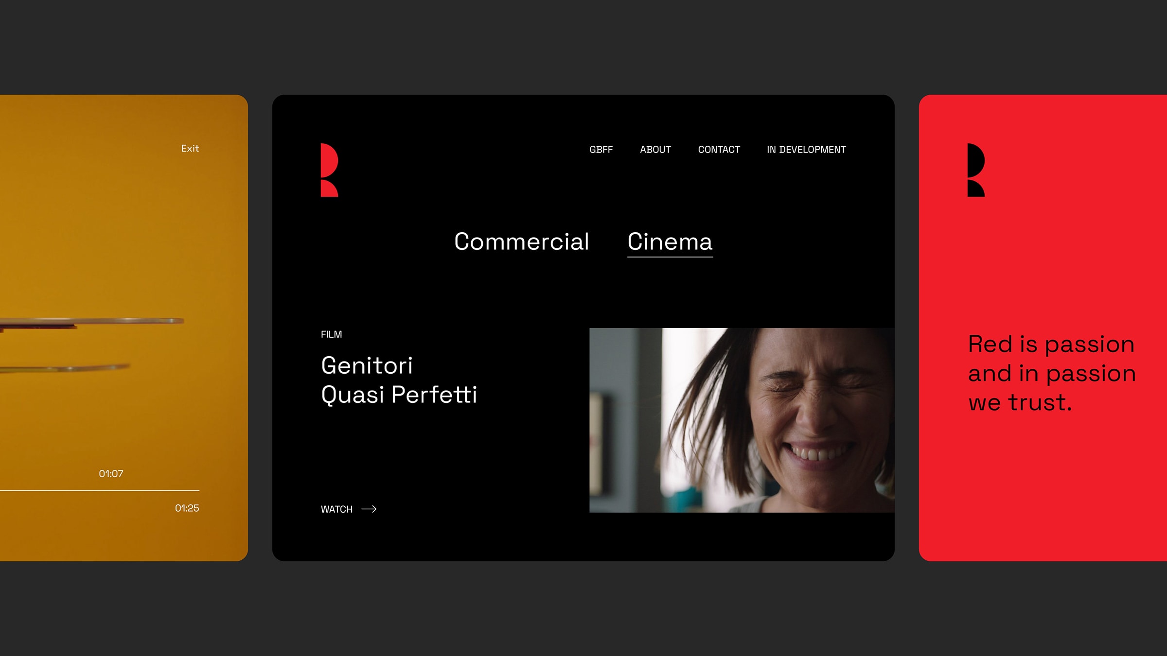
Rosso Film
Logo, Visual Identity, Web Design, UI / UX, Web Development
The logo we designed for the film production company ROSSO is an eyehole through which new worlds can be imagined.