ROT
The visionary creators of ROT, a new name in Italian luxury, asked us to develop a brand identity, a website, and a launch campaign as radical and chic as the fashion pieces they design. Here they are.
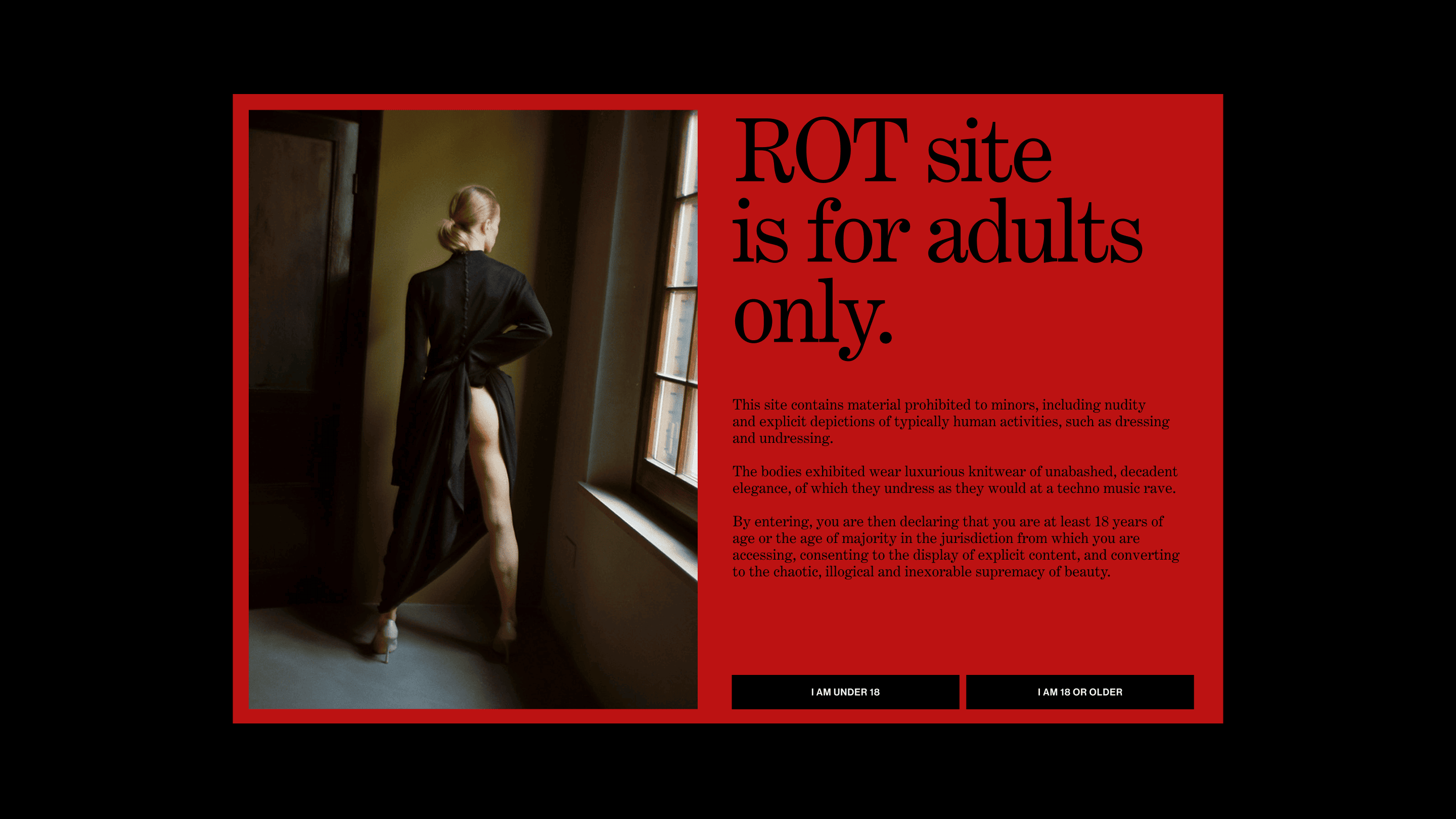
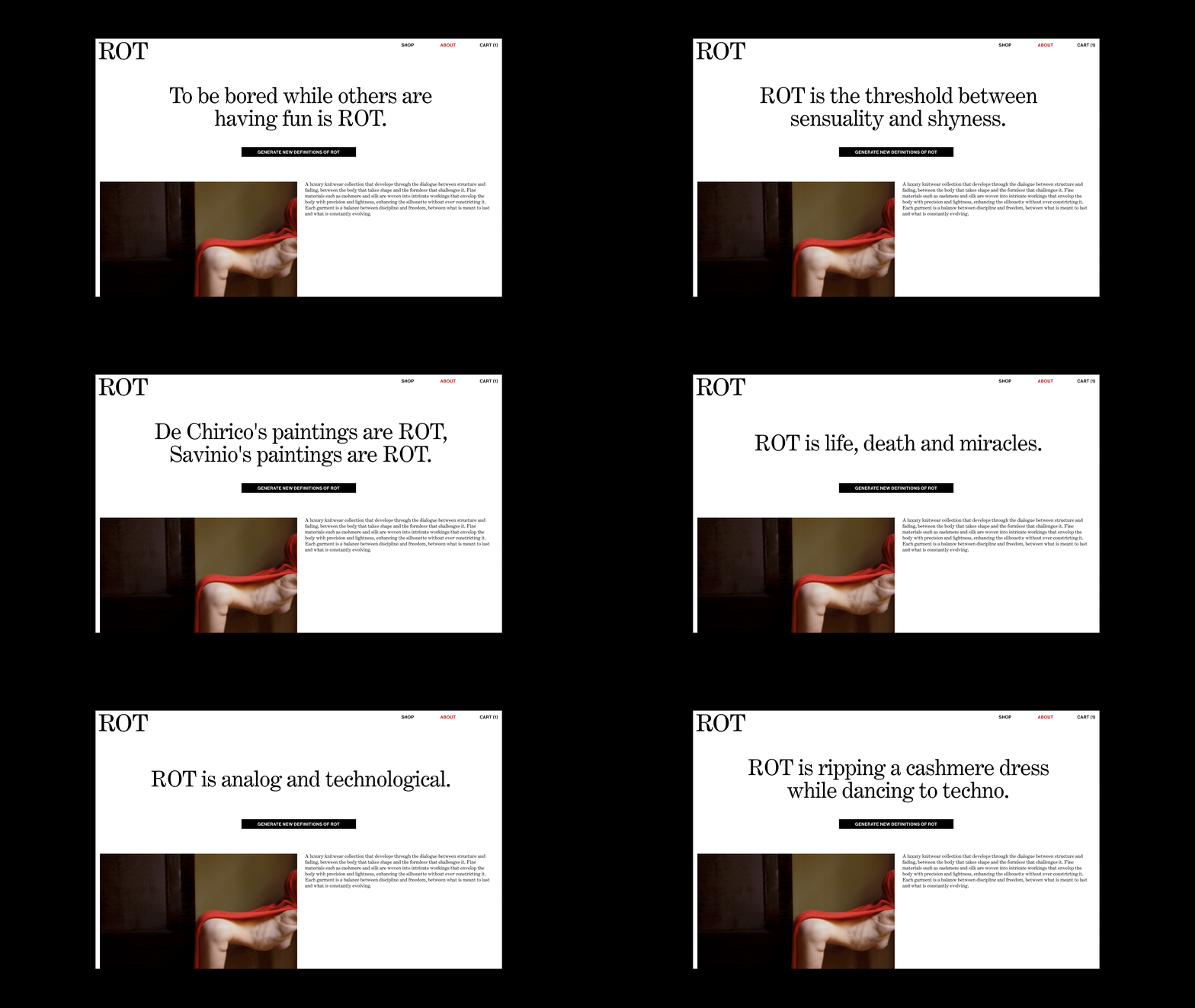
ROT has no values, only three communication threads. By weaving together the elegance of paradox, radical provocation, and metamorphosis, we created the logo, graphic system, and storytelling.
We designed a provocative yet refined website. A site for adults, with explicit scenes covered by red blocks that only of-age users can unlock.
Note: ROT has no claim but an ever-evolving automatic definition generator.
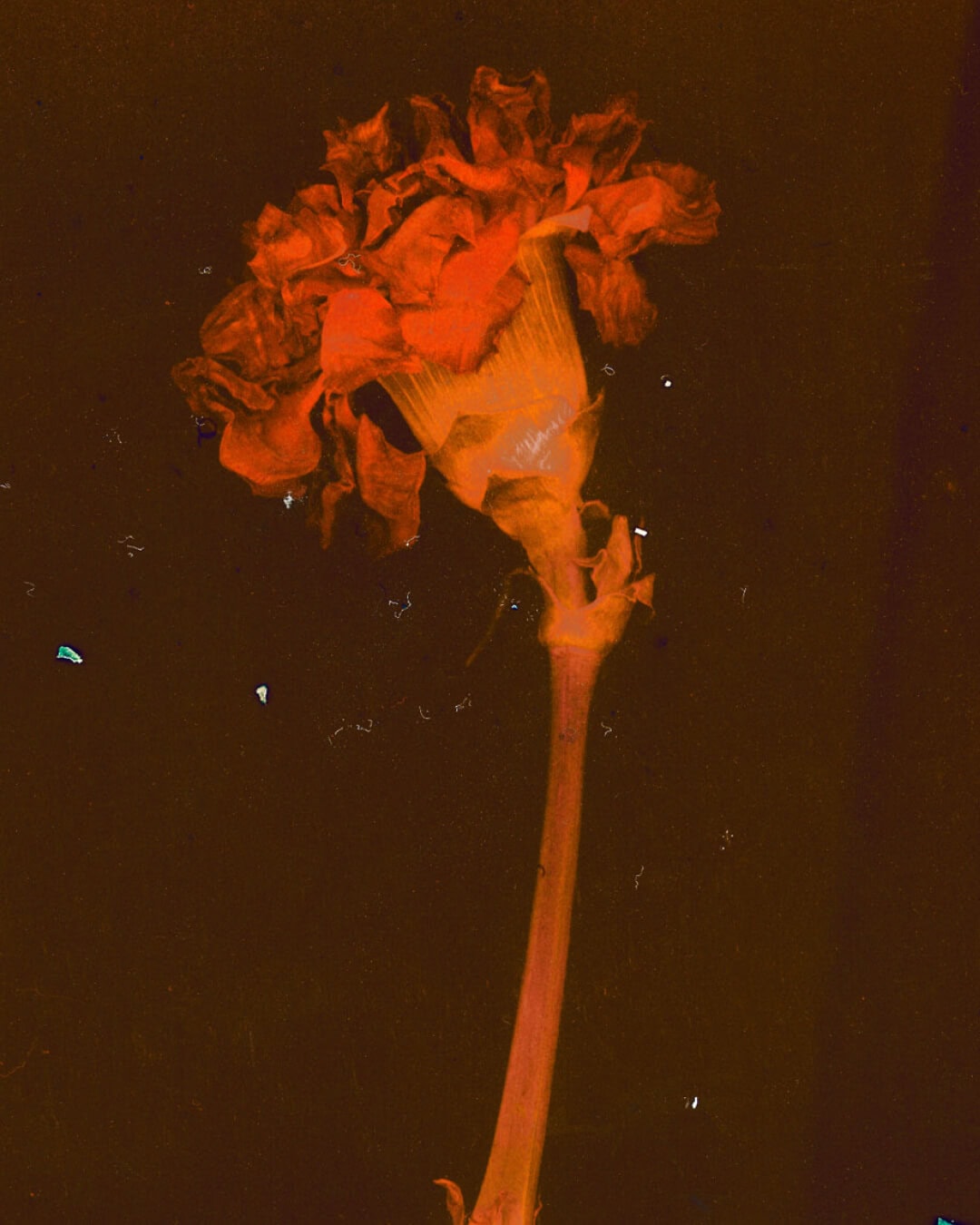
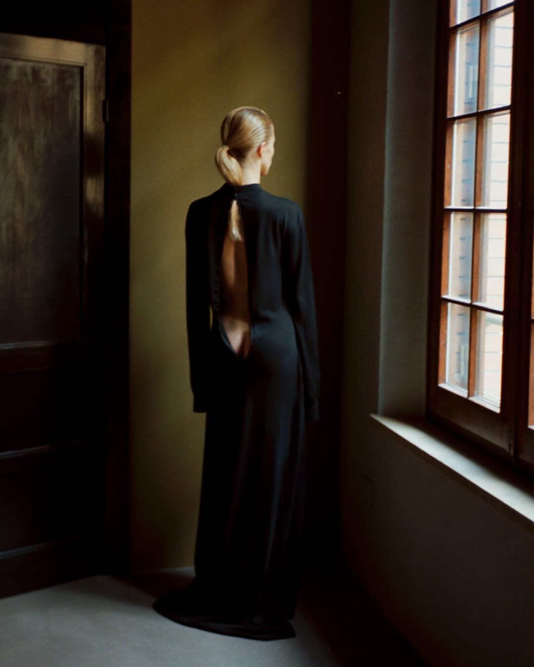
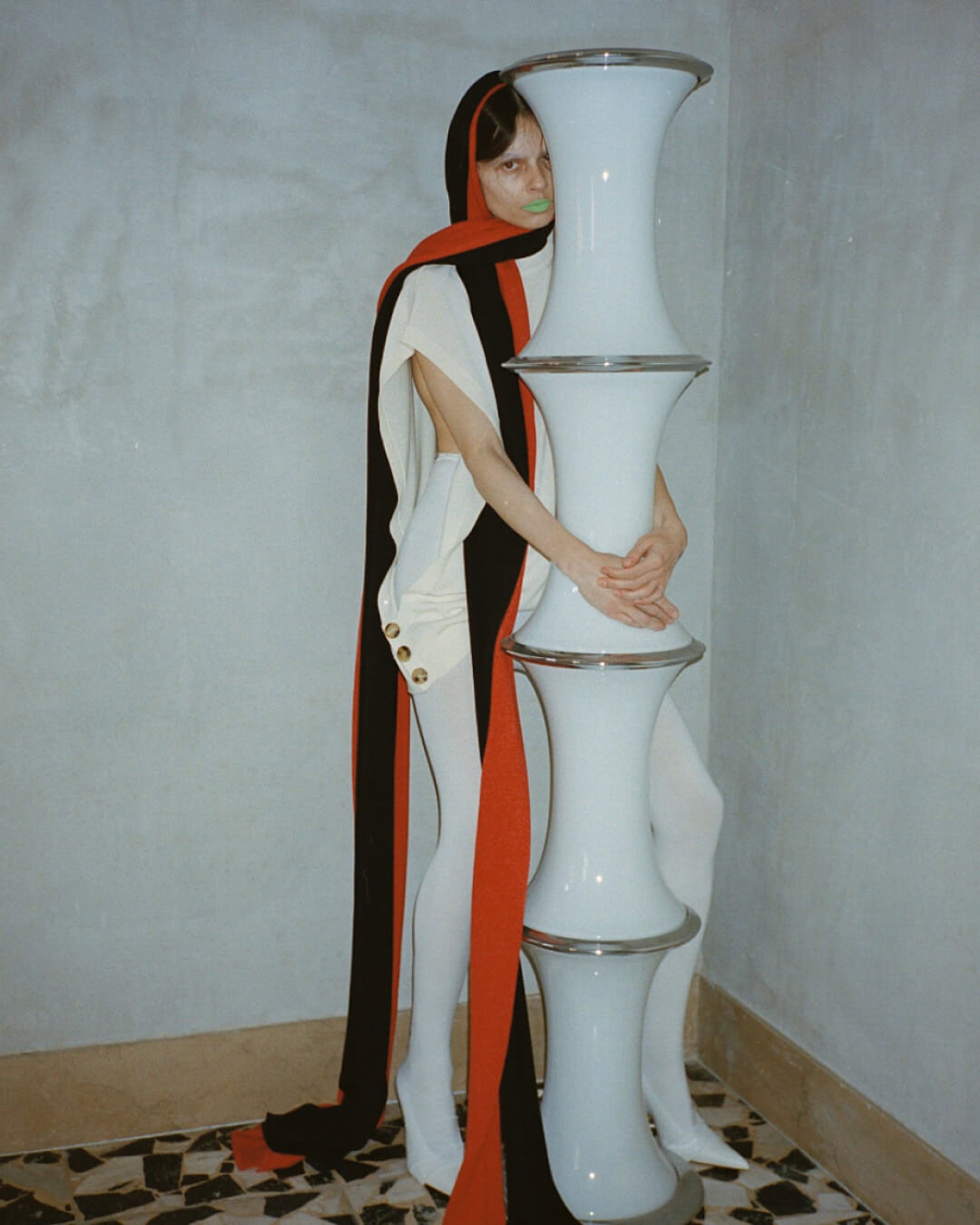
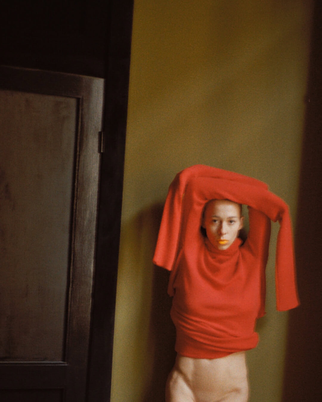
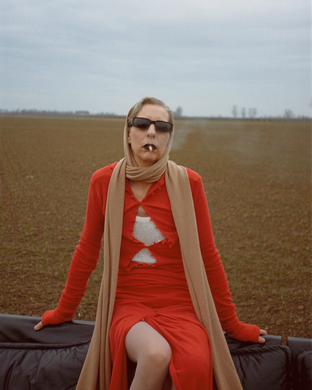
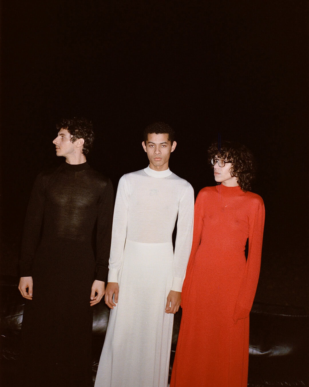
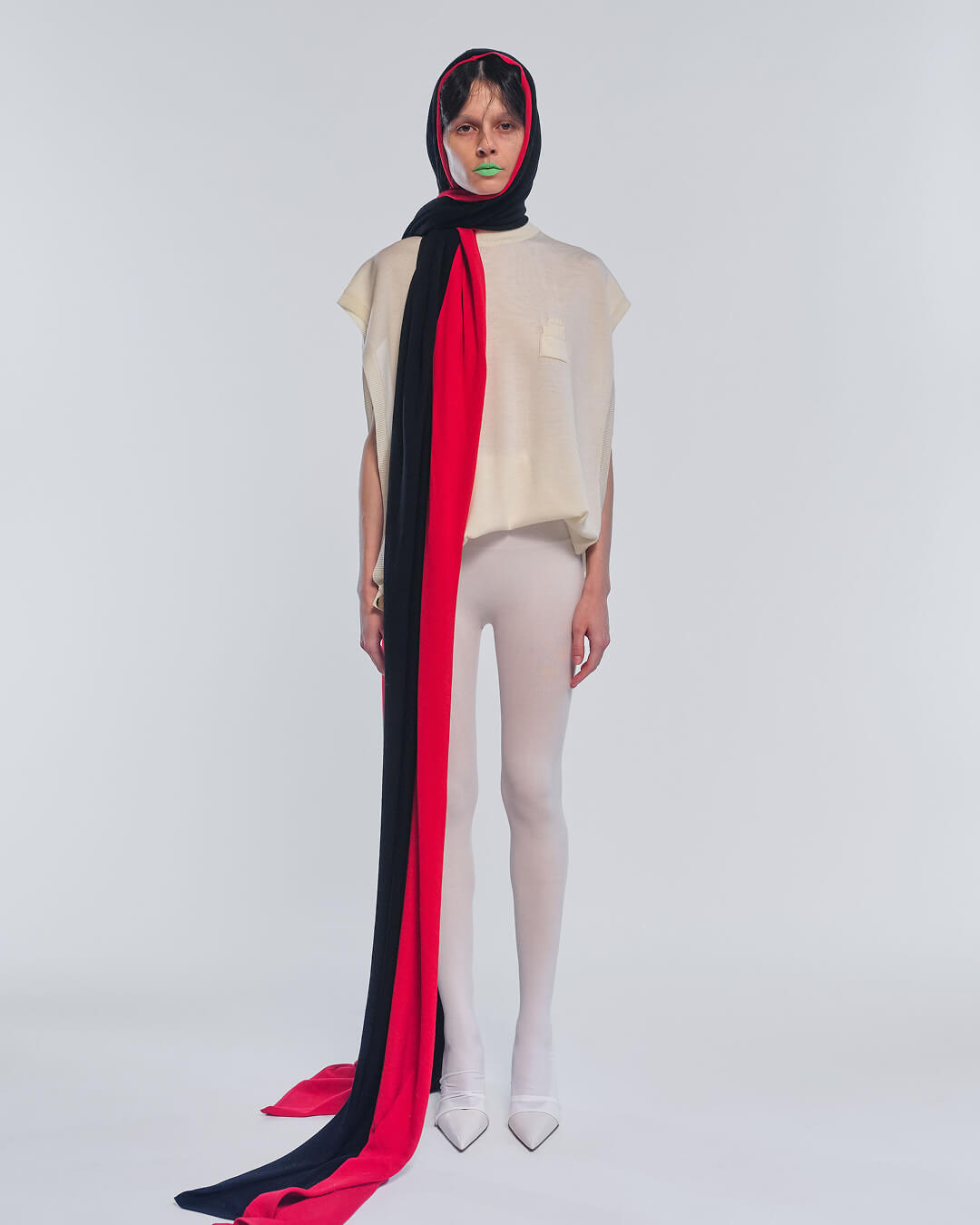
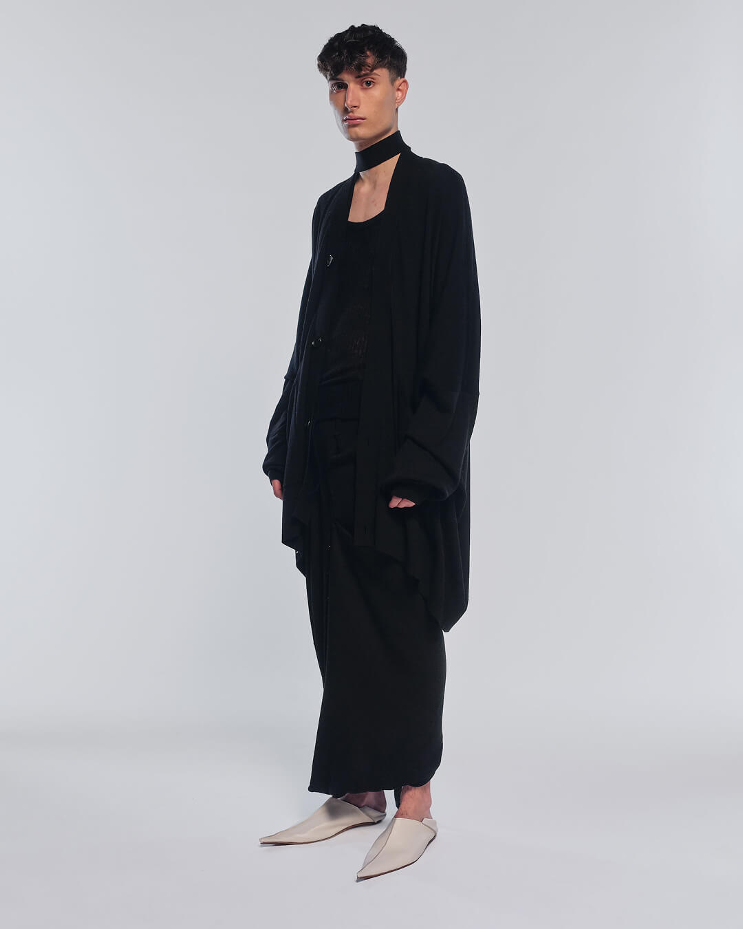
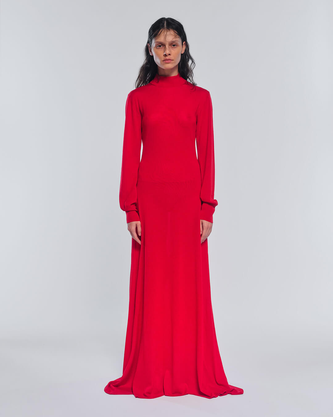
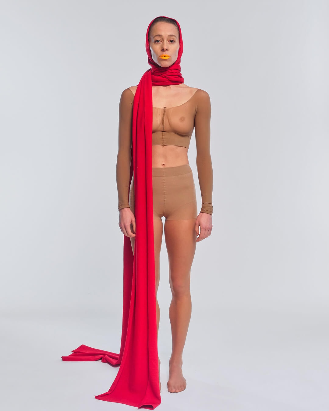
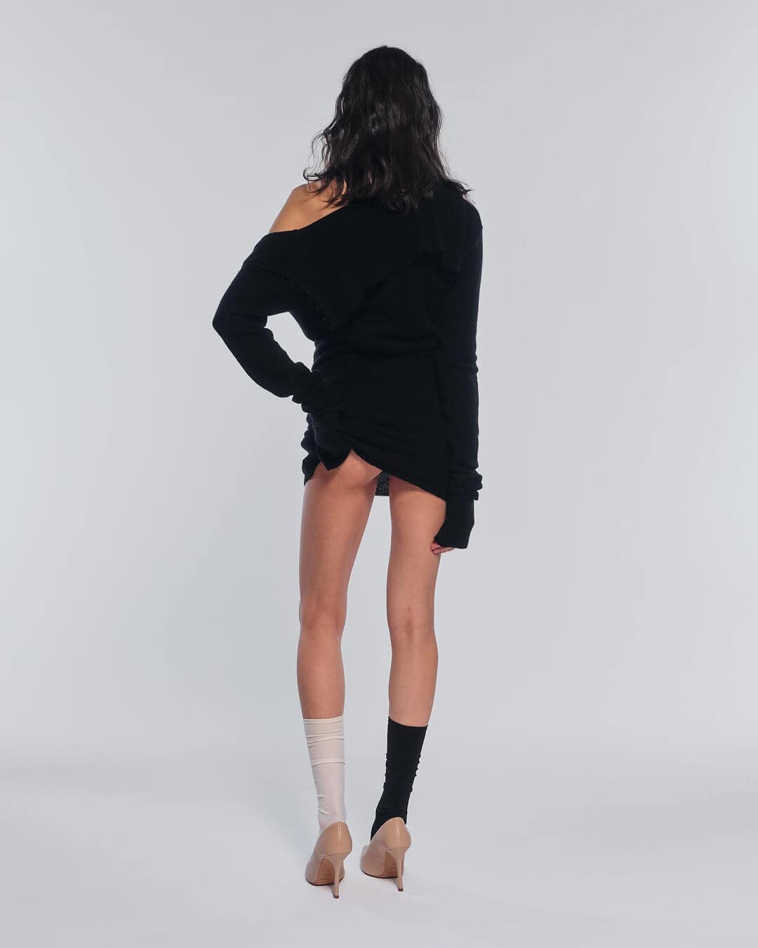
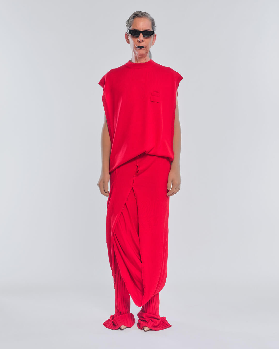
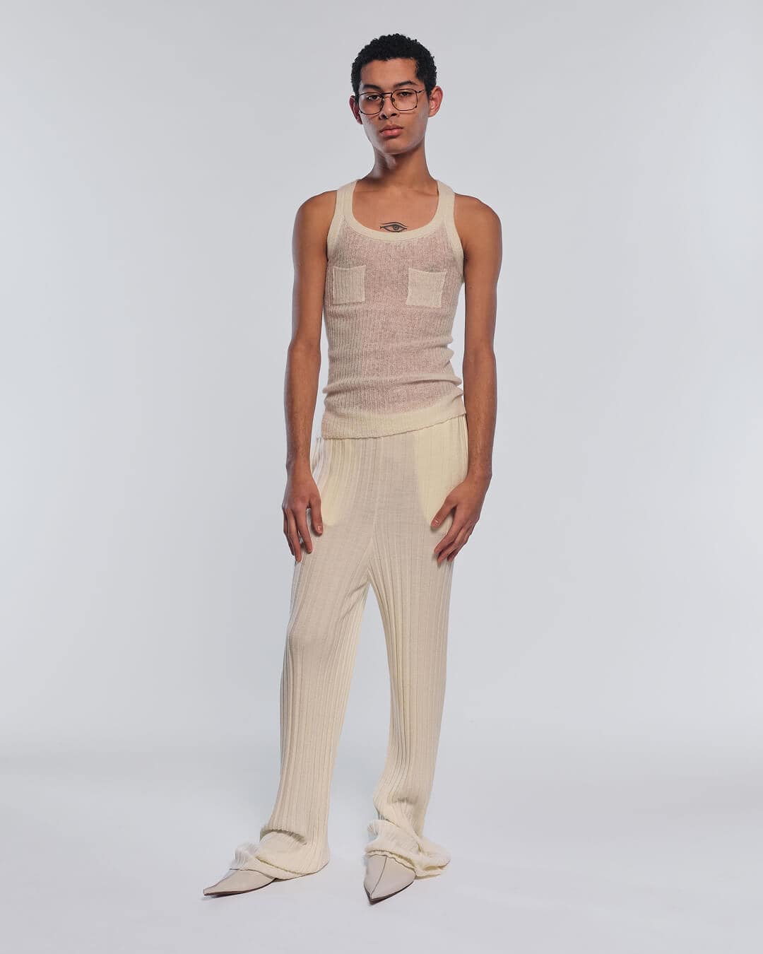
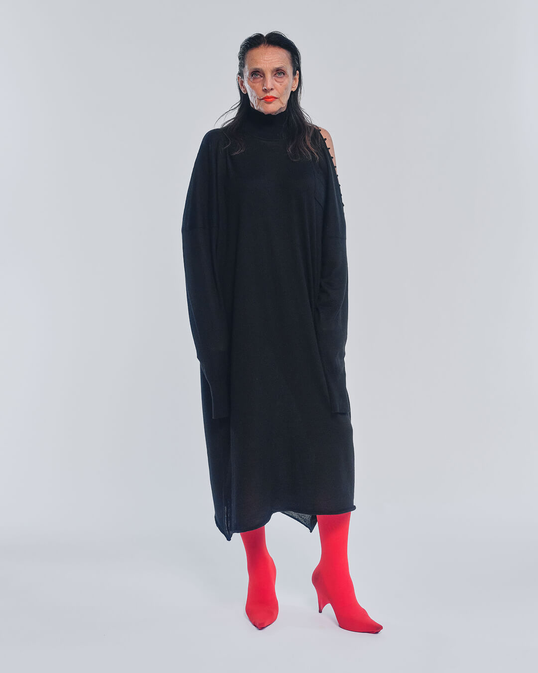
The launch campaign presents ROT in its tension between logic and irrationality, between chastity and provocation.
Credits
ROT
Emanuele Bonavolta
Gabriella Cataldi
Client
Andrea Fagiolari, Vittorio Perotti
Creative Direction
Andrea Serrani
Web Developer
Maria Clara Macrì
Photography and video
Leonardo Pini
Music


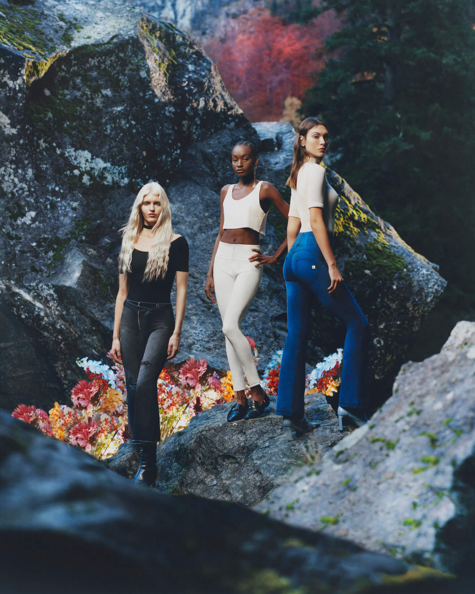
WRUP: We Two
Film, Art Direction, Copywriting, Social Content
The campaign for the new eco-friendly WRUP line celebrates Nature by drawing inspiration from the great American poet Walt Whitman.
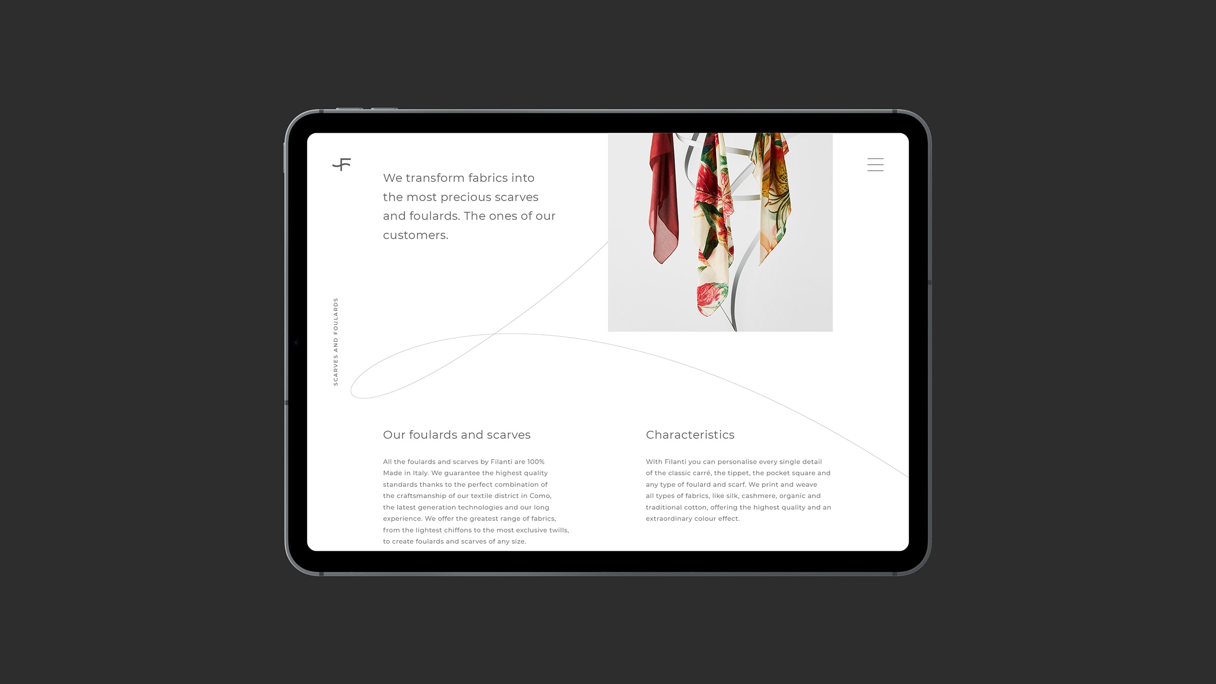
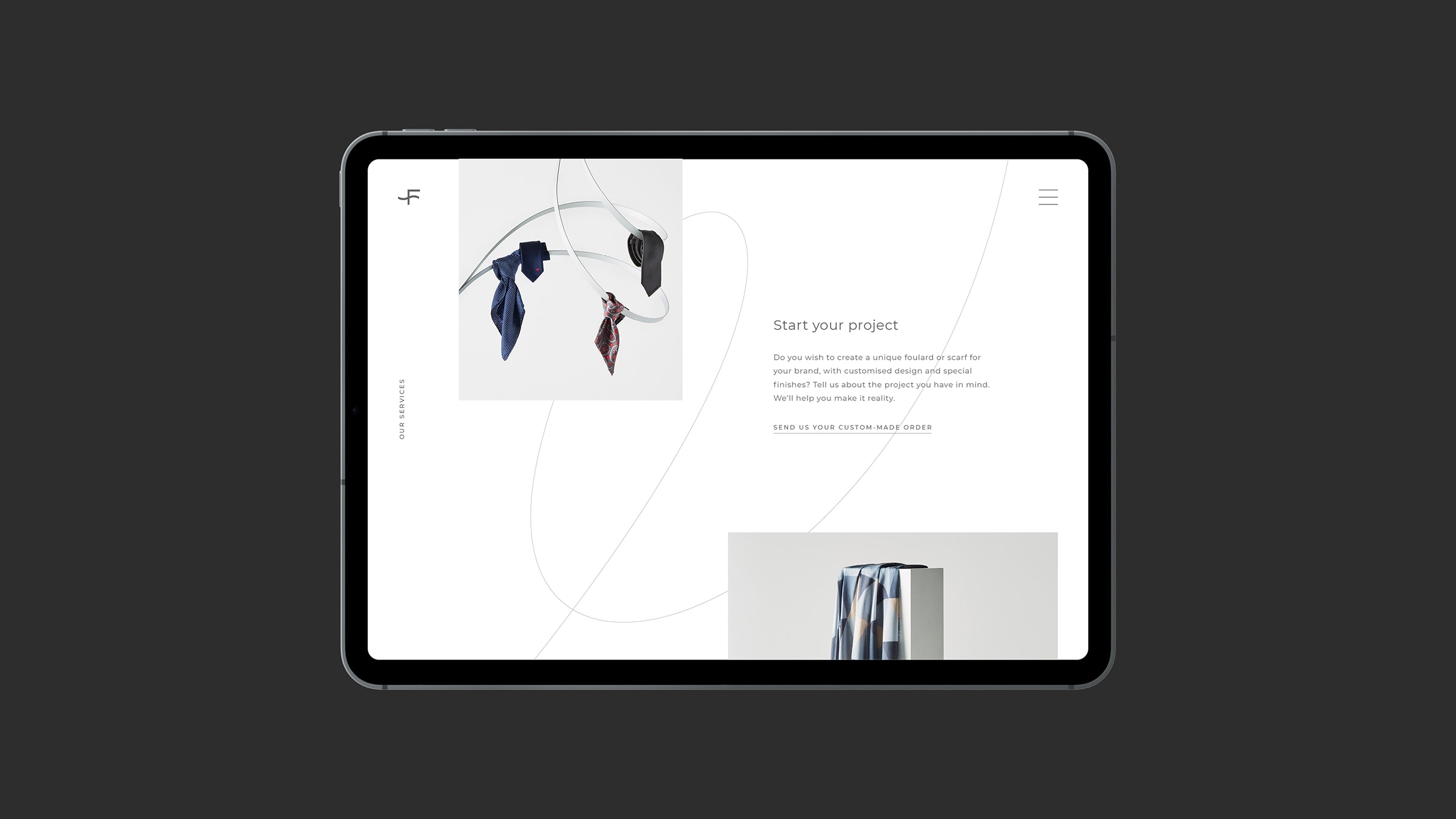
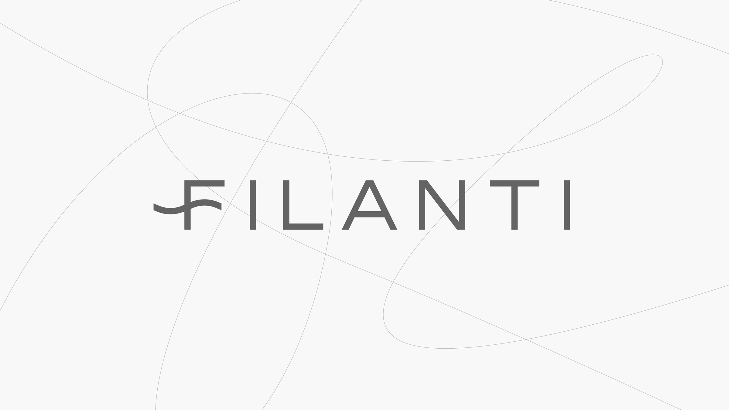
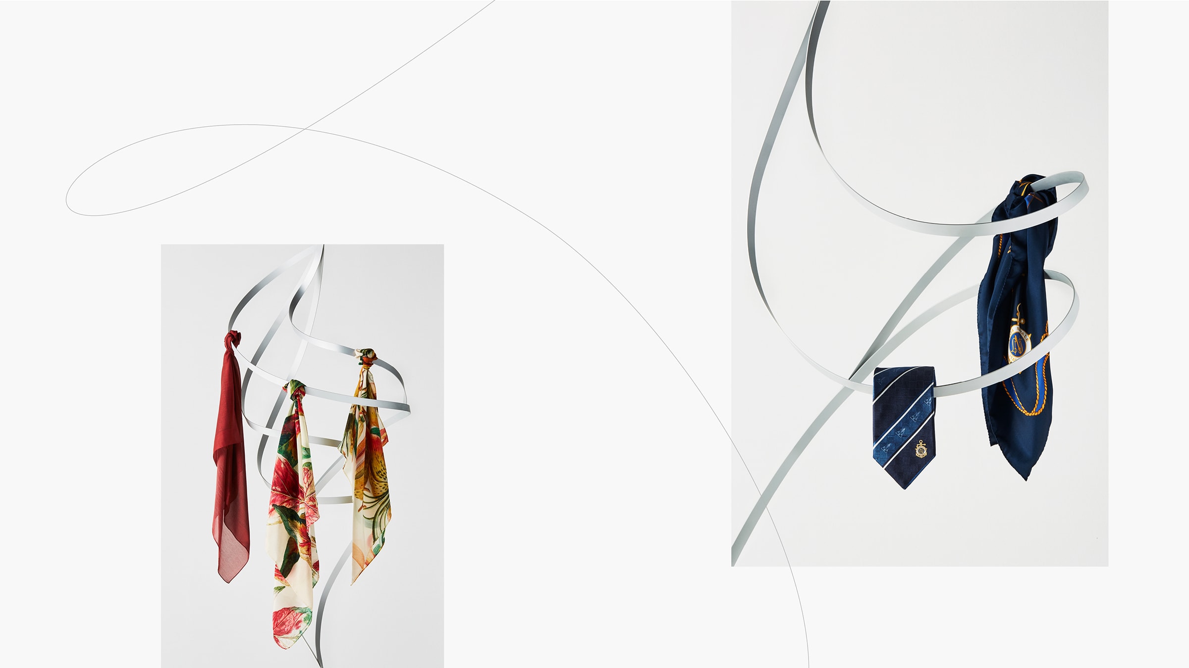
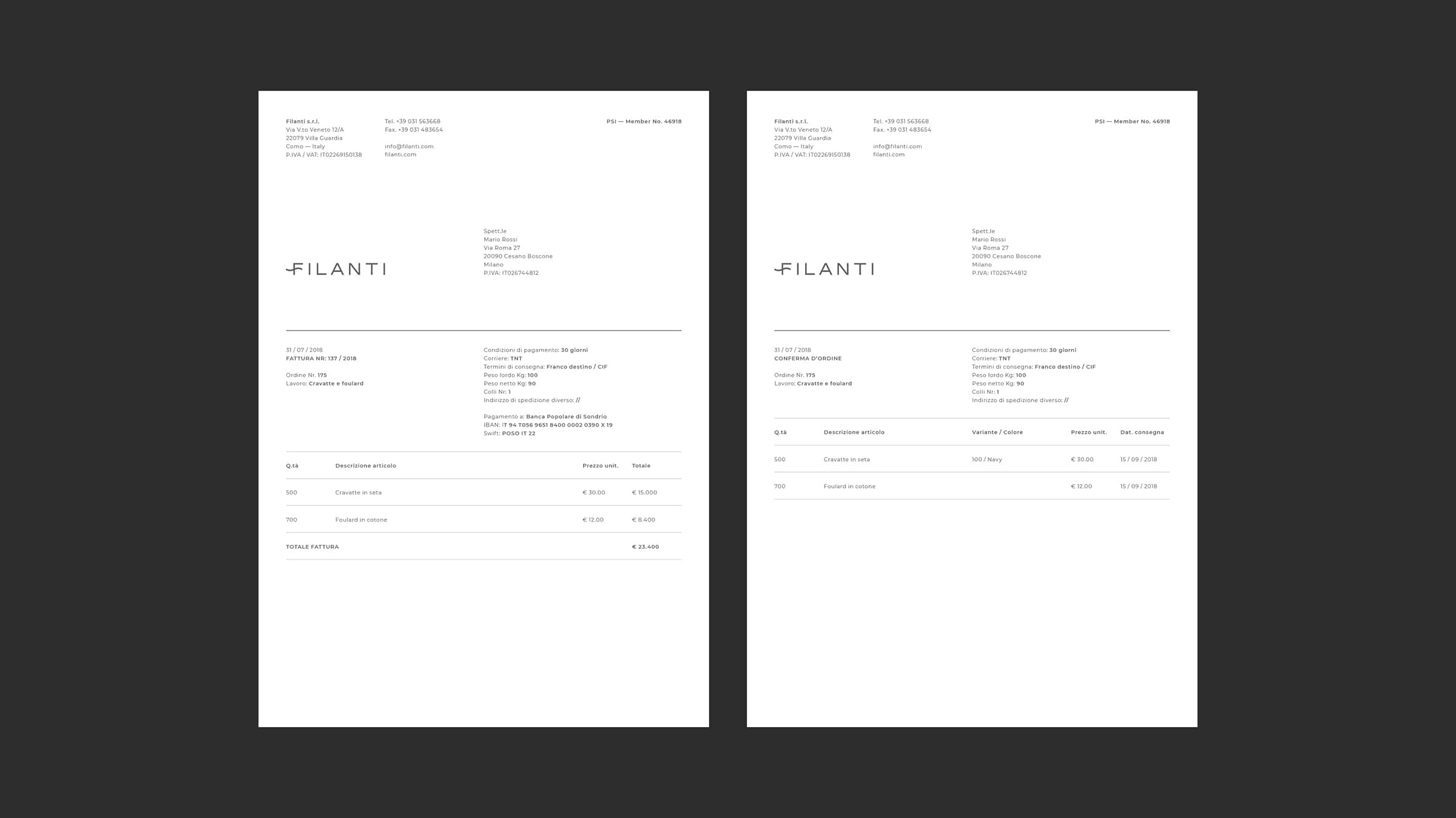
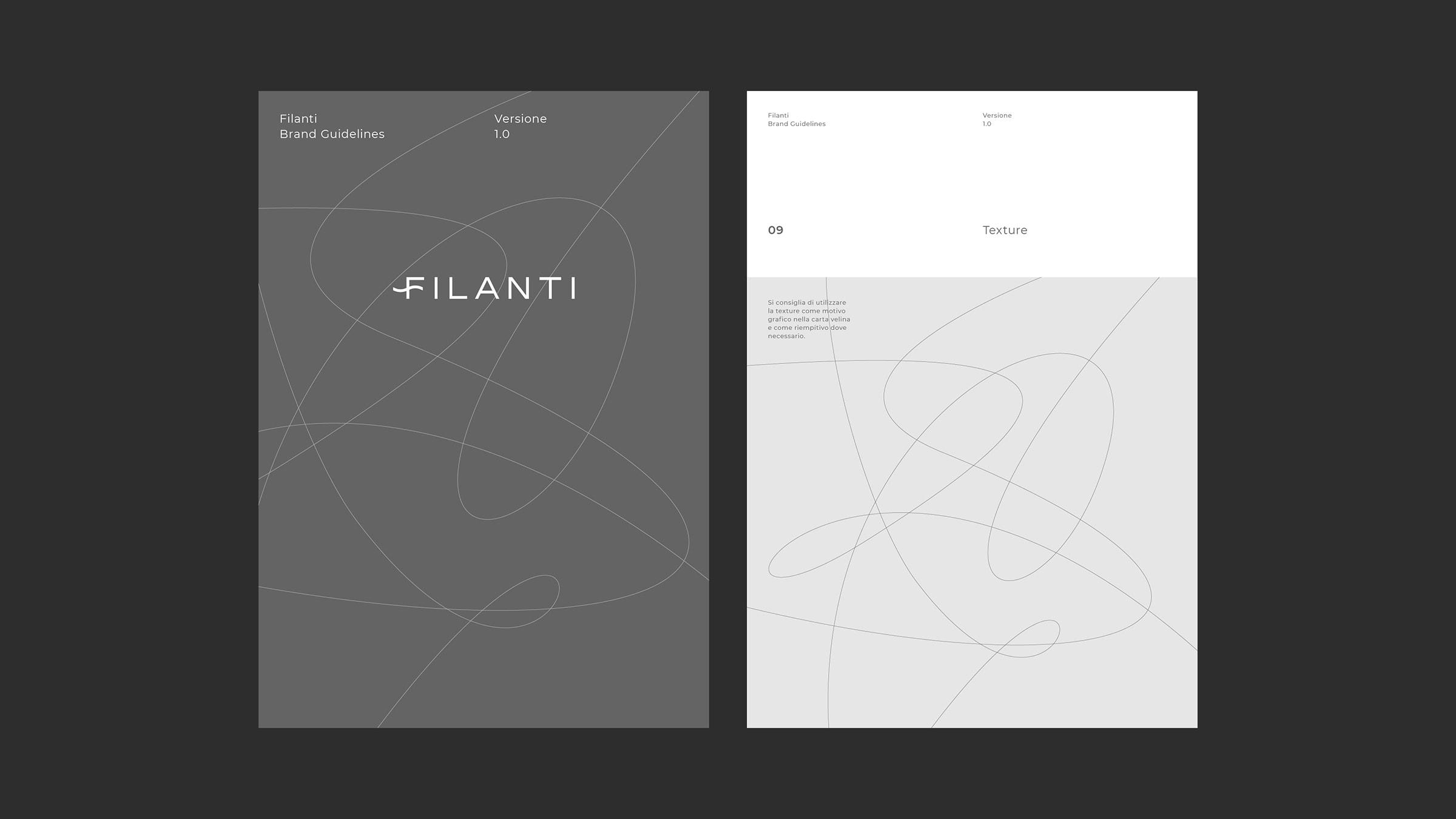
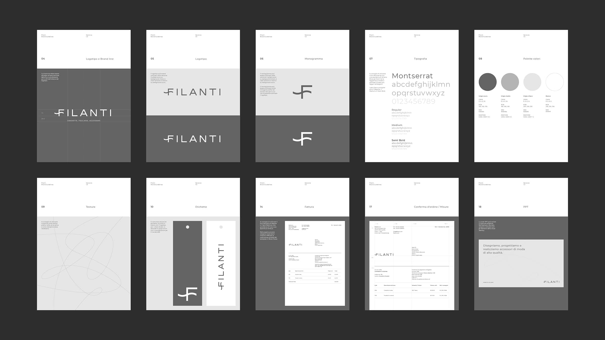
Filanti
Naming, Logo, Visual Identity, UI / UX, Web Development
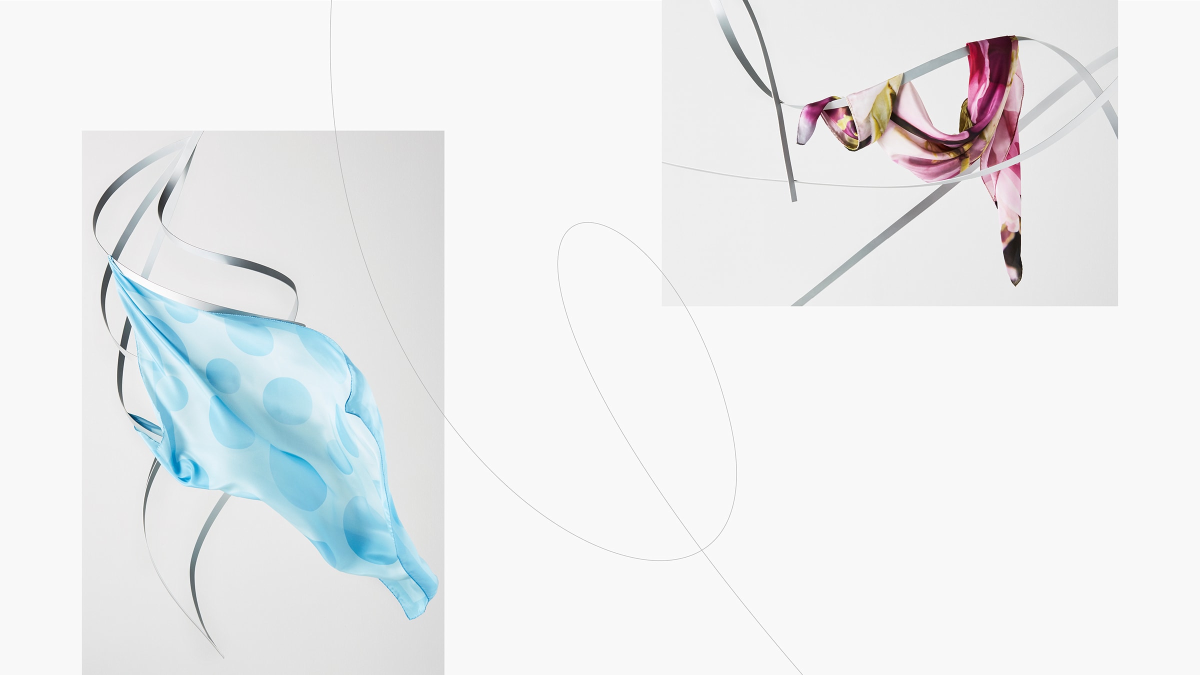
We built the image of Topkapi, brand of the silk district of Como, by modernizing its historic values: Italianness, elegance, and minimalism.